|
Square by Still [web]
[nfo]
|
||||||||||||||
|---|---|---|---|---|---|---|---|---|---|---|---|---|---|---|
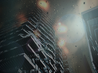
|
|
|||||||||||||
|
popularity : 80% |
|||||||||||||
alltime top: #109 |
||||||||||||||
| added on the 2012-09-28 23:07:59 by pixtur |
||||||||||||||
popularity helper
comments
wow. jawdrop.
Very, very different to pretty much everything else around at the moment. Nice take on using sphere tracing for something that looks very new and fresh. Reminded me of some scenes in Inception in places. Good stuff indeed!
Holy crap... this is massive. And beautiful.
Sublime beauty. Things like this make me believe in the demoscene once again.
my cup of tea!
Rather different indeed. I don't like all of it (in particular I don't think the music works all too well with the visuals), and it's sort of artifactiy in places, but certainly worth a thumb.
gorgeous visuals, music not my cup of tea, but definitely one of the best demos of the year so far
HOLY SHIT! THIS IS MASSIVE.
just... Wow!!!! Beautiful colors.
I still don't get in my head what I've just seen... this was inbetween pixelgetöse and massive beauty. Me likes, even the music that doesn't fit to my playlist ;) THUMB.. IMMEDIATE!
sick shit :)
Really beautiful. Framerate was a bit slow but my pc is old.
excellent work, the pacing is adjusted to suit the fantasic music perfectly, the colour scheme matches the grimey ruined city aptly, and the graphics and camera work are superb also, really a very coherent demo with an impecable aesthetic. and what Preacher said :)
Not entirely blown away but damn good anyway, loved the dissolve effect and the title/credits at the end(!!!).
I. Just. Came.
haha i was thinking "man they ripped a popsong i know this tune inside out" when i finally realized it was dq :)
yes! yes!
yes! yes!
i just came again.
this is the best thing ever since youshould =)
this is the best thing ever since youshould =)
awesome visuals
Pure art. Nice choice of musical style.
Wow! This is awesome!
Epic?
Epic.
Epic.
Favourite demo of the year? Quite possible.
Yep.
Awesome
yes. awesome.
(loved the high-rise atmosphere and the music!)
I started to believe in PC Demos again. Thank you still, that's art how it should be!
I can't believe this won at the party. Don't demos this good always come second? Crazy good shit, some really stunning effects, massive atmosphere, and I also happen to love that tune :D
You really should watch this realtime, but for those who want it, here's a HQ MP4 to complament the youtube video.

Still is still at the top of there game.. where are the results.txt of this party by the way ? :)
This production is just awesome! Whats next? keep em coming!
This production is just awesome! Whats next? keep em coming!
hell yeah!
Wow! Nice graphics, music, atmosphere and direction. All thumbs go up!
this is my new reference as modern PC demo
Very impressive. Good job... "Great" should I say.
Well.
very nice gfx, music and direction.
I already think that the prod is good.
I already think that the prod is good.
Not what imagined when I first listened to the song, but holly molly what a trip!
amazing!
great
Apart from the soundtrack (never been much into reggae-style stuff), I am all thumbs-up for this.
Holy crap. Exquisite in every way. Amazing direction and camera work. Can I give TWO thumbs up?
I'm usually not into downtempo demos, but this is one of the few exceptions, love the atmosphere from the music combined with the visuals!
No doubt that this rules big time! But, the usual fractal-bulb-kaleidoscope-chaos-scenes sucks big time and ruins an otherwise fantastic fractal world which is shaded so beautifully!!!
Side note: some of the particles has a visual transparent white box around them? Overexposed alpha which was close to zero?
Side note: some of the particles has a visual transparent white box around them? Overexposed alpha which was close to zero?
`
Quote:
But, the usual fractal-bulb-kaleidoscope-chaos-scenes sucks big time and ruins an otherwise fantastic fractal world which is shaded so beautifully!!!
My thoughts exactly.
Other than that, damn awesome.
amazing composition, camerawork and visuals. but im especially in love with the soundtrack.
deserved winner ;)
deserved winner ;)
Fantastic!
Super-rules!
FUCKING ACE!
This was massive or just awesome. For me one the best demos of the last years.
Good.
Massive prod
No scroller, no greets, no rasterbars = thumb down. ;P
Great stuff, finally some proper design with raymarching :D
Best demo of 2012.
Very good.
Welp, looks like everything's been said already.
coool.
Great visuals. But the lyrics in the music runis it for me so pigge.
This prod is really massive! Best prod this year no doubt. Awesome soundtrack and great visuals that perform very well considering the complexity of marchers/whatever. Thank you :)
yeah!
sweet jesus!
Easily one of the most interesting things from the last few years. And I don't get the hate on the music, it's a p decent track!
Nice
Except for the music which I really didn't like this is an awesome demo!
urban fractal magic.
Love it, visually astounding and crisp. Concept is great and music flows with the visuals with perfect sync. I feel it required more style or punchy element(s) although I fully understand the ambient asthetic the artists involved were looking for.
okkie: no chip sounds? The lyrics are beautiful, anyone got a translation though? :)
Brilliant, and i knew as soon as i saw Rrrola's name it was shader based work :D top stuff.
Super nice effects. I was a bit sad about the use of a soundtrack which had already been released, because I've heard that song 50 times before, making the demo as a whole feel really detached.
What everybody else said.
the size is less then 64mb, wow! :)
Most polished Still demo I've seen. The choice of tones is sublime.
It was worth waiting.
It was worth waiting.
Really nice demo with a massive soundtrack. Finally a good demo to see this year :)
I noticed that the youtube video is quite out of sync (around 200ms) compared to the realtime version. Therefore I made a capture with better synchro :)
Youtube(1080p)
I noticed that the youtube video is quite out of sync (around 200ms) compared to the realtime version. Therefore I made a capture with better synchro :)
Youtube(1080p)
So fantastic :)
Well polished, nice soundtrack, tasteful choices of colours. Fabulous.
Nice nice!
awesome, finally a pc demo i like to watch :)
the exe did not run here but still a very nice demo :)
Unique
wow - massive demo ! good sound track - fits perfect.
good colors and colorsheme. i get the feeling as if the colors were "screaming" - amazing.
the "clipping" / morphing effect combined with the vector blur (?) is really clever.
good colors and colorsheme. i get the feeling as if the colors were "screaming" - amazing.
the "clipping" / morphing effect combined with the vector blur (?) is really clever.
Thank you for putting life back into the demo scene. Great inspiration. Nice to see a pleasant demo for a change. Great sound track and effects. Huge thumbs up for the amount of time spent on the polishing that is lacking in this years demos in the scene..Well done. It's made my week end.
stunning demo. Applause!
a kind of art ! really ! not any dismatch about computing and thinking during about it. really rocks ! applause !!!!
Too sad that it didnt have an audience like with Breakp... Revision. ;o)
holy cow, batman
dont like the soundtrack. fractals arent always equally pretty but i like the overall look and feel of this thing.
just wow.
really nice & great!!
Amazing. Brilliant. Beautiful!
great prod. Bravo !
.fat
What Sesse said.
I think I get what you wanted to do with the soundtrack... but I (sadly) don't feel the symbiosis.
The last scene if amazing.
I think I get what you wanted to do with the soundtrack... but I (sadly) don't feel the symbiosis.
The last scene if amazing.
is*
According to amount of "massive" comments I expected something like Finally Inside demo, but I dont consider this as massive one. It is very good demo with nice gfx and different music.
pixtur is the best director of all times!
Excellent overall. Didn't particularly like the soundtrack, but the visuals were great.
WOW! this is the best I have seen from the demoscene in years! wow! :D did I mention WOW? Actually I thought the days for such demos was over! Still: you proved me wrong!
This.
excellent
Someday in future in my late night demoplaying sessions I will clearly remember:
"Square by Stiill, hmmm, that was demo from 2012, visually outstanding, with focus to perfectly ballanced secenes and with obnoxious and annoying music with some rasta voice , that I can't stand anymore."
In other words : I want give a big thumb down for used music score, but rest is top class prod.
very very good demo, caught me instantly.
I jizzed over my keyboard.
out of my eyes and ears that is...
no
The good stuff.
Awesome, one of the best demos EVER
Always awesome work from still.
most impressive demo i've seen this year
Great in every aspect.
depressing.
wow. that was one of the best demos ive seen in ages.
it leans heavily on an amazing soundtrack, one of the best tracks ive ever heard in a demo, but the visuals work with it so well. great direction and some remarkable shots particularly of the skyscrapers.
ok, i dont really like the pure 4k-like mandel scenes and some of the ray marches looked a bit toud. but i absolutely love stuff like the end with the still logo - now thats polish. and the blurred particles, the flares all over the place. great touches.
the best thing is the mood, the atmosphere it creates - the soundtrack, pacing, colours, camera movements, transitions, details all add up to this unique thing that makes you want to turn up the sound and switch off all the lights before watching. not many demos do that.
I couldn't run it since I am still on old Windows XP Pro. SP3 with its DirectX 9.0c. Video capture looked decent. :)
Not really technically impressive, but that doesn't really matter with a demo like this.
You guys took a new direction with the medium, and it's tasty and refreshing. This doesn't look like anything I've seen before, and that's excellent.
I agree with basically everything smash said. I'm not really entirely sold on the soundtrack, and I was kind of hoping for a sick drop+tempo change the whole time, but what I got instead was novel and maybe even better!
massive... and what smash said ;-)
amazing demo!
yes!
Fawk. I kind of hate you for attempting to title-shadow the REAL Square, though.
Relaxing and lovely, sweet.
Possibly best soundtrack ever ^ what everyone else said. Congratulations!
holy fucking shit


huge
jawdropper
That was awsom.
Hell yeah!!!
as far as i'm concerned, first time any demo has ever done anything interesting with 3d fractals.
GREAT!!!! best demo in 2012!
Though there are a few really good parts and it's produced very well, there's also way too much 4k aesthetics and the singing just doesn't fit. For me, at least.
This based on the vimeo version, the .exe hard crashes ~10s into the demo.
This based on the vimeo version, the .exe hard crashes ~10s into the demo.
simply amazing demo! Also brave choice for the soundtrack but it worked perfectly.
Really nice visuals. Which would have deserved a better track than a ragga voice + dubstep'ish mood. Pity.
YAY! SO MASSIVE!
holy
This is for me taking the raymarcher mandelbox algorithm and giving it soul.
now this was pretty damn awesome!
Best demo in quite some time!
Finally someone that manages to taker proper raymarching beyond the 4k, although some of the fractal scenes are a bit to 4k'ish. And the whole works really great, even though what Graga said.
Finally someone that manages to taker proper raymarching beyond the 4k, although some of the fractal scenes are a bit to 4k'ish. And the whole works really great, even though what Graga said.
i'm curious how the demo would feel without the vocals..
Fantastic graphic and sound.
awesome
Yes yes.
Well done guys!
fantastic! although the visuals and the soundtrack don't create one well-tuned unit all the way, it's among the best demos in 2012.
Rules of course. The music fits the massive visuals perfectly.
fak je.
demo of the year. i'm totally amazed.
demo of the year. i'm totally amazed.
A
Could've closed my eyes and still thumb this up, best soundtrack since numb res.
Visuals vary between ok and great, but fits the mood I get from the music well throughout the demo.
Visuals vary between ok and great, but fits the mood I get from the music well throughout the demo.
WAHNSINN.
My 8 month old daughter is laying on the floor watching this on youtube on the tv completely fascinated. Good job considering her attention span ;)
I just need to say that I can't stop watching this. I think it's truely flawless. Technically interesting enough and brilliant in all artistic aspects. God damn, Pixtur, what I'd give for your sense of color :)
*truly (oh the irony)
yes. we are not worthy.
This demo is what happens when you apply style and ideas to an effect, instead of just simply focusing on the math behind it.
Lovely.
Graphically it's extremely beautiful, but the pace of it all does bore me to death though.
besides some heavy glitches...
las:
Quote:
This demo is what happens when you apply style and ideas to an effect, instead of just simply focusing on the math behind it.
Better than fr-041 ?
cool!!!
Early Saturday I was running a little demoshow at Function when I accidentally saw this on pouet. Downloaded, put it on the bigscreen and instantly fell in love. The music combined with the visuals creates a really unique atmosphere. Didn't realize these building looking thingies were pure fractals until I read the nfo, incredible stuff.
Quote:
This demo is what happens when you apply style and ideas to an effect, instead of just simply focusing on the math behind it.
Well I don't disagree - I was just mentioning that doing that is more awesome if you don't do it with glitches ;)
Hm. Dunno. Obviously a high quality demo, but somehow doesn't do much for me. Maybe just not my kind of show...
(music is amazing, at least)
sehr schön!
Quote:
I disagree - I think they really worked here stylistically :)Well I don't disagree - I was just mentioning that doing that is more awesome if you don't do it with glitches ;)
Great!
Instant love.
Not a big fan of the music, to be honest - but great visuals, colours and polish!
Best demo of the month.
great visuals. music sucks. still ossom!
pixtur: thanks for the link on the lyrics, makes them more powerful :) Stunning track indeed.. <3
Very impressive!
Absolutely fucking YES and CORRECT!
FUCKING HELL, WHAT AN EFFORT!!!
ein augenschmaus!
Whaaaaaaaaaaaaaaaaaaaaaaaaaaaaaaaaaaaaaaaaaaaaaaaaaaaaaaaaaaaaaaaaaaaaaaaaaaaaaaaaaat?!

cant stop watching it, this is just too good.
"Actually, I like the off-sync of the youtube upload. Would it be be too much of artificial freedom to ask for the pouet-youtube link to be changed back to the one I posted?"
Just post your request in the fix-me-beautiful thread and it will be done. Youre the creator so you have first say what video you want of it here.
Just post your request in the fix-me-beautiful thread and it will be done. Youre the creator so you have first say what video you want of it here.
a great demo in all aspects but i dont hit it off with it just now. i'm pretty sure i'll love it in a few months.
amazing visuals and sountrack!
Quote:
that was my thoughts exactly too. amazing how just a dash of colors and better camera work seem to help such a lot ;)given that "Uncovering Static" does actually a better job in almost any aspect in a fraction of the size
the soundtrack is nearly as (or even just as) good as my favourite interpretation of the vocals. and that means a lot.
Great!
Right technology usage.
Right technology usage.
Great scenes at the beginning and the end. Middle part was quite boring though. Music was cool but I fear that the vocals will get annoying after a couple of viewings.
Still, one of the most interesting/best demos this year.
Still, one of the most interesting/best demos this year.
The music is really not my cup of tea, but apart from that, it's technologically perfect. The visuals are amazing, and I really dig the end credits part :)
Wow the style gods of Still strike again...
What an amazing demo this is, everything works so well together, amazing atmosphere!
Only point of critique would be the part that starts at 1:35, the orange blobs are amazing, but then it disintegrates into typical fractal stuff.
But other than that, mindblowing stuff. :)
What an amazing demo this is, everything works so well together, amazing atmosphere!
Only point of critique would be the part that starts at 1:35, the orange blobs are amazing, but then it disintegrates into typical fractal stuff.
But other than that, mindblowing stuff. :)
what i said
i mean, more of this! more of the same kind of music, the same kind of effects! more!!!
Lovely
Very, very cool.
extremely coolsome , with the moving city parts i got a halflife2'ish city 17 feeling. lovely.
oh wow. perfect.
absolutely brilliant!
well done, pixtur and cynic et al!
fresh.pr0n.
Fuck. Yes.
love it.
This is amazing, proves why Still is one of my favourite groups.
There are a few minor nitpicks I have to mention just so that my comment is longer than "what everyone else said":
- The visuals are a bit on the dark side sometimes and could use more contrast (the demo definitely looked best on my LED TV with the backlight set to "fry everyone"). Should be possible without sacrificing any artistic message IMHO. :)
- The mix of the soundtrack is... weird. The voice doesn't really find its place in it, probably because of the irritating chorus effect and its loudness.
Apart from that: What everyone else said. Polished to perfection, and the stark contrast between the cold visuals and the warmth of the vocals creates an atmosphere that I've rarely had the pleasure to experience in the scene so far. Best of 2012 for sure.
Congratulations! It's super good.
wow
Well said Johnny.
Amazing visuals and a great tune! OSX port by any chance? :)
Great everything! Perfect imho.
D: wow. Way to make it look easy.
Very interesting demo. Certainly sets itself apart and has a lot of artistic ambition mixed with cutting-edge visuals, much like in Spacecut. Even if I didn't like either one much, it's good and refreshing to see these kind of demos appear, as they don't let stylistic movements in the scene stagnate. That being said, as pixtur seems to love constructive negative critique (tm), and this body of work certainly deserves discussion, I'll write up some more layman observations.
The demo didn't work for me as well as it could. The visuals and music alone are both pretty powerful on their own, but their connection feels very weak and there's no sense of pressure build-up that somehow resolves at the end of the demo. Progression-wise the whole thing is rather flat (which probably saved it from failing to fulfill its own promises—I'm looking at you, Uncovering Static and Linger in Shadows)—there is little difference between the first 1/3 and the pre-outro part, and the part in the middle isn't very interesting at all outside the remarkably good sense of color as noted by Ferris earlier. In general, visual complexity of shapes is inconsistent with purported imagery; for instance, things that look like they're representing buildings fall into the uncanny valley of not looking enough like buildings, and the same applies to transformation effects—it's hard to say what are they—and everything else, for that matter—a metaphor for (if they even are in the first place). In other words, there is a certain promise that the visuals represent some heavily stylized world rather than being abstract blobs, but at the same time they remain too abstract and distractingly simple for no good reason, like something out of a we-ran-out-of-space raymarching 4k. Finally, the blur effect and camera movement at the rather abrupt end of the "silver bullet" scene (which is my favorite one) kind of didn't work well.
To summarize, I feel you're looking in the right direction with this prod, and I'd like to see more experiments with this and similar effects, probably in some kind of a mix, and with more careful approach to storytelling and direction in general. To stop here would be unfair. Thumbs up for keeping things fresh.
lol - what you call the "silver bullet", I would call "the space dildo" ;)
some (well a very few actually...) demos I just need to comment again... and again... This gets better and better every time I see it. seen it 20 times or so now. The music as well. just wow. Sorry I can't give another thumb though.
Spacecut was great but this one is top notch. The athmosphere is great and everything fits together. For me the best demo of the year. Congrats!
I think the soundtrack would've worked better (for me) without the vocals, but holy shit were the visuals awesome. Really great atmosphere, wish I could pull off something like this :)
Awesome!
Truely outstanding, the scene awards opener was top notch already, but this is over the top (spinned it 12 times now according to log count and it gets better not boring)
Since you're asking for feedback, here's some thoughts:
In the 4th scene the vocals warn you about a vampire sneaking up from behind and some rather big "blood" blob approaches from behind, this is just brilliant.
This kind of connection could have been made when the vocals warn you to watch where you go and what you say there, too. That could mean some misplaced anagram name/logo that is then placed somewhere else and reorders it's letters to make a different sense.
Another thing that was mentioned before: the visuals of the skyscraper scene after the "silver bullet" is a bit too calm, the way the music builds up I was somehow expecting more action.
Have you considered the particles to rain down instead of floating?
HOT!
This is brilliant! Pure magic, except for a few scenes, which was also mentioned above.
The soundtrack has not really grown on me yet though.
The soundtrack has not really grown on me yet though.
wow, i am impressed. how can somebody thumb this down?
Good parameter-picks, great tune. Watched this several times.
dq: lol
...and great production!
very good prod!
solid production
Beautiful demo. I don't know whether I should love or hate the glitchy rendering, though.
This is just... beautiful...
good flow
Impressive!
Just superb!
An orgasm for the soul. Exquisite. Just... every second is full of pleasure. So much style. Everything just comes together. It just feels so good watching this one.
wow.. THAT was great!
and a thumb up, too! :)
it doesnt not work on my DELL but wow! Still...
Didn't really like the music, but the visuals make it up for it, great demo!
This is hot.
Vocals don't fit (yes, explained by dq already earlier) but otherwise very nice sound. Great atmosphere and visuals, top notch!
Really nice!
glitchy rendering? where?
very nice but (for me) it lacked "something"....i dunno...some kind of kick; a contrasting memorable moment within the whole. overall it felt flat. not as memorable as Finally Inside but a very nice demo all the same.
Strong demo for sure but it leave me strangely cold.
Relly Nice! Love the soundtrack.
really really nice, though the soundtrack is not my cup of tea :P
super awesome visuals
super awesome visuals
I thought for a long time, where I heard that song before...
Augmented Mind...
very nice!
Augmented Mind...
very nice!
That was WOW!
Magnificient :)
Top notch! The city morphing reminded me of the "tuning" in Dark City.
Awesome, fresh & massive at the same time !
Abstract style!
What TRC said.
It's a great journey but the music soooo doesn't fit the visuals this screams blood
great job!
i dont understand the "music doesnt fit the visuals" comments at all.. for me the music *makes* the visuals.. makes the pacing and everything make sense and work :)
great
Awesome
beautiful, stirring, pulsating, energizing, thought-provoking, inspiring... thank you for this journey!
great
Marvellous visuals with a really awkward soundtrack.
I especially like how smooth those various parts work together and create a consistent flow.
About the youtube offset issue: If the preferred one is the one with the delay - shouldn´t the demo reflect that as well?
(Anyway, next time I watch this demo I better replace the track anyway - basically everything between noise, ambient and chants with about the same speed should work equally well. Recommendations/remix anyone? ;)
music and dissolving buildings were cool and built the whole atmosphere
well deserved klubi 2012 award, looks the finns have demotaste after all =)
What a fantastic demo !
Man, you rulez big times !
Man, you rulez big times !
There are some really nice illusions in this one.
how did I miss this one ? O_o
I somehow got around never voting for this masterpiece. Love the fractals, the music and the general design. I journey in demo excellence. Great work!
You know it is a good demo when each time you watch it, you have to watch it twice!
Stop panning the soundtrack. It's perfect. Just as the visuals. Everything's perfect.
nice :)
I really dig this demo. I like the soundtrack as well and it fits for me. Great low end in there, I used it for testing the subs at @party. It shook the room real good ;)
As I live in Shanghai this imagery of dissolving and melting buildings really resonates with me. This city is changing so fast. One rich guy with a mall makes room for the next.
love it
great
Watched this about 2 months ago on youtube, and it was actually a contributing factor to me refreshing my PC spec. After doing that, just watched it in realtime and it really does have a unique style. Great choice to avoid the usual polygon route and try something completely diffrerent. The track works really well with the visuals and pace.
This is one of my favourite demos ever! :) Everything is simply awesome in this demo: music, design, effects etc. !
ohh..wow... dude!! thanks for this.
Watched it a lot over the past 1,5 years, and still love it. Basically, what smash said.
The combination of the tune and the visuals really touch me, absorb me - which few demos do. Those are the best.
The combination of the tune and the visuals really touch me, absorb me - which few demos do. Those are the best.
This is actually one of my favourite demos of all time. I was going to write some paragraphs explaining how I feel about each aspect of this demo but nobody really wants to read all that. Instead I just leave my thumb and my respect for the people who created this.
Great!
5 seconds in and you already know it's gonna be gold. Has a lot of character in it.

Watched this again. Music is still (ehe ehe) not for me, but the decaying cityscape is beyond understanding.
Hoy. This is really good. Took my brain to an interesting place.
Why haven't I seen this before? :o Well I'm glad that I found it now.
The visuals and soundtrack as well as the idea are good and I really like the atmosphere. Definitely one of my favourite demos ever.
The visuals and soundtrack as well as the idea are good and I really like the atmosphere. Definitely one of my favourite demos ever.
rewatch. rewatch.
Quote:
i told "pixtur and the others" (c) (tm) more than one times that the visuals don't show the content of the lyrics, but he didn't accept my pulpy assessment as a bad musician.
piggy for that.
if you have talent helping you. why not accept the help..
Simply unforgettable: masterpiece, period.
Different a bit; me likes
Good demo indeed
The music is fucking impressive. Not sure if these quite cyberpunkish visuals are fitting the theme really. I would have preferred some coolio-orange-like-style here. Still a thumb up for sure.
mature as fuck
master.piece
So unreal
really nice
Dat cinematic experience.
good shit
awesome
Nice calm demo when the whole world explodes
cool concept and execution, the raymarching artifacts are kinda ugly though
Quote:
a great demo in all aspects but i dont hit it off with it just now. i'm pretty sure i'll love it in a few months.
can confirm.
Quote:
Quote:a great demo in all aspects but i dont hit it off with it just now. i'm pretty sure i'll love it in a few months.
can confirm.
It took you some number of months Gargaj ;)
all-time classic
really cool gfx,
unfortunately the music doesn't match the graphics
unfortunately the music doesn't match the graphics
looking at stuff from 10 years ago always convinces me the 10-times Covid theories were right and we're heading for a stone-age
Does not run anymore for me on Windows 11 / RTX 4080 / 565.90 driver combo. Well deserved thumb up nevertheless.
stands out as some of the best wielding of SDF-fu ever, it's excellent
Great
lists containing this prod
submit changes
if this prod is a fake, some info is false or the download link is broken,
do not post about it in the comments, it will get lost.
instead, click here !

