|
905509 by Stroboholics
[nfo]
|
||||||||||||||
|---|---|---|---|---|---|---|---|---|---|---|---|---|---|---|

|
|
|||||||||||||
|
popularity : 73% |
|||||||||||||
alltime top: #786 |
|
|||||||||||||
| added on the 2013-08-18 00:16:23 by las |
||||||||||||||
popularity helper
comments
.
rulez added on the 2013-08-18 00:18:13 by FOSTER 
postpro.
!!!
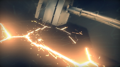
I liked some scenes. The hammer in the screenshot and the green thing in the beginning were great!
lasipallo
stop!...hammertime!
<3 es glitzert! awesome materials!
reflections \o/
The beginning was really nice, and I liked the hammer. The rest was mostly ugly, but those two + music saves is.
boom-boom-boom!
The demoscene equivalent of taking the most exquisite gourmet meal ever concocted by a Michelin-starred master chef, and deep-frying it in batter. I love it.
Keeping the style and progressing in presentation. Great!
Looks absolutely fantastic! Is that voronoi fracture and FFT post processing I'm spotting?
A lot of great ideas, but the overall composition didn't do it for me, sorry.
Someone can youtube ? i don't have nvidia
Xyl2k, yes, I have enough nvidia for all of us.
http://www.youtube.com/watch?v=tpOQ72ZzKXA
As for the prod, I like it, some nice graphics and the music was ok-ish.
http://www.youtube.com/watch?v=tpOQ72ZzKXA
As for the prod, I like it, some nice graphics and the music was ok-ish.
Forgot the thumb.
Jizzed in my pants.
Not enough oontz and strobo for a Stroboholics prod, but the improved versions of the shaders that you stole from Mercury are really beautiful and stunning.
"We have the technology."
"But we don't have the time, so let's just hammer it then."
This looks gorgeous (apart from the aliasing artifacts all over the place), so please take the time to make an actual killer prod next time. :)
"But we don't have the time, so let's just hammer it then."
This looks gorgeous (apart from the aliasing artifacts all over the place), so please take the time to make an actual killer prod next time. :)
pretty!
Needs more strobo
After a while of loading I got this: "The NVIDIA OpenGL driver lost connection with the display driver due to exceeding thr Windows Time-Out limit and is unable to continue."
I like it. :))
Love it! Nice bokeh and lens flares. Oh, and the hammer!
I like how the music starts of like something from Jan Hammer (irony) and evolves into something completely different.
Well done!
I like how the music starts of like something from Jan Hammer (irony) and evolves into something completely different.
Well done!
Super music, great pacing.
Ich mag nicht das Rumgestrobe
Fecking nice, great sync and blasting soundtrack, and actual size loading bar!
A really solid prod in every way. Music is nice and the visuals are downright awesome! Worked fantastically on the big screen. Great job!
great !
This thing is pure beauty. Not only it has stunning visuals but it also fits in 64k and run well, even on old hardware. Would give CDC if i had one.
strobo
Biiiiiig!
Is ja hammer!
Very nice - time well spent on the lighting!
(but seriously, just STOP using that rubbered sphere-object, please please..)
(but seriously, just STOP using that rubbered sphere-object, please please..)
Really!
Beautiful visuals.
Great viz and sync! :D
I really like how crystal shinny everything looks. Much better than what I expected when I read it's from Strobo :)
Setting TdrLevel to zero fixed that problem.
Nice visuals, nice beginning except the music, which very annoyed.
Nice visuals, nice beginning except the music, which very annoyed.
This didn't run for me, maybe I need new drivers for GL 4.3. Based on youtube:
Along with that Gloom said, I would also suggest that you tweak your use of bokeh. That shit is so 2011.
Apart from that, this is (of course) pretty great, so congrats on that! The skull model especially was quite something to behold. Wish I could have seen this on the big screen.
Along with that Gloom said, I would also suggest that you tweak your use of bokeh. That shit is so 2011.
Apart from that, this is (of course) pretty great, so congrats on that! The skull model especially was quite something to behold. Wish I could have seen this on the big screen.
What visy said, but with added props for the post-process.
surprisingly decent
not bad! the rendering is very nice, except those ugly random white pixels everywhere. The intro part is beautiful. It could have more interesting content though.
Well that was beautiful except the epilepsy inducing shiny shiney flashing.
Really nice colours and smoothing.
Really nice colours and smoothing.
Too good for stroboholics, not good enough for a "serious" release. Some of those scenes look very yummy though. Could have been (even) better. :)
Hell yeah, the post-pro \o/
hauptsache strobo.
hammer
shiny!
Thanks PotcFdk
Hammertime!
Ost-Nord-Ost-Ladebalken \o/
absolutely.
has it's moments. starts really great with shiny stuff but then ... i don't know. the fact that is is a 64k saves it from piggie ;)
Geiler Scheiß!
Cica!
Cica!!!
The visuals are simply beautiful, but this whole childish strobo stuff drags it down to almost-piggy levels. If the whole into was paced like the first 20 seconds, it would be a double thumb up.
Good quality sound, music is mostly uninteresting.
I couldn't enjoy the visuals because of the flashing.
What a waste of a perfectly fine gummybear effect.
Hahaha! IN YOU FACE!
To contrast the jaw-dropping shading (man, I'm sooo jealous...) and some evidence that you guys can design and have taste with tons of scenes that carefully lack both makes it quite interesting.
In that sense it almost reminds me of David O'Reilly's Octocat.
The only thing that's missing for me, was the glass the shatter.
Like the shading and flares + the music breakdown at the beginning.
Nice trash
not my taste but it's totally awesome
What a terrible noise... LIKE IT !
sucks hard. twice.
magnificent!
love it!
Hammer zeit!
Came for the music, stayed for the rocket-powered space dildo. Also nice bokeh.
What uncle-x said.
Great stuff, absolutely gorgeous shading and the post process work really paid off :D Tons of nice effects too.
rulez
OMFG! that intro kicked my ass so hard that it's still hurting now :D
Beautiful + kickass in one :)
spacedildo +1
That's energic!
ossum!
Technically cool, I found the content pretty meh though. And what Saga said about the music :)
First Omoholics prod i liked! :)
Absolutely stunning! Great rendering, nice ideas, music is awesome. I really enjoyed this trip!
viel zu viel content!!! :)
Strobo! Bass! zerficke von einem Objekt!
:-)
Strobo! Bass! zerficke von einem Objekt!
:-)
1) attach rockets to dildo
2) send into orbit
3) #1
2) send into orbit
3) #1
\o/
WIN!
I love the musicwise cheesy misleading in the beginning and how you tear it down + all the eyecandy things.
I love the musicwise cheesy misleading in the beginning and how you tear it down + all the eyecandy things.
Killer ;).
+ the hours of work here
+ scenes, materials, illumination, post-fx, gen-models (except from the rocket and skull?¿)
+ sinchro
- the unz unz unz score: repetitive, plain, basic melody. and i also like electronic music, but...
- the cheap white flash-flash-flash meme
+ scenes, materials, illumination, post-fx, gen-models (except from the rocket and skull?¿)
+ sinchro
- the unz unz unz score: repetitive, plain, basic melody. and i also like electronic music, but...
- the cheap white flash-flash-flash meme
Must be German intro - fucked up music with a bunch of technically impressive effects. Why oh why you've had to made it unhearable/unwatchable right after the first scene? Massive piggy for the effort.
crash at about 2/3 of the loading
Okay, worked the second time.
"Haha thought we made something good looking, well here's some random shit blurred to oblivion instead". And please put that kickdrum out of its misery, it's painful.
"Haha thought we made something good looking, well here's some random shit blurred to oblivion instead". And please put that kickdrum out of its misery, it's painful.
awful music.
i'm seconding ronny on the music, it's pretty nice! a few off-beat tricks, and dj bok bok would play it in his set. :) what i'm sick of are the endless-melody-jerkoffs in demo soundtracks, so i really prefer some rhythm instead.
I definitely hate the flickering bokeh particles. And I've seen one too many lasballs already. Apart from that it's a really good demo.
Very nice!
When I looked up from my place at Evoke and saw all those people behind las' screen flashing up and laughing I suspected we're in for something great. :)
Nice post rendering!
Nice even though I can't run it on my ancient Windows XP Pro. SP3 box, but I didn't like its music much though.
A bit, um, aggressive music, but I do love the postfx.
Nice visuals.
hotchpotch of stuff, but good stuff
What gargaj said, choose content over shaders
You had me with the dildo-rocket scene, but sadly the music blows. Also what's that you're trying to hide behind that blur?
Naw. Really. Too good anyway to not thumb it...
catchy.
!
RefractionMarcher + HypnoGlow 2.0 + X-traGlow + heavy muzak!
I thought this would get more "Raymarching is boring me"-comments ;)
But you made a nice Intro out of that! Thanks!
I thought this would get more "Raymarching is boring me"-comments ;)
But you made a nice Intro out of that! Thanks!
Herr Vorragend!
What a fucking good demo!!
Great stuff, but would have been even cooler if it worked on AMD as well.
that hammer almost smashed my face.
i really like this one. especially the graphics and how the music changes after the beginning. a pity that the rest of the music is a bit monotonous and slightly annoying. however, the hammer rocked the shit!
technically cool, but too much flashing and shaking and mostly uninspired scenes.
Absolutely gorgeous visuals, the music really rattles my brain though.
what oswald said..
I like this, it is polished even with the pretty fucked up track.
great light effects.
#101!
what ronny said
Not my cup, it's ok.
Beautiful.
Despite the strobo theme, you manage to not destroy you scenes with constant camera changes like seen in so many demos. I like that.
Despite the strobo theme, you manage to not destroy you scenes with constant camera changes like seen in so many demos. I like that.
This is a pleasant mix of "hauptsache strobo", "lazor", "gabberhammer" and mercury shader domination. Instant love! <3 Keep rewatching it, I wish it would run realtime on my ATI.
Screw ATI... rocks hard on my new GTX 760.
красный экран :( AMD ASUS R9 270x ( 13.12 ) :(
чёрный экран :( AMD ASUS R9 270x ( 14.12 ) :(
wow
Hard music, hard hitting hammers. <3
bam babam
wake up
it has rainbow clash vibes!
lists containing this prod
submit changes
if this prod is a fake, some info is false or the download link is broken,
do not post about it in the comments, it will get lost.
instead, click here !
