|
Fern by lkcc [web] & Bauknecht [web]
[nfo]
|
||||||||||||||||
|---|---|---|---|---|---|---|---|---|---|---|---|---|---|---|---|---|

|
|
|||||||||||||||
|
popularity : 69% |
|||||||||||||||
alltime top: #1930 |
||||||||||||||||
| added on the 2004-08-30 09:59:46 by pixtur |
||||||||||||||||
popularity helper
comments
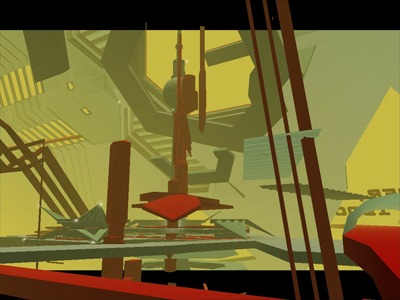
Neat prod.. The black border is a cool designtouch. Also it is very consistent all the way...
rulez added on the 2004-08-30 10:16:51 by loaderror 
Flyby, but it's a GOOD flyby :)
LAST KC COMPUTER CLUB
Wow, really nice flat shaded style. I liked the sync, the tune was good, and the design is great. Nice work!
nice, you could have used textures...
cool style! congratulations to this one
I like this one
pretty good stuff.
Okeyish.
the legendary LKCC is back!!! although the attempt to drum'n'bass was less satisfying, visually it was very cool.
very refreshing and especially nice to see pixtur/dr.lazy still doing things.
Nothing spectacular, but well made anyway. Nice music too. I don't really like that some objects are on the black borders though.
this one was nice
acually a nice flyby
Not afwul
Originality is good for demos.
I give it a piggy becouse it didn't draw my attention enough from the TV-serie I was watching at the same time ;)
Great design, soothing music...should have won the competition. The floating digit-letters were a nice touch...
The moral winner of the Evoke demo compo - at least the only demo with at least an attempt at design.
No seriously, this should have stood out more. Pity it seemed to be too subtle for the most ppl there (including me).
No seriously, this should have stood out more. Pity it seemed to be too subtle for the most ppl there (including me).
very nice!
definetely deserved to be in the top3.
Some great scenes ... complex, yet attractive ...
Just a flyby, but a very good one.
I think this prod is far better than a simple ok, but somehow i don't get the point...
nope... and the black borders look like a bug rather than style...
great 3D scenes, respect *double thumbs up*
After some more examination i rethink my previous vote... ;)
neat.
interesting scene, very stylish (especially the partial-render-to-border) and nice music
oh, and btw: invitros suck ;)
oh, and btw: invitros suck ;)
this could have been something. this could have been reeeeeealy something.
and it is:D
nice material but this shouldnt have been invitation, not an usual one at least. + muzik sounds like a dnb attempt but with these dibi-dibi beatz it lacks energy
teh thumb
cool stuff, laid back chill music
oki fly-by
ye let them have 'em
Wow. This was flat-shaded heaven. Although I do agree with spengler about the borders looking more like a bug than style. And the music wasn't good.
i like it
I like it very much!!
sooo nice - we need more of these!
oh! a little gem from this years evoke. :) a little slowmoving but pretty. a little buggy too (some z-buffer fighting here and there), but still - a good show.
I like it !
the color scheme is courageous, at last a flyby that doesnt suxxx!
A very good job.
the color scheme is courageous, at last a flyby that doesnt suxxx!
A very good job.
is ok
like like like like it
nice nice
my favourite demo from evoke04
ok invtro - nice modelling
Good job.
"C-Base" the BSM2004 location was real cool.
What about another BSM in 2006? :)
"C-Base" the BSM2004 location was real cool.
What about another BSM in 2006? :)
k++
LKCC, i love you.
Superklasse :)
design!
nice
Super cool visuals and the music rules too. Thank you! :)
And I forget the thumb yet again....
i like the strange effect on top and bottom border
nice attitude, style/design and track ..
my words!
Lovely design!
Really.
One of the best flat shaded demos...
Really.
One of the best flat shaded demos...
This wants a thumb.
it`s just flyby
considering this year's (2007 that is) invitations, this is just pure gold! loved it at evoke back then, still love it today!
Very nice invitation. I don't like the colors very much, though.
very cool! one building, one effect: that's a interesting concept... the transitions between the effects/scenes are given through the location. every transition is just a movement in one global space, every element of the building could be animated and processed literally on the fly, especially if the whole geometry would have been procedurally generated... 3d sound would be possible as well, attached sound sources to moving objects or rooms... this is more than just a flyby!
yea, and i like the simple visual style! the scene isn't perfectly polished, it's just right. looks like a huge city or a micro machine under construction...
yea, and i like the simple visual style! the scene isn't perfectly polished, it's just right. looks like a huge city or a micro machine under construction...
Wut, no thumb?
This is still my favourite ivitation ever. The flatshaded hires-look is just awesome. Music is great, too. I really don't know why this placed fourth behind three much weaker entries...
This is still my favourite ivitation ever. The flatshaded hires-look is just awesome. Music is great, too. I really don't know why this placed fourth behind three much weaker entries...
Sad, but it's too dull.
Nice and laidback
nice
Ferner 1.0 :>
amazing all around! i literally can't find a single fault in this...
Genial.
cool
i like
Excellent music and great minimalistic style.
Impressive. Amazed to see it's nearly 20 years old.
lists containing this prod
submit changes
if this prod is a fake, some info is false or the download link is broken,
do not post about it in the comments, it will get lost.
instead, click here !
