|
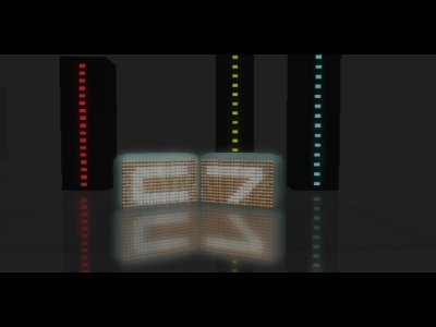
dark light pattern by Cubalid7 [web] & Black Maiden [web]
[nfo]
|
||||||||||||||
|---|---|---|---|---|---|---|---|---|---|---|---|---|---|---|

|
|
|||||||||||||
|
popularity : 70% |
|||||||||||||
alltime top: #2725 |
|
|||||||||||||
|
||||||||||||||
| added on the 2004-12-29 12:42:45 by Gargaj |
||||||||||||||
popularity helper
comments
ey dip, fucking great track there!!!
rulez added on the 2004-12-29 12:43:57 by Gargaj 
I thought it was rather horrid. :)
very cool tune :) and nice sync :)
Yeaaah!
Some nice sync and nice touches, but too random, chaotic and nothing new to see.
dl_good();
Visuals were sometimes cool, and then fugly (those negative-like flashes sucked big time). Music and synchro were ok... a piggie then.
great music. dull and not very pretty visuals.
okayish music and some good scenes, but not particularly interesting
some nice scenes in some places, needs abit more complex 3d objects and animations to make an impact though.
Some nice scenes and syncs. The music is nice for initro-music, but qute horrible otherwise.
Started in a rather promising way, but couldn't maintain it.
I also feel some of the parts could have a more accurate sync.
Not my taste is all i can say.
I also feel some of the parts could have a more accurate sync.
Not my taste is all i can say.
good TUM's 64k
Cool Stuff! Very stylish in the beginning, a little bit lame in the ending, tho.
waste of time, space and bandwidth
that light thingie on screenshot was okish... rest quite poor
this rocked the partyplace.... :)
Scenes just thrown together. Some of them are nice, but still..
Expected a bit more from the starting point, but it ruled a lot (even if it crashed in the first execution at the videowall)
good beginning, nice orange colors...
but than, it got back to the ms-dos style, just in hires and hi-color... the blue tunel was horrible...
and the "m0uschnblÖr" wasnt calculated correctly... like, there wasnt interpolation betweeen the last and new frame... just calcs for the new ?
ill give it a suck... its 2005, nearly...
and the music was horrible...
nice ingredients, but I somehow miss the recipe.
the music was not horrible at all. and it had a nice atmosphere and at least one very very very good looking scene. It's up.
second dominei
that was really the best 64k on tum 04!! :)
greats to C7 and BM
greats to C7 and BM
nice one.
however, my machine was crushed by the last scene.
however, my machine was crushed by the last scene.
Some cool parts, some ugly crap.. All in all so very average.
scenes are not too well connected to each others but there are some seriously sweet stuff and nice tune
geil
enjoyable
a well deserved winner :)
Made a nosedive into Uglytown after the first part. What the *hell* were they smoking when they made that "blurred" thing with a ring of blue ugly around it?
I pity the soundtrack for being in this horrible mess. It wasn't that bad :(
I pity the soundtrack for being in this horrible mess. It wasn't that bad :(
Thoroughly enjoyable, and a fine 64k.
pretty average intro. some very cool ideas by destroyed by poor execution in several places. the music was pretty bad too. not a down-thumb though.
cool one.
not 100% consistant design, but nevertheless a big thumb up!
not 100% consistant design, but nevertheless a big thumb up!
nice product, love the sync of the music and the drum n bass track! keep it rocking guys
quite nice, but not something i'd watch more than once
the very beginning is neat with a cool atmosphere, although the music gradually gets worse as does the entire intro. it`s old fashioned with little design. although I do agree the sync is good! (must add it was a good style of music)
Pretty standard effects, but nice flow and the music by Afromies/Jumalauta (or something) is quite cool.
Hm much better than that crap "pageturner" BM 64kintro...design is good, but music suxx cock...that voice is awfull...learn from Farbrausch and from AND.
so piggie...
so piggie...
crap
dipswitch fuck you too, you vulgar brat, and btw improve your musical skills, and thi is not only my opinion, look at other posts....
no you dont understand, you can learn how to make a voice in a 64K intro like ones in FR (Candytron) and from AND (Zoom3). Nothing more....I mean, that this your intro has imho poor ordinary music, but very crappy voices within...
and stop the flame, i don´t have time to flame out with some "ghettoglopper" like you....
why the fuck should ALL soundtrack have speech, Canonlamer?
Cool production, only the speech in between didn't really hit the spot.
nice to see how cubalid 7 are going their way. Please go on :)
dipswitch ahs really improved at music department too.. remember "vittu perkele" ;D i wish i could track dnb.. anyway nice prod.
So-so, gave thumb up because I could not find a reason not to.
But what is up with that bad resolution? Wake up! Nobody is using 15" CRTs anymore.
But what is up with that bad resolution? Wake up! Nobody is using 15" CRTs anymore.
Cool scenes and colors
Cool effects, cool music!
+ for the music
- for the rest, motion blur and ripple filters came straight from ugly town.
- for the rest, motion blur and ripple filters came straight from ugly town.
Some good, some bad. Average.
prematurely esc'ed due to heavy bugging on my setup (p4 3.2/gf fx5700/det 6177)
well, soso
the music rules but the rest is just the same old stupid boring flowers/abstract stuff
the music rules but the rest is just the same old stupid boring flowers/abstract stuff
nice greetings part.
otherwise nothing really new here.
but hey a demo doesn't have to re-invent the wheel to be good.
otherwise nothing really new here.
but hey a demo doesn't have to re-invent the wheel to be good.
Pretty nice stuff. Maybe a bit too blurry in some spots.
ok
I like this one smashing the PC.
nice
good music and some nice effects.
Good synchronisation and style.
tfu ;/
thumbs up
fuck
fuck
thumbs up
fuck
fuck
Very nice track, a nice model and two nice textures.
it's a good idea but waay too segmented visual style (a bit like watching all modes on a VCR except 'play' button).. not a keeper.
Some nice bits, but too incoherent. The main part of the soundtrack does not follow up the moody and dark intro, and the progression of the visuals lack logic. I do however like the artificially polished look of most scenes :)
great track
nice one
very nice one
Some nice effects in there bit weak towards the end. Overall , I liked it.
Cool soundtrack!
Great.
piggy..... bueehhhh
DIPSWITCH DIPSWITCH DIPSWITCH DIPSWITCH DIPSWITCH DIPSWITCH DIPSWITCH DIPSWITCH DIPSWITCH DIPSWITCH DIPSWITCH DIPSWITCH DIPSWITCH DIPSWITCH DIPSWITCH DIPSWITCH DIPSWITCH DIPSWITCH DIPSWITCH DIPSWITCH DIPSWITCH DIPSWITCH DIPSWITCH DIPSWITCH
+ several fantastic scenes + speech
Fuck yeah!
+ several fantastic scenes + speech
Fuck yeah!
evil!
I dunno if this one plays correctly anymore, half the instruments sounded missing.
Some sceness look really nice but some just don't cut it for me. Mixed bag.
like it
lists containing this prod
submit changes
if this prod is a fake, some info is false or the download link is broken,
do not post about it in the comments, it will get lost.
instead, click here !
