|
Focused by Gaspode
[nfo]
|
||||||||||||||
|---|---|---|---|---|---|---|---|---|---|---|---|---|---|---|

|
|
|||||||||||||
|
popularity : 66% |
|||||||||||||
alltime top: #2843 |
|
|||||||||||||
|
||||||||||||||
| added on the 2023-07-30 17:19:26 by gaspode |
||||||||||||||
popularity helper
comments
Easily the winner for me. Just amazing overall. Go in, do something, come out, the end. Do it all in style. Great.
rulez added on the 2023-07-30 17:32:03 by leGend 
Yep
My favourite in the compo. Pixel perfect transitions, visuals working together with the soundtrack just flawlessly.
fantastic gaspode.. my favourite of the PC compo ! <3
clean syncs and aesthetic
My favourite from the compo, should have won.
Such a whole and pure delight!
And you can't stop watching until the end... Thumb up!
And you can't stop watching until the end... Thumb up!
Great perspective tricks <3
This demo is very aesthetic. I like it very much.
nice and stylish PC demo
Some neat ideas packaged in a clean simple design, certainly the most interesting demo at Evoke.
great flow, transitions, fun, syncs, style! my favorite
Delightful design, a supple flow and nice music to match.
nicely executed concept
Incredibly slick and brilliant ideas. Never disappoints !
Lovely
Works for everybody.
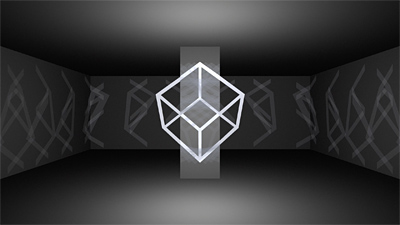
I don't know. It's very clean and very focused, but save the (excellent) scene from the screenshot, it feels more like a Wikipedia article of perspective tricks rather than something that uses that concept as a starting point that does something interesting with it. (Superliminal had the same problem tbh.)
The cube scene was a lot more like it, but then just as I was getting ready for the big wave of cool interesting content it ended :(
Like, make no mistake, it's still cool, but it was also 80% predictable.
The cube scene was a lot more like it, but then just as I was getting ready for the big wave of cool interesting content it ended :(
Like, make no mistake, it's still cool, but it was also 80% predictable.
C³ - concept, creative, cool
I love how focused this is. Typical Gaspode.
thumbs up for the soundtrack.
I liked this a lot but I have to second gargaj, the majority of the effects were too predictable for my taste.
stylish
Excellent design and flow. Good stuff.
Yes!
Really cool, great job
neatly done
Good work on the sync
great prod.
Gargaj has a point: up to the quote it felt like a big intro and I was hungry for more after the cube :D.
Gargaj has a point: up to the quote it felt like a big intro and I was hungry for more after the cube :D.
Incredible! But how did he do those shadows? 🤔
But seriously: watching that made my day.
But seriously: watching that made my day.
Really cool prod that leaves you thirsty for more.
I liked the concept so much and the animations and the sound track are totally on point!
quite nice!
Es ist sehr gut.
Basically what Gargaj said.
Smooth and clean and different from many other scene productions. Great stuff!
the design directions are very well executed in this one! Although simple, yet impressive. Less is more!
cool vectorz + music
Clean design, but would have loved some more!
take the thumbs.
Amazing clever design! Very fun to watch throughout. Goes to show that you don't need much in terms of visual candy if your execution of ideas and design is otherwise polished.
gargaj+1
Neat design and a lot of ideas.
And an (admittedly simple) quote from P K.dick.
what more could you ask for?
And an (admittedly simple) quote from P K.dick.
what more could you ask for?
that was friggin sick
Absolutely wonderful!
well, wehat gargaj said but its really well done!
I absolutely love this! Clean, clever, crisp! Gets the message across and a lovely tune! WTG gaspode!!
Wonderful. But I just join Gargat on this one about "when I was just getting ready for the big wave of "cooler" interesting content it ended.
quite nice, especially the music.
Short and engaging. Not everything has to be epic..
Nice
So awesome, congrats!
OK.
Nice flow, idea and music. A minor quibble; some more resolution in some of the shadow maps (?) and some of the splines (in particular the initial O) would have removed some annoynances.
The initial music reminded me of something else about forced perspective, but I don't know exactly what. I thought it might be Echochrome (a PS3 game featuring that), but it seems it's entirely different.
The initial music reminded me of something else about forced perspective, but I don't know exactly what. I thought it might be Echochrome (a PS3 game featuring that), but it seems it's entirely different.
This is awesome! So clean! So fresh! Unpredictable and exciting to watch. Never boring or repetitive.
nice!
wow. very neatly aligned geometry & projections. matching O's in the last scene were cherry on top!
Very stylish one! I especially like the soundtrack
Great transitions and sync, coherent style, good pacing, fresh ideas. Visually it's a bit more basic, one could say focussed ;)
lists containing this prod
submit changes
if this prod is a fake, some info is false or the download link is broken,
do not post about it in the comments, it will get lost.
instead, click here !
