|
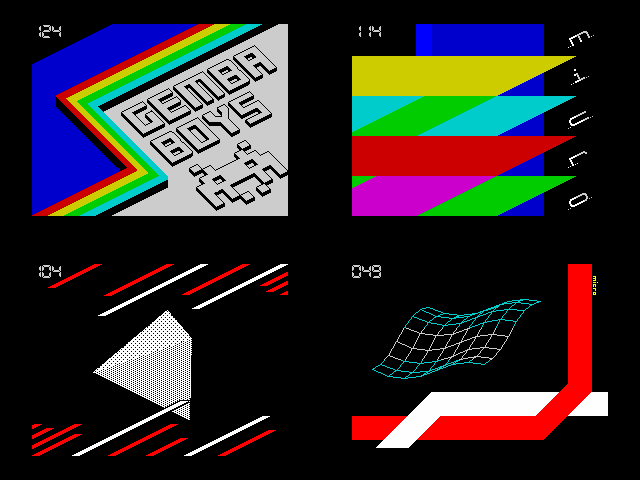
Micro by Gemba Boys
[nfo]
|
||||||||||||||
|---|---|---|---|---|---|---|---|---|---|---|---|---|---|---|

|
|
|||||||||||||
|
popularity : 65% |
|||||||||||||
alltime top: #3743 |
||||||||||||||
|
||||||||||||||
| added on the 2014-03-18 15:17:50 by diver |
||||||||||||||
popularity helper
comments
awesome design. i'm speachless.
rulez added on the 2014-03-18 15:18:27 by diver 
Very well-designed. I love it.
Very nice design - rarely seen on zx platform. Good soundtrack as well and pretty decent code.
bit boring 3d-part - but design is excellent!!!
probably the freshest, nicest design on speccy ever, however the effects are missing :(
Okish due to 3D shapes with incorrect perspective.
ouch
Wow, cool speccy demo, some pixel res vectors again, yeyyy!!!
great tune, nice design. really neat prod :)
Great!
Loved the design in this one a lot! No annoying/overly long parts either. Should've been first. =)
Also, the best Gemba's demo in all those years.
Also, the best Gemba's demo in all those years.
brilliant! like the design, like the vectors, like the music! thumb up!
Nice show and good music. Not having perspective correction in the 3D parts was a bit annoying though :)
.nice one
very nice design! fine 3d effect! Rulez!
Great effects, design and music. Fast paced and fresh
Excellent direction and pacing. Wish it lasted a power of 2 longer!
Brilliant design, music and graphics in ideal proportions. I love this demo!
few effects are very similar, like in the "We are alive!", but I like design and tune.
So nice!
Great job. Well made transitions from part to part. The grand style. Interestingly line made over cubes - "mask" 1 - the place!
Almost perfect demo, design is brilliant. Only the "no perspective" is a fault.
Was expecting more ZX drama (c) on this thread though! ;p
Was expecting more ZX drama (c) on this thread though! ;p
i can't explain why this came only 2nd.
well, actually, i can. but i won't.
should have won in any aspects. best design on zx since aeon.
well, actually, i can. but i won't.
should have won in any aspects. best design on zx since aeon.
Excellent design and solid flow. I think much better than 1st place.
Great demo!
Great demo!
Solid!
It's good to see such attention to design/presentation on ZX.
The 3D parts were really neat. The orthogonal projection makes me think it uses a custom charset to draw the shapes but I'm not sure if that's possible on ZX :p
It's good to see such attention to design/presentation on ZX.
The 3D parts were really neat. The orthogonal projection makes me think it uses a custom charset to draw the shapes but I'm not sure if that's possible on ZX :p
As many people said before, it has a magnificent design. 3D objects are beautiful (I especially like the "waving net") and it holds together perfectly (in contrast to the winning demo which does not hold together at all!).
Not being a ZX connaisseur, can not tell whether it is properly, well coded. But one must admit clearly - the filled vectors are gorgeous!
I found the the design particular and original, altou a little bit too "square'ish", imho.
Nice music too, moody and perfectly matching the show.
The only thing which disturbed me a li'l was a countdown couter, which is eternally ;) connected to Mad Elks' "Technological Death" Amiga trackmo =).
Great work. Thank you fellow for your effort. I hope to see, one more time, something interesting in the future from you.
This demo is simply great, for me the best on Forever 2014 in all platforms together. Gemba!
Finally the zx spectrum is catching up to the C64 on the design side. Loved the music too.
Kewl. Smart use of the color limitations in some parts.
Great music, well designed, just very nice!
A huge THANK YOU for releasing trdos fix! :)
Nice 3d-objects ;)
Great demo, great design and good music. Please more similar demos on the ZX
Simply beautiful. Fantastic design along the limits of an attribute memory based machine.
cool design and fast 3D for a Spectrum.
Decent. :)
yes. very nice!
nice one!
Nice, and great music!
Design is a rare thing on Speccy nowadays.
Nice!
pretty decent
Very nice looking prod, and great vector routine.
As some others have pointed out, the lack of perspective correction does look bad, a tip is to stay away from things like cubes as it is very obvious then, while for example the other regular polyhedra (tetrahedron, octahedron etc.) tend to look quite OK.
As some others have pointed out, the lack of perspective correction does look bad, a tip is to stay away from things like cubes as it is very obvious then, while for example the other regular polyhedra (tetrahedron, octahedron etc.) tend to look quite OK.
Dopé!
design!
snappy filled vectors and nice overlay gfx
yep
Short, but so sweet - another Gemba instant classic. + another great tune by Aki.
Church of cube approves, specially if they are flatshaded! Great mellow tune to enjoy the objects with!
lovely
submit changes
if this prod is a fake, some info is false or the download link is broken,
do not post about it in the comments, it will get lost.
instead, click here !
