|
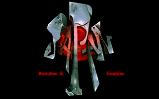
JAPAN beauties and troubles by Blabla [web] & Sector One [web] & Cocoon [web]
[nfo]
|
||||||||||||||
|---|---|---|---|---|---|---|---|---|---|---|---|---|---|---|

|
|
|||||||||||||
|
popularity : 69% |
|||||||||||||
alltime top: #1774 |
||||||||||||||
|
||||||||||||||
| added on the 2012-07-01 18:34:15 by hedning |
||||||||||||||
popularity helper
comments
Great graphics, even better soundtrack and sort of a follow-up (and improvement) to the Street Art demo. Great stuff!
rulez added on the 2012-07-01 18:44:00 by evil 
Cool!!
nice
Although it loses the first time brain exploding impact of Street Art, still lovely to see highcolor ST effects. Perhaps a little less impact then before, code-wise, but gains back on the theme and visuals.
Very nice.
Cool effects.
just superb!!!!!!!!!!!!!!!!!
this multicolor mode rox!!!!!!!!
this multicolor mode rox!!!!!!!!
Great great great great great great great STUFF.
Strange design, cool music, interesting blurs/glows.
Demo is absolutely not my cup of tea and looks way too messed up most of the time (so why beat this on Amiga? :D). However, DMA-SC's music is utterly fantastic! And the logos are cool too so the thumb goes up anyway. Mainly for the brilliant music though!
By the way, I've just tested it on Atari 520ST 4Mb - it works perfectly.
weird theme and horrible haikus, but it had some good scenes and pixel graphics in there.
more hicolour the better! nice to see a refinement! look forward to more developments! perhaps come classic fx done with this technique? I am thinking 3D balls!
interesting theme, really nice gfx and music :)
Regarding the music: what Stingray said. Maybe it was a long time since I heard a DMA-SC tune, but it was absolutely delightful!
The demo seems more fluent and coherent than street art so that's a good thing as well. The syncs and flashes worked really well on the big screen.
Enjoyed it!
The demo seems more fluent and coherent than street art so that's a good thing as well. The syncs and flashes worked really well on the big screen.
Enjoyed it!
neat
Fuck yes!
what Frost said.
really nice gfx i msx !
Great stuff! Please share the music.
Great one.
Superb and colorfull! :)
Also nice to see some people don't forget what happened one year ago!
Also nice to see some people don't forget what happened one year ago!
Impressive graphics, and some out standing logos. I don't dig the message though, and the Standford dragon was completely out of place.
P.S.: the city in the earthquake image is not Hiroshima but Yokohama, as seen from the top of the Landmark Tower. :p
P.S.: the city in the earthquake image is not Hiroshima but Yokohama, as seen from the top of the Landmark Tower. :p
Nice gfx and music
Ace music and quite stunning hicolor effects.
some good looking techniques in this one! cool demo
Nice show. Great Music by D M A - SC :)
 gfx
gfx music
musicAwesome prod!
Nice colours :D
Colours, colours and more colours. Extremely impressive stuff effect-, code-, graphics- and sound-wise.
Nice stuff. Love the logos.
quite nice for..
last effect is my fave
this shivers my spinal-cord. sound <3 visuals <3 japanese girls <3<3
Great!
Nice!
nice!
Almost exactly what Stingray said except that i didnt find dma sc's tune SO extraordinary. It is a very good tune but man.. some of the older ones by him are so damn best that maybe my bar for him is set too high :)
impressive stuff
I think I will never come at peace with the noisy/dirty aspect of Spectrum images.
However this prod is nothing short of great!
I'd like to see you guys try to stick to one palette per scanline, a bit like what Dune does/did recently. Yes, you'd get less colors in total but the effects and images would be super clean: Bye bye ugly Spectrum smudge and noise. Hello razor sharp details.
Nice colorfull demo on Atari STE and very cool colaboration, more graphisms and then more colors ;)
...but the funny thing is, it worx normally on a regular ST. ;)
Awesome! :D
Some nice refraction and normal map type effects. I like the music but not the use of photos or the scene poetry. The rolling fades on the photos were cool, though.
There were too many colours.
There were too many colours.
great logos!
Beautiful color effects ! Original prods ! Many truth in it also ! Good work guys !
excellent! p01 points out, where the "new" limitations of the machine can be pushed!
awesome!
i like this!
Nice effects, nice music, nice pace.
Decent.
great music, nice prod.
I don't think the ham-fisted poetry/story was really needed, as the effects are good enough to stand on their own. Really good work with the blur and bump (?) routines, it's really cool to see that on a ST :)
You should use the blur technique to make a camera focus change effect in the next demo.
I wish the transitions could be more subtle and on some pictures the "dirty" look due to the limitations of the Spectrum technique is a bit too strong, but that's minor. Good work!
You should use the blur technique to make a camera focus change effect in the next demo.
I wish the transitions could be more subtle and on some pictures the "dirty" look due to the limitations of the Spectrum technique is a bit too strong, but that's minor. Good work!
tune and logos
Quote:
Wondering what this technic would looks on Amiga with the 32 colors and the copper improvements...
I'm wondering what an STE could do with this technique :-)
What! only third? Dead-heat with DHS for me! :)
The graphs are very beautiful and some effects are truly amazing !
The hicolor is very refreshing!
The graphs are very beautiful and some effects are truly amazing !
The hicolor is very refreshing!
Hicolor on ST!
A way better than those flickering and static Spectrum pictures.
(so bad there are black pixels spoiling the pictures on my STE and Mega STE, maybe due to STE hardware - the video on DHS web site is so clean)
A way better than those flickering and static Spectrum pictures.
(so bad there are black pixels spoiling the pictures on my STE and Mega STE, maybe due to STE hardware - the video on DHS web site is so clean)
SUGOI DESU
Every good raster split deverves a thumb.
Another prod with wow factor with a great forward pushing soundtrack. The demo feels a bit generic after the first demo though (not so many obvious "effects"), however, these graphics on ST - my goodness!
cool effects.
What vectory said.
The code is great but design and graphics look ugly to me. Nice music though.
solid.
yes!
Quite impressive, isn't it?
A jaw dropper. I love this and now WANT to see much more :-)
Great work!
""I'm wondering what an STE could do with this technique :-)""
@CiH Yeah I have to agree!
@CiH Yeah I have to agree!
Great music and nice design imho.
A beautiful demo and so unique in styles too.
https://www.youtube.com/watch?v=i47RMKv7gQU
https://www.youtube.com/watch?v=i47RMKv7gQU
Nice.
Forgot the thumb !
Great code, otherwise ugly as fuck.
Great prelude to what more there is to come!
Nice!
yes
submit changes
if this prod is a fake, some info is false or the download link is broken,
do not post about it in the comments, it will get lost.
instead, click here !
