|
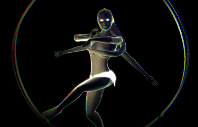
Traversing The Unknown by Inque [web]
[nfo]
|
||||||||||||||
|---|---|---|---|---|---|---|---|---|---|---|---|---|---|---|

|
|
|||||||||||||
|
popularity : 64% |
|||||||||||||
alltime top: #5719 |
|
|||||||||||||
|
||||||||||||||
| added on the 2011-08-14 15:17:29 by glow |
||||||||||||||
popularity helper
comments
If it aint dutch it aint much :)
Better than the 1st place.
nice little trip there. perhaps a bit too brutal kick, but the track is good :)
All a bit too obvious. Expected more from these guys.
nothing shocking really, solid execution though.
Expected more from these guys
Best intro in compo, final 3d-model - great!
Aaah thnx a million for that mate, and now go get some wel deserved sleep! ;)
Not the strongest Inque release, but congrats on getting it done in time. Should've won the compo.
Seem to be a bit rushed to me :/
Quote:
perhaps a bit too brutal kick
Kicks can never be too brutal. I say more distortion, more noise! :p
Nice prod, feels a bit black here and there but I love the model and the tunnel before it. Thanks for the greets as well!
Not exactly blown away, but solid. The music was surprisingly well done.
Most of the visuals were too slow for the music. Nice mesh tho.
"ohh see we still have 40k of free space - let's but this static model..."
Didn't run on my laptop, but the video was enough to thumb up!
Thanks anni for those very high quality rips you put on youtube!
Thanks anni for those very high quality rips you put on youtube!
for the goa and medusa
Nice one!
i was waiting for some percussion to kick in, but it didn't come. rest is great, though!
Should have won.
Ok+
<insert_maali_comment_here>
Deserve a higher place.
Only first tunnel part looks boring.
Only first tunnel part looks boring.
It does look good, but the whole thing is so darn boring.
=<
Looked a bit like something was missing. Very simple ribbonlike stuff with RGBish glow. I thought maybe my PC but no. The statue and the music brought this up.
nice!
Didn't particularly like it to be honest, but it's worth a thumb.
Ok-ish.
The minimalistic shapes on black background look nice and the mesh is clean.
The minimalistic shapes on black background look nice and the mesh is clean.
My personal winner of the 64k compo.
Wow, now some prod there, the cellular twisted tunnel scene among a lot of other things finally closing to that mighty and ohh so beautiful 64k goddess. The stuff that's
quite fucking hard to generate from scratch(even if it has some 10-20k prestored data
in it it's impressive)
...years of hardwork + experience in harnessing impossibility is
the only way and you mad guys have it. 64k bytebudget well-spent.
quite fucking hard to generate from scratch(even if it has some 10-20k prestored data
in it it's impressive)
...years of hardwork + experience in harnessing impossibility is
the only way and you mad guys have it. 64k bytebudget well-spent.
tunnel scene is much better in the final than in the party version.
greetz part was nice. no words found for the model ;)
that alpha blending AA or what it was.. did not look really good imo.
well it glitched good enough for a thumb :)
greetz part was nice. no words found for the model ;)
that alpha blending AA or what it was.. did not look really good imo.
well it glitched good enough for a thumb :)
Not bad
Pumping music and slow-moving (though nice) effects isn't a winning combination. The model looks really great though.
good use of the synth, the mesh looks nice, the rest feels a bit empty.
liked the music. visuals were somewhat ugly.
What chock said.
Its all black in XP ?
thumb up for a partyproding with cool result
Nice one.
no sound here. apart from that most of the above...
ok
submit changes
if this prod is a fake, some info is false or the download link is broken,
do not post about it in the comments, it will get lost.
instead, click here !

Big thanks to pandur for waiting for us with the compo.