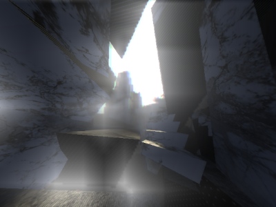
|
콘크 리트 맘 by Limp Ninja [web]
[nfo]
|
||||||||||||||
|---|---|---|---|---|---|---|---|---|---|---|---|---|---|---|

|
|
|||||||||||||
|
popularity : 66% |
|||||||||||||
alltime top: #3473 |
|
|||||||||||||
| added on the 2010-08-22 13:51:46 by Shifter |
||||||||||||||
popularity helper
comments
Next time please write your demo name in a language people can read.
Other than that, the demo was quite nice.
Other than that, the demo was quite nice.
Nice visuals, music was a bit dull though...
dark. moody. more content than the meat-thing.
not my cup but prest prod of the compo imho
not my cup but prest prod of the compo imho
each part was quite nice and fitted the music, however it all felt "thrown together".
btw. press SPACE for hidden part in demo :)
btw. press SPACE for hidden part in demo :)
should've won
I quite like it. The aliasing is a bit crappy but that could just be my screen resizing things.
There are some blocky glitches in the post processing, and shadows seem to flicker every where.
interesting, even more with the editor hud on :)
yes, editor is more fun than the demo itself :D
dUIM oP
Quite nice.
great! liking the edit mode too... should have won, indeed.
cool. not bad for the target platform.
nice visuals and always nice to see someone try to play in new limits, didn't like the music though.
compo winner for me. kinda reminds me chimera by halcyon.
Hmm. Last piece with the names was nice (in the sense that before all was dark stuff flying around and through eachother, and the credits part in contrast had colour and, well, non-abstract 3D. I would've liked more contrasting stuff like that; the whole seemed kind of aimless and dragged on and on now.
add closing ) somewhere in that comment
Honestly I have to say that I don't understand that noise stuff, but this one really had some atmospheric scenes and catch my attention till the end!
Nice, it runs on my outdated PC.
Thumb up for the editor.
Thumb up for the editor.
i love it!
Quote:
Nice, it runs on my outdated PC.
It's optimized for netbooks, so yeah.. :)
Should've won!
Quite nice...and one of the most entertaining infofiles I've read in recent years. :-)
great demo! i really like this style - and the ending: AWESOME :)
!!! <3 !!!
Uninspired, dull...the shading technique doesnt save it.
Partially interesting, partially just ugly. In particular, the shadows… is that calculation done per-vertex or something?
This was actually quite neat!
Looked great on the bigscreen. Very good work!
experimental. i have to rewatch it tonight, when it's dark and i'm in the mood. but here's what i can say already: i like the concept of explosions (?) running backwards and the fact that it runs flawlessly on my ancient laptop
thumb for the ninjaz !
what nula said.
Split Concrete Heart alles klar!
looks pretty good. But I think I'd rather do without the shadows than that nasty popping ;)
Somehow I didn't really like it at the party. But now after watching it again and playing arround with the debug console, it's a great demo.
Sorry, so boring for me.
I got editor. Fun stuff.
pretty COOL ambience! the music...well, meh.
+ long
+ stylish
+ a few typography-like textures
+ ambient soundtrack
+ stylish
+ a few typography-like textures
+ ambient soundtrack
+ low system requirements
kinda empty but i like the style
nice
i can move in teh demo
I didn't realize "optimized for netbooks" means "looks like ass with a bunch of rendering artefacts".
Still, nice to see Dutch demos at all, I suppose!
Still, nice to see Dutch demos at all, I suppose!
Well, I suppose there are plenty of techniques that were used in '2000'-era demos that should still work okay now? (Looking at Kasparov, for instance).
I have to admit I never really 'get' noise demos anyway, except that recent ASD one (which is so clean it's probably why I got it in the first place).
Feel free to do something more commercial next time :)
I have to admit I never really 'get' noise demos anyway, except that recent ASD one (which is so clean it's probably why I got it in the first place).
Feel free to do something more commercial next time :)
ups for the lj's
Limpya-Ninjisky !
Go ninjas!
hm
... !
I like the build in demo-tool. It's even stranger than our Tooll. I guess Navis would love it. ;-)
Both the demo and the editor are a bit on the weird side, which i just happen to like! :D
nice!
림프닌자~!
crap
Reminds me of sad winter nights.
¿
why 콘크 리트 맘 instead of 콘크리트 암?
nice
submit changes
if this prod is a fake, some info is false or the download link is broken,
do not post about it in the comments, it will get lost.
instead, click here !
