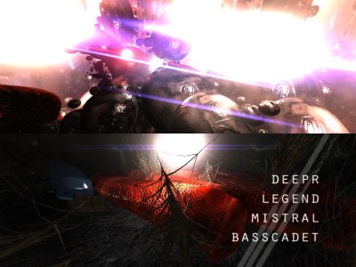
|
Devour by Adapt [web]
[nfo]
|
||||||||||||||
|---|---|---|---|---|---|---|---|---|---|---|---|---|---|---|

|
|
|||||||||||||
|
popularity : 66% |
|||||||||||||
alltime top: #6920 |
|
|||||||||||||
| added on the 2009-08-08 22:22:58 by deepr |
||||||||||||||
popularity helper
comments
Flashy visuals.
rulez added on the 2009-08-08 22:26:24 by Optimus 
Visuals/design is a total mess and all those flares flashing constantly on the screen were quite annoying really. Music was quite good so piggy it is.
It looked like it was trying to be an ASD demo, but was way too cluttered and messy with polygons folding and flying everywhere.
Good music though.
Good music though.
Music was fascinating but didn't care for the rest that much, too messy, not too bad though..
Didn't work for me...piggy
Design is non-existent and visuals aren't that great either. Has a few parts I like (like the greetings part) but other than that it's rather boring. Also runs quite slow here. Weak pigface.
Love the flares!
Solid from Adapt again.
Very messy. Nice music though.
I don't think this is the right direction
Seems like the design have been put in a mixmaster.
it is like some kind of a dream...
The special Adapt thing again.
ok. a bit too flashy
Generic lots-of-things-moving-around-looking-nice demo.
very very weird!! XD
Yep, the messiness and questionable design. Piggie.
i appreciate the skills but this is weak
Best Adapt demo so far, for me. Outstanding visuals, nice music, loads of great effects, but really weird design.
Great looking scenes slapped together into a way too incoherent presentation. Great soundtrack though.
unlike masterm, the only thing i really liked was the lens/distortion effects.
Pure shit!
Hmm, not so bad ... but a bit strange - and a bit slow on my Radeon 4850 ?!
nah.
Whenever there's a new Adapt demo I always try to make myself like it, but never seem to be able to. :-(
Overcomplicated at times. Overall OK.
The usual adapt mess, now with mass effect/star trek lens flares. Music's pretty good again.
Adapt demos are better and better as time passes. I like colours and great music. Keep it up !
Aouch, "too much" kills the demo !
this was the biggest mess i've ever seen, but i'm pretty sure it was intended so it's ok
I don't really get the hostility here. This was way more coherent and stylish than all the ASD rip-off crap in the compo. Some of the visuals here were even fresh and cool (haven't seen that sweet flares in a long while).
Balance is better but this is really good!
hmmmm...
Meh
plz drop the gloss!
and the flares as well!
they really ruined the demo for me :(
and the flares as well!
they really ruined the demo for me :(
Again improvement over the last one.
Its funny how some people say it is too ASD-alike...
In the 90' you saw a lot of Orange/Melon-style in demos that gave groups a base to build their own style.
I think nowadays ASD is the new "base-style".
Noby was complaining to me about Within Epsilon trying to be too ASD but this year you saw a lot orginal style from pyrotech even trough it might remind you a bit from last years pyrotech prod.
Adapt has been always good at effects(MOAR COOL EFFECTS PLS!)but style haven't been that good, I think they can build up a better style in their next prod cause I think they learned something from this demo, a bit like pyrotech did.
C'mon! Don't you think that this demo have a lot of good effects and (IMO) fancy cameramovement(similar to "Balance" demo).
I liked it and imo it should've placed a lot higher. I don't actually think it tries to be ASD alike. It doesn't really have any kind of story, adapt is mostly focusing on effects, and that's fine by me, not every demo needs to be ASD clone. To me, some of the scenes sorta reminded me of certain ASD demos, but still overall I didn't get the feeling that this would've been an ASD copy. About the demo itself, it was good. Probably the new best from adapt. I think the forest scene at the end was not that interresting and was dragged on for too long but everything else was simpyly good. Bassacdets track was nice too.
tree part was ugly, rest was ok
1999 called...
"Overcomplicated" fits it pretty well.
hmm, the potential is definitely there, but somehow it's too messy, somewhat ugly, does not really work. but almost :)
and i liked the music!
and i liked the music!
The same blala said, but for me is a rulez
better luck next time. Shows a lot of potential, but the final result is just way to cluttered.
No matter what all the no-talent losers are saying here, this one had some really awesome looking effects and great music.
I don't see much ASD in there, but a consistent style with previous Adapt demos, evolving constantly.
Should've scored way, way higher in the compo. Well ok the last effect (nokia+hand) was a little bit WTF :) One more killer effect there and the result could've been completely different.
I don't see much ASD in there, but a consistent style with previous Adapt demos, evolving constantly.
Should've scored way, way higher in the compo. Well ok the last effect (nokia+hand) was a little bit WTF :) One more killer effect there and the result could've been completely different.
yeah what kurli said =)
Although sometimes i found it too much layering and the music was sometimes strange to the picture, i still give it a thumbs up.
9th? wtf?
Exactly. Kurli has leading.
Can you pseudo-democoders out there please be a bit more friendly when expressing your opinion? It doesn't exactly motivate..
(I'm still recovering from NVision demo "comments"..)
Respect to Adapt - Please keep up the nice work!
Quote:
No matter what all the no-talent losers are saying here, this one had some really awesome looking effects and great music.
Exactly. Kurli has leading.
Can you pseudo-democoders out there please be a bit more friendly when expressing your opinion? It doesn't exactly motivate..
(I'm still recovering from NVision demo "comments"..)
Respect to Adapt - Please keep up the nice work!
I don't know why this ranked the last, I really really liked this one as I mentioned on the compo studio as well... :(
Usual Adapt-style + nice music, there's just too much of... everything :)
Oink!
Oink!
Brillant in every way.
Nice colors and ligthing.
Plus a very good music.
This did not deserve the last place.
Nice colors and ligthing.
Plus a very good music.
This did not deserve the last place.
I also thought it was rather messy but I really liked those flares
It has its flaws but it also has good things and there is something cool about it in the end.
I seriously didn't get it
too overloaded and weird/messy design for me (especially in the second half of the demo, so maybe a part of this if because of the deadline)
Don't like the font either.
So nice effects and nice music, but I didn't get in the demo at all :/.
too overloaded and weird/messy design for me (especially in the second half of the demo, so maybe a part of this if because of the deadline)
Don't like the font either.
So nice effects and nice music, but I didn't get in the demo at all :/.
ok
boring, lacks design.
did not deserve the last place, that's for sure
bot on the other hand it looks like a modern-day version of a bad "3dsplayer" demo from ±1999, whatsup with the flares? :) (sorry uncle-x..)
bot on the other hand it looks like a modern-day version of a bad "3dsplayer" demo from ±1999, whatsup with the flares? :) (sorry uncle-x..)
you know i love adapt's prods in some twisted way =)))
it's amazing, how you guys manage to end up with such visual results, having such cool code fx from the beginning.
on the other hand, it's just me and you must be having your own vision, doing those things during the years.
so you are the true deliverers of the coder colors!!! =)))
it's amazing, how you guys manage to end up with such visual results, having such cool code fx from the beginning.
on the other hand, it's just me and you must be having your own vision, doing those things during the years.
so you are the true deliverers of the coder colors!!! =)))
I've always liked your demos -- although I can't figure out why you always place badly. Keep making awesome stuff like this.
There are nice effects and some scenes look actually good despite the "too much of everything" factor (or because of that :). The problem is that some of the scenes look so dull and plain ugly. Especially the ending.
don`t worked for me...
suxx!
hm...
Visuals were ok-ish, music was good-ish.
almost asd style of transitions. ah the car scene nearly destroyed its abstract feeling. needs more thumbs anyway.
ok
submit changes
if this prod is a fake, some info is false or the download link is broken,
do not post about it in the comments, it will get lost.
instead, click here !
