|
Binary Alchemy by Northern Dragons [web]
[nfo]
|
||||||||||||||
|---|---|---|---|---|---|---|---|---|---|---|---|---|---|---|

|
|
|||||||||||||
|
popularity : 74% |
|||||||||||||
alltime top: #678 |
||||||||||||||
| added on the 2008-08-27 16:09:36 by [HamsTeR] |
||||||||||||||
popularity helper
comments
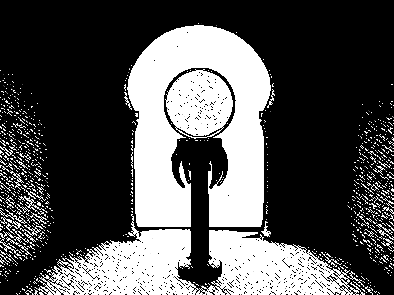
very nice 1 bit NPR rendering. Cool demo.
nice ideas and execution
hmmm.
Great effects...lots of style. Kudos for having the courage to do something like this. The rendering technique reminds me a bit of 32 degrees in the shade.
mostly a roadtrip and partyplace prod, hoping to release a final version with tighter cameras and missing scene elements soon.
Greets to NVIDIA for a great party!!! <3
Greets to NVIDIA for a great party!!! <3
excellent arty b&w rendering, and 3d modeling!
kudos for doing something different, not the winner demo style ;)
the final babel tower scene is madness :D
kudos for doing something different, not the winner demo style ;)
the final babel tower scene is madness :D
nice work dragons!
Awesome job guys....really slick
nice renderer!
But was the music really meant to be played with this demo?
But was the music really meant to be played with this demo?
Good demo - respect :)
good flow. surprised me somehow.
you´r harry potter fans? :D
but u used the right symbols anyway ;)
you´r harry potter fans? :D
but u used the right symbols anyway ;)
ulen
Very good with a high impact novelty factor. I just found the visuals too harsh on my eyes and the music too harsh on my ears.
I kept wondering how it would have looked over a paper texture with more anti-aliasing, like the loading pic.
Anyway, a thumb for the idea and effort.
I kept wondering how it would have looked over a paper texture with more anti-aliasing, like the loading pic.
Anyway, a thumb for the idea and effort.
what zest said
Amazing rendering technique with amazing atmosphere and concept. I think I was drooling while I was watching this one, for some reason...
good idea
Awesome idea.
Nice rendering style!
my favourite in the compo! the music is so great
Interesting, but it didnt grab my attention so much.
Enjoyed it plenty, good work.
nice one
Nice one.
pleasant to watch and hear
I liked it!
Since I didn't participate in this one I can thumb it up!
Really something else then the mainstream dx10 effects! ND is still in the game lol!
Really something else then the mainstream dx10 effects! ND is still in the game lol!
i liked the visuals a lot, but the music got so much on my nerves it nearly ruined the experience for me. judging by the other comments, it seems to be kinda polarizing, so i'll stick with the rulez - but i doubt i'll watch it again (or if i do, i'll watch it muted).
Really really really really love the rendering
what ps said.. reminded me a bit of antimoney
crazy
nice surprise, I like the rendering very much ! I like the soundtrack too. Thanks !
Great, also very nice tune
I find this rather original but the greetings were completely out of place
Interesting rendering, some original ideas, but it didn't really grab me. Probably a matter of taste though.
Really a pleasant surprise! I loved the style and the "Tower of Babel" scene was amazing. Best American demo ever - congrats!
neat
A solid production! Although, like Wade said, a paper texture would have looked better than harsh white. I really like the infinite 3d zoomer at the beginning.
Did I mention this rules?
nice solid prod
the shading is not easy on the eyes; you could have used some colors, carefully. the tower part is good. the credits part is bad. the rest is not really interesting. contrary to ryg, i liked the music, but it's quite independent from the visuals. borderline rulez...
to s_tec and Wade: the plan WAS to use rice paper texture and maybe some key colors. but we were too tired at 6am to add that. will probably be there in final ;)
..oh andthe title sucks we know. and there's no reference to happy rotter.
..oh andthe title sucks we know. and there's no reference to happy rotter.
Nice to see somebody doing a pure NPR demo. But the music didn't fit IMHO.
Pleasant carbon paper style.
Quote:
to s_tec and Wade: the plan WAS to use rice paper texture and maybe some key colors. but we were too tired at 6am to add that. will probably be there in final ;)
Great minds think alike. ;)
I look forward to the final!
Nice flow
great idea and style.
peculiar, cool style
nice paper style.
great idea.
great idea.
Some of the transitions (in the zooming part) could have been a bit "smoother", but it's otherwise an enjoyable trip, and the music reaches some levels of interesting strangeness without reaching the point where it would start to be annoying :)
nice ideas (rendering and the tower) but the camera movement was way too choppy, imho. i like the zoom idea but if you zoom into an object the rest of the scene seems quite empty... anyway, here goes my thumb
My favourite demo from Northern Dragons so far, and one of my personal favourites from the compo.
cool and fresh look!
cool hatching
Interesting rendering (though not my taste), quite good scenes, but I didn't get the story if there's any...
Other than that: what ryg said
Other than that: what ryg said
I have wanted to make a demo with that kind of rendering and style for years and you did it really nicely so I should hate you for that ;)
Really nice work there.
Really nice work there.
really nice journey!
My favourite in the compo, fresh and well directed.
really well done! definitely my favourite from the ones i've seen up until now. *love* the pisa tower scene.
Very well done and pretty unique. I like it.
Very interesting concepts, well executed.
Nice trip!!!
great one. Great looks! Didn't like the song that much though.
Nice!
to explain a lil about the song: we were using Shpongle/Hallucinogen as the inspiration, which is weird, weird psychedelic maybe trance/jazz/chilllout with brilliant flute laid over it. I think it fits perfectly, especially during the hilbert curve scene (which will have the wall in the final) : D but I'm weird.
up up!
Yes, this is good stuff. It takes balls to go black'n'white as well. The only thing that bothered me was that the spots and pecks updated at a slower pace than the camera moved, making the neat rendering technique appear distanced from the objects it was rendering. The music didn't bother me at all either. The last scene was killer as well.
The message, music, render style - everything joins very well!
rendering thumb!
why doesn't it run on my atariiiii?
wow!
Nice and well executed idea!
not sure about the shader, and the object show behind it left me cold. I dunno, didn't grab me.
Very nice and nice story but took time to load :D
this just so rocks! ;)
That is not the way hatching is supposed to be done.
this is great to watch, very nice
"Pencil" rendering <3
Music <3
Art direction <3
A pure jewel!
Music <3
Art direction <3
A pure jewel!
Not bad!
what untel said.
Amazing.
Amazing.
very cool and intersting well worth a thumb.
Very good idea. And nice music, of course.
Ehm..
*great* rendering
thumb! really nice visual style.
the music is okay. i would have liked to hear some different sections perhaps. some of the treble is too harsh for me.
the music is okay. i would have liked to hear some different sections perhaps. some of the treble is too harsh for me.
This gets me pumped! Truly WIcKED - Total MAGIcKH
the filter is maybe a bit too simple to make it really look good, but apart from that this is a pretty fresh demo (although being a 100% fly-by demo :) )
toxie: aside from andromeda's nested 3d fractals, I think we're the only one doing nested 3d infinite zooms... and watch for the prt'd architecture ribbons... and the multiple-gravity vector physics engine... and well it's all quite subtle ^_^
for the refreshing style!
I genuinely think this is the best ND prod yet. Very interesting zooms on well modelled 3d with a stylish rendering. It felt 64k due to the lack of variation to me but that didnt stop me enjoying it. I'll watch this again (twice already)
+1 - For sure !
I loved it.
I loved it.
*cough*
style!
nice indeed!
do i love this shit? yes i do!
fukk thats kewl!
especially the soundtrack!
fukk thats kewl!
especially the soundtrack!
shading could be improved, nice anyway
Nothing to complain about :) everything is neat
probably the most underrated demo of 2008. The music is very fitting. Thumbs up !!
very cool.
ah, I've been trying all day to find what the music reminds me of (at least the first half minute): the background music to several Giallo films (Argento et al), usually made by Gobllin. Can we get it on a separate mp3/ogg ?
Great!
CUMSHOT
Fucking love the soundtrack!!!
Wow, I missed this one! Really nice and original.
Nice rendering style.
Final: http://www.northerndragons.ca/files/ND-BinaryAlchemy_final.zip
Many little improvements, cleaned up camera paths, better synch, some missing effects inserted, more gratuitous use of architecture ribbons : D
Many little improvements, cleaned up camera paths, better synch, some missing effects inserted, more gratuitous use of architecture ribbons : D
great improvements in the final, thanks for taking the time for a final!
simpl'n'good
how come I never thumbed this, lovely rendering style :).
Original and cool style... only problem for me was the music, didn't really like it much.
Anyway, big thumbs up.
Anyway, big thumbs up.
The music is powerful and the visual style adds to its haunting nature.
The best B&W demo I have already seen ;o)
great rendering and nice music!
refreshing :)
refreshing :)
Thumbs up for the final of an interesting demo.
Very nice and consistent vibe here. Reminded me of Infinity by Craw Productions in all the good ways.
I didn't like the music much, but very nice demo!
Great direction, nice idea. Sometimes too "dark" but overall strong.
Interesting, and the final surprised me
Nice.
B&W Masterpiece :)
Real (demo) art!
In my opinion, it doesn't work all the way through but some parts (the tunnel and staircases for example) I think work really well with this effect. The problems seem to come from flat-shaded areas. Nice idea though.
Great!!!!!
Feels more like ordinary rendering with a hatching layer on top than actual NPR. Decent music and flow.
interesting, unique rendering that deserves a thumb up
fly as hell
lists containing this prod
submit changes
if this prod is a fake, some info is false or the download link is broken,
do not post about it in the comments, it will get lost.
instead, click here !

but it didnt quite hit the spot, probably due to some inconsistency between the sound and the scenes..