|
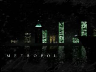
Metropol by the|neonray [web] & Throb [web]
[nfo]
|
||||||||||||||
|---|---|---|---|---|---|---|---|---|---|---|---|---|---|---|

|
|
|||||||||||||
|
popularity : 69% |
|||||||||||||
alltime top: #2395 |
|
|||||||||||||
| added on the 2002-08-06 12:18:06 by bhead |
||||||||||||||
popularity helper
comments
Enjoyable and rather stylish w. good design ideas. Waiting for the final:)
i thought this was quite nice though a bit too dark. i also had pauses on my own pc. (256MB) good luck with finalization.
wow
Great demo, a bit too dark at some places, but the design is _very_ good. I'm also waiting for the final version. And it was nice to see you Neonray at ASM :) Good luck!
crashed my office machine right at the oiltruck scene, it seemed to be working fine before that..
anyway, this is definitely one of unkle night_'s finest. 8) keep it up!
anyway, this is definitely one of unkle night_'s finest. 8) keep it up!
Groovy
one of my lovely!
nice music, and some interesting design elements..
Great style!
Fantastic work, very stylish and very well done.
Can't wait for the finished version. :)
Can't wait for the finished version. :)
good demo, it's not for 11 place.
Something original for a change. Rox. Should have been in the top 5 instead of fable.
yep
cool x)
Heh, metropol is the name is a gay club in murcia (my city :D). Haven't seen the demo yet, so no voting :-)
Very nice and original. I really like it.
I just don't like groups that ostentate the incompleteness of their production.
I think I'll rate the final version.
ps: it looks quite ok as is.
I just don't like groups that ostentate the incompleteness of their production.
I think I'll rate the final version.
ps: it looks quite ok as is.
visuals are nice. i just didn't like the music.
this rocked my arse man!!! nice visuals. nice overall design. (a lil bit dark, tho) !
At Assembly I thought this was a bit boring (dunno why), but now when I watched it again, it's actually pretty cool. And I really like the music too.
Yeah, this is nice. Urban (or whatever) without wandering into the realm of cheesiness. Some nice touches, such as text which has the same angle of perspective as the background.
Outstanding!
oh dear, it will take some time to fix that demo. but i will like it once it's done!
don't stop working, and test on every 3d-card you can get hold of!
don't stop working, and test on every 3d-card you can get hold of!
this demo is really cool.
typography was nice.
and very original.
It matches very much also about music.
typography was nice.
and very original.
It matches very much also about music.
hm.. crashes pretty randomly... but the first 10 seconds or so i could see looked really promising. gimme final, final!
Given the compatibility problems mentioned, I'm pretty surprised that it worked here without a problem even though I use an ATI card :)
On the demo itself: This-is-great-stuff. The graphics are not overly interesting, but kudos for actually asking instead of just ripping the music :), and the work on the design/synchronization is absolutely great. There's always something happening on the screen, always some details moving (just like in so abstract world), and I really appreciate how everything works together in this demo to create a great experience. I want more of that!
On the demo itself: This-is-great-stuff. The graphics are not overly interesting, but kudos for actually asking instead of just ripping the music :), and the work on the design/synchronization is absolutely great. There's always something happening on the screen, always some details moving (just like in so abstract world), and I really appreciate how everything works together in this demo to create a great experience. I want more of that!
i dont know this commercial music, and they have the rights to use it, so it's more a videoclip than a demo
too much black on layers wich kills the texturing work
the music is mediocre, except one part wich is good for synchros ad well used
but in the globality, it's not fantastic, so a pig face for me.
(finish your work before present it please)
too much black on layers wich kills the texturing work
the music is mediocre, except one part wich is good for synchros ad well used
but in the globality, it's not fantastic, so a pig face for me.
(finish your work before present it please)
very very nice design + good ideas on how to introduce effects.
looking forward to the final version.
Lotsa Effects Incredible !! Can't wait for the final version.
YEEEAAAAHHHH!!!
SUPER !!!
Yeah, it was nice.
not seen yet, will watch it tonight
but i'm curious: how did you managed to get lunatic calm's permission ? who have you contacted for that ?
but i'm curious: how did you managed to get lunatic calm's permission ? who have you contacted for that ?
excellent! i want a final version!
crashes on winxp/c600/tnt2/128ram, perhaps needs more than i can give
I bet that tnt2 of yours is to blame, raver 8}
please do the final version already, ok?
Thanks a Million Bud For The Final Version
Just AWWSUMMMM
Just AWWSUMMMM
The Final Version=RESPECT !!!
Love The Zooming Effect.
Love The Zooming Effect.
my mouse bit my thumb off heres my left one
won't let me thumb up either here, BTW excellent productions
a final version was cool!!!
some typography idea was good.
and music was good!!!!!!!!!
some typography idea was good.
and music was good!!!!!!!!!
Quite different from the original one...
I really liked this one, but I think you should have better released directly THIS version at, say, Breakpoint.
I really liked this one, but I think you should have better released directly THIS version at, say, Breakpoint.
amazing. only thing i didn't like was the loussy noise effect... it should have been much softer IMO.
great nonetheless
great nonetheless
cool
one of my favourites. this demo needs more attention!
somehow not my cup of tea :(
haven't seen the final version, but the compo version is way too uninteresting
haven't seen the final version, but the compo version is way too uninteresting
no1 loves metropol
great demo!
the final was very nice. had a decent pace and a stylish aproach to it. it was also directed smoothly and the music was fitting.
props.
props.
this is the type of demo you MUST give a "rulez". the direction is simply sensational, the music fits, and the design is just right! you guys do stuff daaaamn right!
And additonal thumbs up for NOT ripping the music, but asking the author!
great design but..
it loaded longer than it played and was rather choppy. sad to see good prod let down by the lack of optimisation
maybe I`ll enjoy it when I get 512 ram/128video
it loaded longer than it played and was rather choppy. sad to see good prod let down by the lack of optimisation
maybe I`ll enjoy it when I get 512 ram/128video
best demo from throb+neonray.
nice demo. good demo.
ohhh, great demo!!!
nice demo. good demo.
ohhh, great demo!!!
Different, but cool style. Nice demo
i'm looking forward to see more products from you. :)
this is my favourite.
it looks so good.
this is my favourite.
it looks so good.
boring!
final better than the preview!!!
but i did not like the music
but i did not like the music
city by night is so tempting!
very cool design. And of course Lunatic Calm - rulez
Stunning design! Bit depressing tho.
Fokken brilliant. I want more of this!
why did i never see this before?? it's really great!!
METROLIUM!!! \o/
METROLIUM!!! \o/
rulez!
I like the darkness and atmosphere very much,. noise,.. mm.. perhaps it wants to hide the ugliness of some parts, adds to the atmosphere anyways. Nice demo with a theme.
too damn short!
only 11th?
stylish.
Nice demo.
underrated.
Damn great, one of the few pure 3d demos from the era that looks pretty good a lot of the time even. Same tricks still being used today :), i.e. put enough junk on top of everything to obscure the ugly stuff out.
it was great
submit changes
if this prod is a fake, some info is false or the download link is broken,
do not post about it in the comments, it will get lost.
instead, click here !

Def. waiting for the final !