|
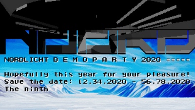
noord - nordlicht demoparty 2020 invitation by Titan [web]
[nfo]
|
||||||||||||||||
|---|---|---|---|---|---|---|---|---|---|---|---|---|---|---|---|---|

|
|
|||||||||||||||
|
popularity : 64% |
|||||||||||||||
alltime top: #4716 |
|
|||||||||||||||
| added on the 2020-04-12 23:17:21 by neoman |
||||||||||||||||
popularity helper
comments
Very nice invitation! Excellent graphics!
not sure if we can make that date yet but really cool invite!
I love the transition between 3D scene and info text
Cool invitation!
Very nice invit !!!
Nice invite for Nordlicht on the Amiga with a space theme
quite nice for an invitation intro
Music works well for me especially with the snowy mountains background. Nice invitation.
what Mystra said
Its nice for a first Amiga prod, but it changes screens to fast so text is hard to read .. Also the font outline makes it a bit hard to read.. Visuals and sound is cool though :) Looking forward for more Titan Amiga action..
Very nice invitation :)
Great one! Love the graphics and the music <3
Very nice demo!!
Very stylish invitation with good music.
Fairly well polished for a first prod in the platform :)
Quote:
ts nice for a first Amiga prod
This invitation is neither Titan's nor Neoman's first Amiga prod. :)
Nordlicht!
i love it...
Beautifully crafted invitation demo, thank you so much lilibox and neoman for creating this! The music and art style fit together very well <3 Hope to see more Amiga stuff from you guys! :)
A note on the party date: this was intentional to reflect the current event restrictions in the country. So It's a feature and not a bug! Check the pouet thread or website for updates regarding the actual date!*
A note on the party date: this was intentional to reflect the current event restrictions in the country. So It's a feature and not a bug! Check the pouet thread or website for updates regarding the actual date!*
plain thumb for the nordlicht 2o2o plan! awesome invitation <3
Cute :з
It's good
.
Like this a lot.
clean invitation with lovely music, dig the split-screen biome idea
Nice flats :)
Looks and sounds great! I feel invited =)
Needs a clean-boot to start on my 4060.
Very nice invitation. Framerate could be a bit higher. Text-write contrast could be better for some backgrounds. I love your way of doing split-screens!
Very nice invitation. Framerate could be a bit higher. Text-write contrast could be better for some backgrounds. I love your way of doing split-screens!
Nice invitation
Quote:
Very nice invitation. Framerate could be a bit higher. Text-write contrast could be better for some backgrounds. I love your way of doing split-screens!
What he said :)
Super Demo.
I am kinda divided... (conclusions based on streaming or video presentation)
- I like this presentation, this invitation. Very nice style, good 3D elemens (sphere!) showing potential(!) of this engine.
- Good, stylish music (in which format, btw? xm, mod, mpg?), I like to listen to for long minutes.
- Good, pixeled gfx, making this production more pleasant, cosy...
But... and here you have my constructive remarks:
- Some 3D elements (square-triangular fonts) are, together with its dark colour and colorfull BG, just unreadable.
- The 8x8 fonts are... black? One need to concentrate what one is reading. Why not white with dark outlines, woulb probably be more readable, as well.
- The music is too silent(!) and...
- Too nice, ambient for such a production.
- Invitation (it's my personal opinion ;) should be like an add, infoming you, shaking you a little bit, and not to make you meditate...
- It should not loop from Z to A and so on... Or if desired (due to the music), loop within the some kind of "end-part"...
For me it is OK. Have a great potential, but will wait for a better use, execution of it =).
Split-screen design and overall look and feel is just great!
had its charm :)
sweet composition
Awesome invit, loved it on the stream (forgotten thumb fixed now).
pretty :)
That's a nice and smooth invite. I dig it :)
I completely missed this; but its awesome! Very smooth!
Rulez!
That's a beautiful demo!
rulez
submit changes
if this prod is a fake, some info is false or the download link is broken,
do not post about it in the comments, it will get lost.
instead, click here !
.gif)