| The Colours and Lights of The North by Eos | ||||||||||||||||
|---|---|---|---|---|---|---|---|---|---|---|---|---|---|---|---|---|

|
|
|||||||||||||||
|
popularity : 62% |
|||||||||||||||
alltime top: #6889 |
|
|||||||||||||||
| added on the 2018-04-02 16:59:07 by SunSpire |
||||||||||||||||
popularity helper
comments
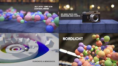
Raytracing is the new rasterization, and thus spheres are the new cubes. I think this was the best sphere-demo in the compo :-)
rulez added on the 2018-04-02 17:51:23 by Sesse 
Very high production values. I like how it felt optimistic and warm, even despite the hipstery vibe with the camera.
looks great. and noby, the soundtrack is ace as fuck! mad props
(needing soundtrack. please add it somewhere:)
Great rendering, but not necessarily the best pacing (that last scene went on a bit toooo long...)
Really beautiful and relaxing. Also what nagz said.
Looks awesome. With which version of Notch was this done? The »learning«-edition?
It has colors :)
I love the soundtrac...... oh, hi noby
calm and beautiful - among the best entries in the compo.
and i reeeeally love the soundtrack (nice chords).
and i reeeeally love the soundtrack (nice chords).
In my opinion, the slow movement doesn't work well with the warm colors. But I love the look of the stills, so thumb it is.
I really dug this at the party :)
The general look of the visuals is sweet.. except that something immediately goes "error!" in my brain when I see near-photorealistic scenes with inexplicable overlapping of objects. That should've either been avoided or exaggerated to make it less annoying. But that's a relatively minor point, this still looks and sounds nice and works well as an invitation.
Calm, simple and beautiful.
so beautiful. Love the polishing and the modelling!
beautifully rendered, and the visuals and music match so well!
Yeah, this was lovely during the compo!
damn this is more polished than the balls of a pro snooker player.
Amazing, looks fanatastic
Nice work
This one's like a beautiful dream, in both audio/visual terms. Reminds me a bit on Imagine by TGGC.
gorgeous, could have been tightened up direction wise, none the less as an exercise in visual composition and rendering techniques, it is a stunner! :)
Love the soundtrack. Also, really nice balls - not even joking, so pleasing to look at, could have watched a demo of just that :)
Tech overkill. Looks sooo damn polished.. And the music is ace. Does remind me a lot to one of my all time favourite demoscene tracks "ocean machine" from tbl. Thumbs!
Gorgeous
Pretty, oh so pretty! Also very pleasing flow bonused by well done effects, and the music fits perfectly to the moods. One of the best executed invitation demos as well :)
the most beautifully rendered spheres, i guess
Nordlichthaus, gut schauts aus
Beautiful, especially music and colours!
/// yea
submit changes
if this prod is a fake, some info is false or the download link is broken,
do not post about it in the comments, it will get lost.
instead, click here !
2.png)