|
Joia by Collapse [web]
[nfo]
|
||||||||||||||
|---|---|---|---|---|---|---|---|---|---|---|---|---|---|---|

|
|
|||||||||||||
|
popularity : 63% |
|||||||||||||
alltime top: #5128 |
|
|||||||||||||
| added on the 2017-04-15 22:49:28 by shash |
||||||||||||||
popularity helper
comments
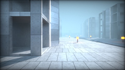
Collapse returns with another size-coded prod in the same style as their previous Revision releases, all beautiful with good lighting. Someone on the party IRC complained about the gray though, but I think it kind of serves to highlight the colored lighting well.
rulez added on the 2017-04-15 23:05:51 by Starchaser 
Amazing direct and indirect lighting, awesome tricks in a 4k and very cool soundtrack that rocked! Great mood IMHO. One of my favs in the compo.
Louis Kahn's Salk Institute in 4k :)
love it
Really nice.
polished wonderful one :)
nice architecture and shadows :)
maybe next time turn all the other instruments off so that we can enjoy that snare even more
awesome!
De-light-ful.
Concrete, light, and shadows.
calm and beautiful!
architecture and light!
Nice lighting!
not bad for 4k for sure
Loved how the camera only moved in straight angles and you still made it somehow work.
I'd still prefer more camera work over more scenes though.
I'd still prefer more camera work over more scenes though.
Awesome prod. Well done.
architecture
Another good 4K again. Nice buildings.
You really should have aimed for more different and interesting content, instead of this pretty clean architecture over and over again.
Did not work on my i5/r9380x... (white screen). Music was okay :)
clean, short, no fireworks. me likes.
Was just about to give this demo a piggy, but then I noticed how it looks on Youtube.
Turns out that when it plays on my computer everything is 10x brighter, there's a ton of white ambient light, most of the lights are completely overblown, shadows are almost unnoticeable and it overall doesn't have any realism to it all.
Anyway very impressive demo with some nice music :)
Turns out that when it plays on my computer everything is 10x brighter, there's a ton of white ambient light, most of the lights are completely overblown, shadows are almost unnoticeable and it overall doesn't have any realism to it all.
Anyway very impressive demo with some nice music :)
<3
Super pretty, great tech!
The thing I'm missing though is some emotion. The presentation is maybe a bit dry to make an impact. The camerawork and soundtrack don't really say anything, in a way comparable to an IKEA catalog.
Aside from those points this is obvious winner material. What a compo to have this end up fifth...
The thing I'm missing though is some emotion. The presentation is maybe a bit dry to make an impact. The camerawork and soundtrack don't really say anything, in a way comparable to an IKEA catalog.
Aside from those points this is obvious winner material. What a compo to have this end up fifth...
Cool lighting but doesn't really go anywhere
Love these polished architectural prods from Collapse. I agree with Noby about IKEA flavour but that's a more positive thing for me.
Awesome 4K, 5!? The cool tune makes me think a bit to if I ruled the world by nas. cool :)
So good looking!
I'm a simple man, I see brutalism, I vote for it.
Amazing! Pretty tight to the 4th.
Love the lighting! and the music fits perfectly.
Have you tried to move this engine to a 300k binary?
Love the lighting! and the music fits perfectly.
Have you tried to move this engine to a 300k binary?
very nice
That was awesome!
Super smooth. Great tech! I love the colours.
Yep
no fresh idea but it looks great!
What noby said. Sorry for everyone submitting such great stuff, at a smaller party this would have been instant winner material :)
Only criticism for me is the music which sounds pretty much like standard 4Klang fare from a few years ago with the usual 4-bar loop, some nondescript melody and horrible mixing (1in10 has a point there). I know it's hard but there's a lot of room for improvement here.
Only criticism for me is the music which sounds pretty much like standard 4Klang fare from a few years ago with the usual 4-bar loop, some nondescript melody and horrible mixing (1in10 has a point there). I know it's hard but there's a lot of room for improvement here.
Nice stuff!
Good looking tech demo with good lighting effects.
The only problems: music is a bit too generic and a bit too long for the content. Otherwise: keep it up!
The only problems: music is a bit too generic and a bit too long for the content. Otherwise: keep it up!
nice but too dull
this is great
submit changes
if this prod is a fake, some info is false or the download link is broken,
do not post about it in the comments, it will get lost.
instead, click here !
