|
fr-082: The Sphere by Farbrausch [web]
[nfo]
|
||||||||||||||
|---|---|---|---|---|---|---|---|---|---|---|---|---|---|---|

|
|
|||||||||||||
|
popularity : 69% |
|||||||||||||
alltime top: #3363 |
|
|||||||||||||
|
||||||||||||||
| added on the 2015-12-28 23:46:03 by BeRo |
||||||||||||||
popularity helper
comments
Nice & fast paced
rulez added on the 2015-12-28 23:48:56 by Steel 
Good stuff! Keep on keepin on bero!!
wild and hot, a real boost of energy in an excellent compo
Uh video please - my silly iSMack is underpowered :-(
Banger! Tells a story too, I like that! The "signal lost" earsore could have been a little shorter ;)
Really nice ... six years after »the cube« there’s »the sphere«! :)
great synthesis! Love it!
Awesome music and quite a stylish progress over the last months. Great stuff
I like the backspin (audio) effect but that's basically it, the rest could really use an outside eye and ear who could tell you that e.g. postprocessing the living shit out of your visuals won't make the object spinning in the middle any more entertaining, or that the soundmix could use some serious engineering. I also particularly like the bit that there's a midsection where you're LITERALLY stalling the audience until the music gets on with it.
You have (and have had) all the tools to make a good intro, but you constantly seem to get caught up in the flashiness of it all to add any much-needed nuance and polish.
You have (and have had) all the tools to make a good intro, but you constantly seem to get caught up in the flashiness of it all to add any much-needed nuance and polish.
Maybe that my graphic card had a bit trouble keeping up, but it seemed like the camerapaths were a bit hectic. The music obviously demands flashy visuals, but maybe it was a bit too much. Couldn't really tell on the stream either so I'm waiting on the youtube-version to know for sure. You did warned for this in the .nfo though.
Besides this what I really liked was the fact that the intermezzo had a blue tint, worked great to contrast the rest of the red scenes. The vocal samples as well as the synthsounds were very nice! The mixing could use some work and I thought I heard some clipping at some point.
Flashy stuff, postproc, music: everything you need for a crowdpleaser. The title also set the uuh. atmosphere. Solid progress yet again!
Did not find this interesting or entertaining in any way.
Nice musics with even nicer drops.
Nice work!
What Gargai said.
i like it!
cashing of fame
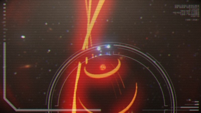
i find nothing wrong with flashing primitive objects into our faces to a strong beat as long as there is some variation. music was obviously awesome. making sure every post effect is noticed individually was maybe a bit much though, it probably would have looked much better if they were tuned a little bit more subtle and melting into each other without being so obvious. i especially liked the look of the distorted hologram.
Loved the demo, great work!
exactly WGS
Good one. Nice tune.
I really wonder what Bero comes up with for Revision 2016..
Hopefully something out of this world for years to come :)
Hopefully something out of this world for years to come :)
OK to watch once.
wicked one man show again! decent dnb track in a fast paced eye candy environment =)
Lost me when everything starting spinning randomly.
what a horrible mess
fr minus 082
will you take the farbrausch lable and fuck it up even more?
fr minus 082
will you take the farbrausch lable and fuck it up even more?
Incredible 64k
What cupe said. Also too long for the amount of content shown. Weak thumb up.
I liked the transition from the super hectic red scenes into the blue room. I think the pacing in the blue room is more mighty :)
@Sir: your attitude sucks and you have successfully and entirely misunderstood the idea behind Farbrausch.
O_o--b
very nineties
Sir: why bother with such comments and bullying.. Stay away with such attitude dude..
Somehow liked it, that face paced stuff and the scene in the "blue room" especially.
Hehe, not "face paced", but "fast paced" of course.
probably my favourite bero release thus far, solid 64k. good job!
my thumb is for the music. the visuals are a bit too messy for my taste.
Your best so far!
Should have won!
Don´t let others irritate you, keep that style, you are splendid in this music-genre and have the fitting visuals!
One Man to rule em all!
Should have won!
Don´t let others irritate you, keep that style, you are splendid in this music-genre and have the fitting visuals!
One Man to rule em all!
one man and his machine - hal 9000 vs bero :) I like it
Kinda what Gargaj said - the postproc is quite overdone just to show it off, but all in all it was still enjoyable and that synth is quite impressive. You're definitely heading into the right direction, and it's quite an improvement yet again.
impressive one-man work and impressive sound synthesis!!
but what Gargaj said.
weak thumb
but what Gargaj said.
weak thumb
I quite liked this actually, one of the best berotros I remember having seen. Surprisingly reminiscent of 90s 64k intros somehow :). Liked the blue middle segment the best.
after the spin something should have happened. no
'EXTERMINATE' dalek reference would've been cool at the end d:D
great one man 64K!
great one man 64K!
demo'ish intro is demo'ish. but colors are very meh. still thumbs up for 64k one man show.
nice & what noby said
g'daym.. you nearly got a CDC there! =)
This is a piggie. You are not able to keep up the atmosphere. Until 1:15 you get a very nice buildup - especially supported by the music - but due to excessive use of repititive effects and musicial boost, it feels like you didn't know what to do after that. Then we got a Signal Lost, here it gets quite interesting but not interesting enough to keep up the attention.
It was OK.
It was not OK.
Like the pace of the demo, but too much of a mess and too little content. Sorry...
ok
HAL 9000 is having a nightmare!
I like the design but the minimal content and the abuse of repetition diminishes the overall effect.
It would work better if it were a bit shorter.
Anyway, my thumb goes up.
I like the design but the minimal content and the abuse of repetition diminishes the overall effect.
It would work better if it were a bit shorter.
Anyway, my thumb goes up.
liked it! probably the best colours ever on a bero's prod ;)
Trauma Zero: So, it was good or bad? :P
i like the music, but get urself a new coder for the visual efeckts
One hell of a cool intro.
Lots of energy and certainly does contain that sphere
nice one - just really, really too repetitive.
Geht so.
Quote:
@Sir: your attitude sucks and you have successfully and entirely misunderstood the idea behind Farbrausch.
Nein, habe ich nicht. Damals schon nicht, heute auch nicht. Mein Kommentar damals war augenscheinlich ein Produkt einer gewissen intoxischen Unzurechnungsfähigkeit. Ich entschuldige mich hiermit bei BeRo und allen anderen Farbrausch-Mitgliedern für meine damalige Entgleisung; mein Kommentar war alles andere als angemessen. Danke, Ronny, dass Du mich darauf hingewiesen hast, und sorry, dass ich es erst jetzt wahrgenommen habe.
Es tut mir leid.
sehr geil
turns out to be quickly boring
submit changes
if this prod is a fake, some info is false or the download link is broken,
do not post about it in the comments, it will get lost.
instead, click here !
