|
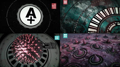
A+ by Inque [web]
[nfo]
|
||||||||||||||
|---|---|---|---|---|---|---|---|---|---|---|---|---|---|---|

|
|
|||||||||||||
|
popularity : 68% |
|||||||||||||
alltime top: #2060 |
|
|||||||||||||
| added on the 2015-10-18 03:13:00 by glow |
||||||||||||||
popularity helper
comments
Yeah more Inque!
rulez added on the 2015-10-18 03:16:11 by numtek 
Best inque prod yet. Great flow and super solid overall design. Love it! :D
Just plain and simple stylish, flawless production, really worthy of an A+ :D
Saw it on stream and it's amazing. What ferris said. Would love if you guys could get it running on win7 so I can watch it on my machine but I understand it's an old OS now I guess.
You guys keep getting better at design. Great stuff :).
great design and soundtrack!
Holy shit! And that logo in the NFO to! Great!
I do not like the "scenepoetry" very much but those visuals are outstanding.
So a bit thumb up it is!
So a bit thumb up it is!
A big thumb up, I meant. :]
strange dizgn but roks ! thanx so much
Style!
design overload \:D/ and the twist0r makes me say: OH MY LORD!
My favourite from Inque now :)
Awesome!
Oh wow I think this might be my favorite Inquetro so far.
top notch!
up!
Excellent! Love the circular design gadgets and how you have implemented these in other elements. Like the look & feel, and it flows very well with the music.
A+ ;)
Wasn't expecting much based on the screenshot, but this was really enjoyable. Slick design, plenty of content, good pacing, fine music. Not a huge fan of the colour scheme but it still worked due to being so consistent. Even the scenepoetry didn't bother me. Top notch.
I submit to the illusion.
wow. just wow.
quite nice, but lacked some punch for me, failed to run fullscreen, but worked windowed.
Excellent intro, totally works for me. Great music, nice effects and design. Very well done!
the illusion is real
good stuff (as always) ruined by not bad but poorly produced music (omg that lame kick drum, that reverb) (as always).
Nice!
inque always delivers.
i hope to meet them irl one day.
i hope to meet them irl one day.
Nice :)
finally a fresh take on newschool design: flatshading, overlays and scene-poetry. I love it!
Works in Wmware/Windows 8.1, with the software renderer "Microsoft Basic Renderer Driver", on my Windows 7 host machine. Nearly a slide show, even with my good old 2500K @ 4.7Ghz, but it works. From a technical perspective, I I don't see anything here that should prevent this demo from running natively on a Windows 7 machine.
Damn, judging from YouTube this might be a great reason for me to update from Windows 7 to Windows 10... Distinct Inque style for sure, without it looking recycled. I love the design work and the pace in this, very good! Only the music is a bit...flat, I guess. Still, best Inque intro for me so far!
wait - this thing does not run on a Windows 7 machine? I mean, honestly? o_O
Dam, I've only got windows 7 installed :(
okay - i've seen better inque intros though.
Ok, watched the youtube instead. Like the design and feel of it, pretty cool. The music is nice, are those drums all synth'd? One of the percussion sounds feels like its taken from Arkanoid?
Good work!
yeah nice design. some reuse of stuff, but i guess it's time you fire izard as the glow+cosmiq combo works better!!! ;)))
Again an ace prod from Inque
Top!
k
This was a delight!
Excellent tech and sound, please add a switch to turn skeneboetry off :)
This is your best production so far, imo. Great visuals and a superb soundtrack. Really a pleasure to watch and listen to.
I really like this; the only letdown for me was the kickdrum.
Nice intro
Finally! an Inque production that has great non-purely-coder aesthetics in addition to the great code. Love the retro 90's intro style.
You guys never let me down! MORE SCENEPOETRY
Quote:
Hoffman: everything was synth'd. No samples were used. I'm guessing Cosmiq/chris got inspired by Arkanoid :)
It's just elevated to awesome!
Well put together.
I really missed scenepoetry for a while! The demo is well made and makes you think, not too much, but still.
yay! Super Nice to have some 8bit feel to the soundtrack!!!!
I did not like the lyrics, not because I am against lyrics in general, just was not convinced by your text. Nevertheless, I LOVE what you guys do with the scene designs. Great prod overall, lots of inspiration for me.
What can i say? Ace production! Sweet design and great music. Two thumbs up!
this must be the worst skenepoetry i've seen in a long time, but otherwise, realy cool!
Making simple buffering glitches on purpose is so A+!
Nice one. Serveral performance drops on my quite old sys, but it's okay...
Not bad. :)
Refreshing design with good soundtrack, great quality as always from Inque.
You are one of the best 64K scene group nowadays, without a doubt.
You are one of the best 64K scene group nowadays, without a doubt.
Yep +
The application of daring yet beautiful colourschemes deserves thumbage ... also very slick soundtrack :)
Solid design and brilliant .nfo ASCII art, but I can't shake the feeling that some of the visuals have a computational price that is just too high given the value.
.
I see what you did here - unfortunately it just doesn't make me go "woah.." more like ...so what. It's boring, and the colors really aren't my kind of palette :/
Really well done!
rad
nice!
A+
You got a pretty unique design, palette und usage of organic forms. First it felt like a mixed bag but somehow it also fits together. The music could be a bit more deviant though. Pretty nice, go on!
Nice one.
A+ also looks like CD-Rom disks
submit changes
if this prod is a fake, some info is false or the download link is broken,
do not post about it in the comments, it will get lost.
instead, click here !
