|
pc-08: dead again by Panda Cube [web]
[nfo]
|
||||||||||||||
|---|---|---|---|---|---|---|---|---|---|---|---|---|---|---|

|
|
|||||||||||||
|
popularity : 67% |
|||||||||||||
alltime top: #4365 |
|
|||||||||||||
| added on the 2013-07-14 03:58:41 by Salinga |
||||||||||||||
popularity helper
comments
Great to watch :)
rulez added on the 2013-07-14 04:33:01 by Starchaser 
the provided d3dx10_43.dll is 64bit only, just remove it to run on win7 32bit.
Cool looking flybye with catchy sound as always from PandaCube.
that was awesome on the stream (=
fucking cool. best pandacube demo, and one of the best demos released this year. great modeling as usual, beautiful colours - clever use of lightning brings lots of dynamic to the scenes. all served with a downtempo chillout-track on the rocks. ;)
A worthy winner! I really liked the the mood and the lighting was great.
cool prod, especially the beginning
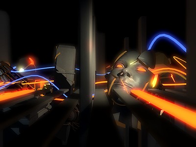
the scene in the screenshot is really awesome with the syncing.
i think the industrial setting from the later scenes is a little worn out but the lighting was for sure impressive.
the music is also good but felt a little disconnected at times.
i think the industrial setting from the later scenes is a little worn out but the lighting was for sure impressive.
the music is also good but felt a little disconnected at times.
Worthy winner for sure. Thanks for releasing it at Solskogen! I hope you enjoyed it enough to come back next year, too =) (Vielleicht brauchen wir eine Deutschsprachige solskogen.no-Sektion? :-P)
it runned under 64bit win7 for me without removing any .dlls and worked fine with SLI =) Pandacube flybys is fine =)
once again great tech, but no action, and I thought the music could have been a lot better.
what keito said
cool demo. i didnt like the (maybe overusage of) lighting though.
as keito said
alright, but it looks really thrown together.
- bad camerawork throughout
- the scenes look generic/pluginy (voronoi floor? greebles?)
- if youre going to make stuff glowing emissive in a dark scene, try and make them light up the stuff around them a bit. otherwise looks cheap. looks like youre using deferred anyway so why not?
- aliasing throughout. come on, even just adding fxaa would help and wouldn't cost you much at all.
- overreliant on one lighting effect which is overused, old, and you could ramp up the samples a bit
- soundtrack doesnt fit the style at all
feels like efficient rather than inspired demomaking - "got a decent engine and some 3d, lets knock out a demo".
I liked the opening but thought the rest wasn't as good, although the tech is there. Also, the music really doesn't fit.
Nice demo. Could use some gamma compensation on the volumetric lights to avoid the oversaturation when multiple lights overlap.
Don't know why but this leaves me emotionless. [strange english, I know]
O_o--b
What smash, Blueberry and gaspode said - it really needs some action, finetuning, more inspiring music and soul.
grx: yea i did run it myself and i set my render quality to "melt".. :) didnt notice the aa settings when i ran it the first time, maybe you should default to on?
Not the best PandaCube demo but still above average as far as visual quality goes.
dem volumetric lights!
Cool music, love the lights!
Nice to meet you again at Solskogen, cheers :)
Nice to meet you again at Solskogen, cheers :)
love it
Video please?
The lights.
Much better than the previous one. Thumb up for cool light effects, still too much boring flyby stuff included though.
I might be weird (taking the rest of comments into account), but I didn't like it, at all... neither the visuals or the music. Maybe needs party mood?
Too much distortion on the "sting" part.
string.
Nice volumetric lights is not enough. I miss some action and music like you have in previous demos.
Bah, no support for ancient XP SP3 so I had to watch it on YouTube. It wasn't bad. I expected more from this group! :(
I like it.
Seriously lacks direction. Nice light, but boring flybys. The first scene with the kind of robot would have been a nice start to stick to.
I don't really know what to think. The rendering and scene props are pretty good, but the lack of proper direction and hectic music make it difficult to enjoy this demo.
Started very nicely, and then got bland and boring. You have the tech, you have the potential to do great things. You should definitely work more on the concept, transitions, and camera paths.
Of course, it's not bad, but you can do better. I'll wait for your next demo!
Of course, it's not bad, but you can do better. I'll wait for your next demo!
boring flyby with boring music
I don't know what to say. It's bad.
yep.
Sorry, you guys could do much better! Music was a pain! Your last good releases save you of a thumb down!
Fucking excellent!
needs some visual studio dll?
music, hello?
you can do MUCH better - you can even do it well :)
you can do MUCH better - you can even do it well :)
I just like it .
.
Lovely music & art. Win10 64bit laptop runs smoothly even on a GTX 960M
lists containing this prod
submit changes
if this prod is a fake, some info is false or the download link is broken,
do not post about it in the comments, it will get lost.
instead, click here !
