|
Hall of Frames by FRequency [web]
[nfo]
|
||||||||||||||||
|---|---|---|---|---|---|---|---|---|---|---|---|---|---|---|---|---|

|
|
|||||||||||||||
|
popularity : 67% |
|||||||||||||||
alltime top: #2763 |
|
|||||||||||||||
| added on the 2010-08-29 01:00:02 by xtrium |
||||||||||||||||
popularity helper
comments
nice concept!
rulez added on the 2010-08-29 01:02:52 by Saga Musix 
Nice one ! Oh, and come to Main :-)
Cool name ;) , clean colors and nice greetings and credits effect. It just needs some flow to get the public.
Nice invit and glad to see the french scene being so active again :)
very nice!
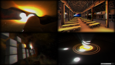
the hall model looked really good :)
the hall model looked really good :)
The mosquitos we're not necessary. A bit bland, but a nice invtro.
overall nice one, was also nice to watch over the stream, thumb up!
couple of nice effects and a spiffy hall model!
Thank you frequency !
Sponsored by DELL??
Good prod, which works well as an invitation.
There some comments, hope that it will help:
- the "loading" font is cheap
- the loading logo (+ the launcher) is great
- the music sounds like a 4K/64k one, especially in the beginning. I know you could do better ulrick ;).
- the direction is poor compared to Ergon (where it was ace, with a perfect visual/music symbiosis). The scenes feel disconnected, the timing is sometime bad... it's a shame :).
- cool idea for the MAIN logo =)
- the sky/explosion were great
- awesome modelling, congratulations Mestaty
- i'm not a fan of your font (and the mixed font in "4k - 64k - demo" is ugly!!)
- like RareWtFailWhale said, the mosquitos were not necessary (unless they are perfectly animating)
- video captures instead of screenshot would have been awesome, but anyway it was really nice to see previous MAIN prods this way
- greetings/credits rubix cube effect rulez hard (and thank you very much for the greet)
Well, i stop being annoying: congratulations guys, overall a really nice job, you continue to amaze me, and thank you for rocking the french scene!
Looking forward to your next demo ;).
(and: COME TO MAIN§§§)
This was a nice invitation. Some quite good looking screens. I am gonna watch again here.
i felt it looked and sounded rather plain, some nice ideas here and there though
all i can think of is "weird". at some points the demo just doesnt seem to know what to do. it looked nice and it sounded okay (the drums seemed weirdly off-beat at some points), but it felt like the demo was confused about how to present itself. ("oh, wait, i think i have another effect!")
Nice look and nice relaxed mood, but some things were just utterly random (the mosquitos, the greetings) - could do with better direction I guess
Awful font!
Nice invitation :)
Nice invitation :)
nice invitation!
I guess those mosquitos could look really great with better animation. The only reason I thumb it up is good hall model - it was really nice to fly through real object instead of some abstract tunnel :)
I agree with Gargaj on the direction and presentation, but a decent invite nonetheless.
The hall scene looks awesome.
nice
The hall model is accurate, everyone gets to see the big screen from a good point of view.
awesome hall modell, very very detailed.
maybe someone should use the modell for a small egoshooter / racegame - would be fun.
critics:
i miss some basic invitation information which could be perfectly place in the 2:40 beginning scene.
An invitation should contain a simple where / when / website.
all else is mentioned before.
maybe someone should use the modell for a small egoshooter / racegame - would be fun.
critics:
i miss some basic invitation information which could be perfectly place in the 2:40 beginning scene.
An invitation should contain a simple where / when / website.
all else is mentioned before.
rubber cube
horrible prod but luckily main rules.
neat and nice : Frequency rules the french demo scene
Great model! I wished it would be used in a more "spaced out" way and not just showing it. The rubic's cube effect was great!
What Gargaj said.
nice invit-demo! french scene is back!
and thank for the greetings ;)
and thank for the greetings ;)
Rubiks part was nice, rest was not my cup of tea, so overall a piggie
looks and sounds nice, nothing more. unnecessary stuff in there and it does not really work as an invtro.
Nice lava lamp effect
Mosquitos! :)
what everyone said about the Rubik's cubes, nice model of the party place too. Did not like the gratuitous colour separation though. Fucking scene is all colour separation and cubes these days. And mosquitos. Grumble grumble.
Well done
it's ok
jolie travail, nice job.
very nice invitation, be there !
Very nice opening logo by H2o, music is very nice but the demo itself is a mixed bag. The opening scene is ok and hall scenes are really good but after that not much to enjoy.
Quite nice.
Great hall model and nice rest.
superb demo, nice modeling of the hall :D even though i've only ever seen it from pictures, i recognized it.
Live w00tage
Live w00tage
Cool one... imho should have ranked second.
Nice prod!
nice invit, and the mosquitos are lol
okish
Sort of disappointing, really, but some nice scenes in there.
it feels like a party-version coz it is !
thumb outstanding till FINAL ;)
thumb outstanding till FINAL ;)
The music is pure beauty!
Visual is nice too, especially the "lava lamp" part.
I hope I'll can be there...
Visual is nice too, especially the "lava lamp" part.
I hope I'll can be there...
what Salinga said.
Great final, the little changes make the invitro as a whole quite better!
Way better. That old font was fugly.
Wouldn't the font effect look better with nearest sampling?
Wouldn't the font effect look better with nearest sampling?
rulez
I'm under impression that shows nothing. What Ferris said.
I think the final version deserves a second thumbup :)
forgot thumb ftw
of course this is great :D
of course this is great :D
ok
great invitro, might actully go there some year
I love the cubes at the end. :)
Yuka Engine !!!!! Great invit.
nice
Up
Nice invitation. The greetings scene is so smart. Sadly the FRequency is dead :(
yes
submit changes
if this prod is a fake, some info is false or the download link is broken,
do not post about it in the comments, it will get lost.
instead, click here !
