|
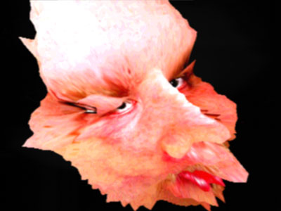
the Jackson five by Kewlers [web]
[nfo]
|
||||||||||||||
|---|---|---|---|---|---|---|---|---|---|---|---|---|---|---|

|
|
|||||||||||||
|
popularity : 70% |
|||||||||||||
alltime top: #2540 |
|
|||||||||||||
| added on the 2002-11-17 09:30:40 by kurli |
||||||||||||||
popularity helper
comments
now that's freaky
Jiseuss,
It's realy scary!!!
It's realy scary!!!
very very sweet evocation of an acid trip panic attack.
very nice monsters mapped with nosfe's face, a soundtrack that i definitely like + very clever/different accelerated rendering.
very very scary..
very nice monsters mapped with nosfe's face, a soundtrack that i definitely like + very clever/different accelerated rendering.
very very scary..
hmmm not only nosfe actually.. well watch the data directory :)
Reminds me of some Chris Cunningham's work on Aphex Twin music videos mixed together with Kooma style of approach. Some scary feeling indeed, I'm happy I didn't watch this late at night. :)
Piggie for not pushing the thema for any more (my guess is the normal "lack of time" again) and recycling the same gfx all over the demo length. However definitely worth watching and at least it's nice to see something decent submitted to Pouet.net for a change.
Piggie for not pushing the thema for any more (my guess is the normal "lack of time" again) and recycling the same gfx all over the demo length. However definitely worth watching and at least it's nice to see something decent submitted to Pouet.net for a change.
should've won the compo. though, flo's demo was also good.
i'm so pretty pretty pretty. :)
i'm so pretty pretty pretty. :)
fun, but not exactly great.
could've used some more ideas & effects.
could've used some more ideas & effects.
grimace
404.
404.
303
i like the faces, but all in all i think this demo is too noisy visually and the sound are best turned off.
tripod
Is this art? </flamebait>
A good idea, but could have been carried out better. Grew boring.
A good idea, but could have been carried out better. Grew boring.
any alternative url that works?
tripod links never work.
syke finske scenere ass. :)
yes
Some damn ugly people in there ;)
hm, couldn't really enjoy it. some stuff was nice tho.
I think there's something wrong with my monitor.
good idea, ok-ish execution.
That was some nice original 3D modeling. Definitely not just a scene fly-by! Scared the turds outta me...
Very nice. Everything fit together in the most hideous manner. Great.
My only complaint is the concept doesn't real hold up for more than about 2 to 2.5 minutes. Halfway through I was really wanting the demo to end.
Very nice. Everything fit together in the most hideous manner. Great.
My only complaint is the concept doesn't real hold up for more than about 2 to 2.5 minutes. Halfway through I was really wanting the demo to end.
Hummm... can't download it, site isn't up anymore!
(I know I'll have bad dreams of a distorted niko trying to do something really bad, like removing a bottle of beer from an out-of-balance rack of beers)
örrörr
kewl as only kewlers does it. and with some more 'serious' music this could've been a real killer :)
YOU GUYS SHOULD MAKE SERIOUS STUFF INSTEAD DEMOSCENE IS NOT ABOUT HAVING FUN!!
ouhyeah!!!
somewhat different idea, which is good. data directory makes me sad - those black & white faces could have been created/stretched in code, but no, lamely done in photoshop or something - and of course the 3 megs of someone snoring during the demomaking wasn't much of a soundtrack. I liked it but it could have been more, and for that no up... Innovative tho, just needed to be one effect rather than a whole demo.
those black and white faces are not photographs and no photoshop or such was used to make them look like they do.
sir, can you please put your bullshit back in the garbagetruck?
great idea and creepy as hell! :-)
plek: Go crack something, you 1337 w4r3z l4m4h...
To Scary for me :-) well, it was a cool show, but Variform vas so,so,so much better! (well i shouldnt compare...)
Well yes scary, original idea, I sort of liked it, but boring after a while. Wow, an art prod that gets the pig from me..
höhö. kökkötraktori tietää taas mistä puhuu.
sick and twisted facial mapping madness ... LoVED iT !!
my bizzle
plek is a war3z l4m3r? awesome
I agree that it's a bit too long but the idea is very nice and scary anyway. Good work.
Melwyn already said most of what has to be said: very Chris Cunningham + Richard D James. In fact, the textures for the deformed faces look a lot like a couple of more recent RDJ 'photos' :)
I *heart* this. Brilliant stuff, even though the music was a tiny bit of a letdown.
Nosfe: I assume this is done breaking the ancient rule of "don't move too much while putting your face on a scanner"? I have quite a number of those kind of scans from a drunken party :)
I *heart* this. Brilliant stuff, even though the music was a tiny bit of a letdown.
Nosfe: I assume this is done breaking the ancient rule of "don't move too much while putting your face on a scanner"? I have quite a number of those kind of scans from a drunken party :)
now that's emotional impact lol
great job, liked it alot :)
great job, liked it alot :)
omg it's frightening
60 seconds are enought for this kind of delirium, so it's become quickly boring
60 seconds are enought for this kind of delirium, so it's become quickly boring
This one is extremely cool. I will not attempt to describe it, but don't let small children watch this or they can't sleep at night :)
yeah I love that
cool demo.. wrong kind of music.
watch "house on the haunted hill", "the excorsist" and "thir13en ghosts" for inspiration.. :)
watch "house on the haunted hill", "the excorsist" and "thir13en ghosts" for inspiration.. :)
kewl
munaa
Scary shit :)
Ouch.
veeery scary! and cool idea! rulez like shit!
heads. nice.
fukking great!
I liked this. COuld have been better, but it was still good.
btw, i've seen an artist doing the same type of pics as the black and white distorted ones, using a fat naked middle-aged woman and a large piece of glass :) Modern art sucks :)
btw, i've seen an artist doing the same type of pics as the black and white distorted ones, using a fat naked middle-aged woman and a large piece of glass :) Modern art sucks :)
Did somebody say the pics were stretched in Photoshop ???
Looks like they had a Xerox glass plate licking session to me ...
Top marks for the 3VIL vibes ... Scarier than Michael and his brothers indeed ...
Looks like they had a Xerox glass plate licking session to me ...
Top marks for the 3VIL vibes ... Scarier than Michael and his brothers indeed ...
Someone please up it to scene.org, seems there's no working url anymore.
Ok, it's already there.
scary deformations.
this is better than remix
I really really would like to see more prods like this, mood-wise.
dunno
.... but don't watch it before going to bed!!
hrmmm what n3nomsoup said
YES
Still a remarkable, yet a bit repetitive concept demo.
Deeply disturbing.
for michael!
I remember thinking this was some strange shit back in the day.
This is so LOL!
i remember putting screenshots from this at all my co-workers machines desktops in the office just for fun )))
owns
not new variform 3 :(
Its horror AND humour
lists containing this prod
submit changes
if this prod is a fake, some info is false or the download link is broken,
do not post about it in the comments, it will get lost.
instead, click here !
