|
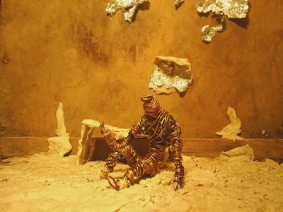
Give me Future or Give me Death by Inward [web]
[nfo]
|
||||||||||||||
|---|---|---|---|---|---|---|---|---|---|---|---|---|---|---|

|
|
|||||||||||||
|
popularity : 73% |
|||||||||||||
alltime top: #1026 |
|
|||||||||||||
| added on the 2008-03-23 17:56:56 by Claw |
||||||||||||||
popularity helper
comments
Hope this is the same inward as does the zx releases, sounds so from the music and the animation style but I'm not sure.
rulez added on the 2008-03-23 18:00:12 by Claw 
interesting and boring :p
This looks so great, but should have end after 2 minutes. It's way too long and make me nearly fall asleep as it seemed it will never end! Nevertheless here's my thumb for the first two minutes.
I feel this.
Despite being perhaps a bit long, it's fantastic.
Despite being perhaps a bit long, it's fantastic.
I've watched it 5 times already. The best video for me in the compo. Amazing expressivity, pure genius.
art
awesome
must have been hard to get it done Oo
must have been hard to get it done Oo
amazing! but a bit too long as everyone else said.
Boring but interesting. :]
rewlz hard!
beautiful! even though lyrics are cheasy!
Quite negative but interesting
not my taste. thumb for the effort
entwicklung
Very nice.
Great!
Great
A bit long but wickedly cool non the less.
this one was my personal favourite from the wild-compo. hope this will win. direction and execution are just awesome! kudos, mate.
I'm saving my vote because in the compo I thought it to be absolutely crap, but maybe that was due to my state of conciousness ;)
Very original and interesting.
a lot of work, amazing
'inspired' by a certain Tool video. i think this isn't very original and the soundtrack didn't quite get me. even if i'm a big fan of the YM and AY chipsound. nobody can deny the enourmous amount of work on the stop-motion, though. so, thumbs up!
Fabulous and extraordinary!
good stuff
very trippy
very good photography and direction. could mybe have been a little shorter, but hey, everybody is impatient during a compo. gotta watch it again.
Too arty for me. Surely much work, but the "music" is a turn-off and it's not very fluent.
original , very well done , (and a little sad)
Too arty for me. Surely much work, but the "music" is a turn-off and it's not very fluent.
i'll join the "maybe could've used some shortening" crowd, but... i got the creeps during the compo. literally.
Same here not my style =/
Not my style either. Depressing.
for the effort
creepy + nice.
Very well done and very underrated.
a little bit boring for me
absolutely fantastic. the creator/creation dilemma is worked out really good (especially considering how worn-up this topic is since hundreds of years, from the golem legend over frankenstein's monster to stanislaw lem). the colors are an eye-pleaser, the movements are dynamic, fluent and unpredictable. and the zx spectrum soundtrack is really haunting (can't you guys put up an mp3 of it?) the only negative thing was that it is simply too long. not only too long for the compo, but in general. the tension got lost due to the length.
Good, somehow depressing though. Was it done with stop motion and "real" stuff, or cg ?
afaik, stopmotion. but i guess elfh can tell more about the making-of as soon as he arrives back home.
The blurring between the frames gave me a headache :-/
Oh. Art.
Very, very good! Thanks for this.
Very nice! A bit too long, though.
Slightly too long but very well done and with a great atmosphere.
cool idea
interframe blending sucked. the rest was quite enjoyable.
they did it at last!
impressive and sensible.
i saw it alive ;)
impressive and sensible.
i saw it alive ;)
great anim guys!
looked nice... but much too long and a bit boring
oooooh its touching :]
i cant remember when i have seen a better video production at a wild compo.
Well, the message of the demo is excellent, but could have made better. Next time you dont pick up stuff you find on the sidewalk if you plan an animation, mkay? :)
I turn it into metaphor, of course, and maybe I shouldn't - but it is a powerful piece.
Just no, sorry.. Went to take a piss in agony when this was on...
nice work, but way too long and kinda boring. thumbs anyway.
I saw this on the stream. At first I thought it was pretty cool, but it dragged on way too long until it became unbearable.
quite a looooong haul....shorter would've been better
gave me the shit tripping
that one was really great for me. maybe a bit too long for the compo but then it has built that great atmosphere for me. good execution, well done! thanks.
Have to agree with Wade.
damn, didn't want to thumb it up ;)
intensive production with cool ideas like the cross-fading. story with context and everything. fucking fantastic! I'm hoping more animation productions from Inward :)
thumbs up for making a bunch of steel wire look like it has feelings
So intense. So aggressive.
my compo favourite. Very dark stuff and it gets inside your brain!
Was a bit too long at the Breakpoint, but It has something to remember. Modern Kafka.
i respect this from an artistic point of view, but really it dragged on too much.. it was like a demo with one or two parts but reused over and over to fill out the time.
Quote:
.The blurring between the frames gave me a headache :-/
my favourite from this compo, dark and moody and i was transfixed while this played on the bigscreen, i love this.
the music was like fuckin annoying, and the video itself was also a few minutes longer than necessary, but still, i liked it :)
i don't understand how this can so many CDCs so fast. I think it's faaaar too long...
Sadly i was sitting way too far behind on the stage so i couldn't escape it.
Why the fuck ever this was submitted at a demoparty completely escapes me.
As work of art itself tho, i can only second most ppl who posted before be. Very good work. And even the chip soundtrack fits in a twisted way.
As work of art itself tho, i can only second most ppl who posted before be. Very good work. And even the chip soundtrack fits in a twisted way.
elfh, somewhere where the audience doesn't consist of hundreds of drunk nerds who want to be entertained at all costs but of people with interest and patience. Where exactly this mythical place is, i don't know tho :( But let's keep our eyes open.
.
i liked it and i didn't find it as boring as other people. nice style too.
elfh: there are literally hundrets of animation festivals around the globe that are accepting international entries all year round (check for deadlines) ... you shouldn't have a problem finding enough compatible venues. if your film will be accepted is another thing tho ... ;) good luck!
reminds me of Tool videos
Should have ranked 3rd!
elfh, check out filmfestivals.com, shortfilmdepot.com and reelport.com for info and online submissions on filmfestivals.
kb, for some people at bp this was the only prod that made the whole compo worth watching. so i wouldnt say that it was in a wrong place. :)
kb, for some people at bp this was the only prod that made the whole compo worth watching. so i wouldnt say that it was in a wrong place. :)
I wish there would be some kind of stronger narrative, some forceful direction and better lighting (shadows!). It looks neat, but it interests so little.
i think i realized what the problem was with this - the look was so organic and then it was accompanied with chipsounds... i think some instrumented music would've fit better.
Regarding the music I have to second Gargaj, and while the style of this animation doesn't appeal to me, I have to give a thumb for the effort and for just being a bit different...
Art!
I have utmost respect for the work that has gone into it. During the compo I have to admit though that I was thinking "geez, how long IS this clip?".. and it was partly getting a repetitive. But elfh, you seriously have to get out there with this clip. I could imagine that at some filmfestivals this would be a soaring success. You should absolutely go for it. Please.
How long did you guys work on this? It's amazing.
How long did you guys work on this? It's amazing.
best production in breakpoint this year
I liked the style, and the tune is damn good... but the frame by frame animation seems a bit jerky to me.
What is it that everybody sees in this. It was too long, and had an ugly uglyness...
Very close to a thumb-down but as I had done a wrong thumb down once today, I'll better wait and have a 3rd look :)
Very close to a thumb-down but as I had done a wrong thumb down once today, I'll better wait and have a 3rd look :)
Great piece of work.
Crazy)
woah! excellent production! So much expression and the script is pretty neat.
fucking awesomeness <3
I am out of coup de coeur sadly. you deserved one!
brilliant! the lighting and the blur gives it sth i´m not able to describe...
wonderfully done, as if it's really alive.
wow
The low amount of frames and fading between them disturbed me a bit, as it was hard to recognize some movements. Other than that, absolutely kickass.
Verry impressive, despite its length
The length surely decreased the "fun factor", but if it was shorter it definitely wouldn't have passed the same kind of a feel of frustaration.
You rarely find scene productions as expressive as this.
meeh....I dont see the awsomness.
Looks like crappy random animating to me.
Is it the"its ment to be crappy, thats why its good" policy people are going for here?
Dont see the hype....booring.
Piggie for the obvious dedication and hard/long work making it.
Looks like crappy random animating to me.
Is it the"its ment to be crappy, thats why its good" policy people are going for here?
Dont see the hype....booring.
Piggie for the obvious dedication and hard/long work making it.
nice movie )
nice
true art!
Doesn't really appeal to me.
Like some others wrote this doesn't catch me and I'm somewhat annoyed by the sound and the "jumps" between the frames.
Piggie.
Like some others wrote this doesn't catch me and I'm somewhat annoyed by the sound and the "jumps" between the frames.
Piggie.
didn't like it at all...
exceptional job
The stop-frame effect is very annoying and so is the music. Piggie.
it's a bit too long, but i like it.
Genius
Due to the frame by frame editing it's really choppy and thus hard to follow, also the whole environment is somewhat harsh. But the technical aspects aside, this is really good. I really like the expressivity and atmosphere of this, and the music in my opinion fits really well here too.
It's a moody, atmospheric piece of animation, set to an ambient digital soundtrack, conveying emotions of frustration and hopelessness. Truly this is art!
Thumbs up for being progressive!
Thumbs up for being progressive!
Really touched me during the compo
different
A tad long, the blur was a bit annoying, and the scenes could have been more distinguishable. But I think the composition of the visuals and the music works well.
lists containing this prod
submit changes
if this prod is a fake, some info is false or the download link is broken,
do not post about it in the comments, it will get lost.
instead, click here !
