cel-shading like *old anime*
category: gfx [glöplog]
Dear all, *someone is using pouet in work D:*
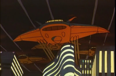
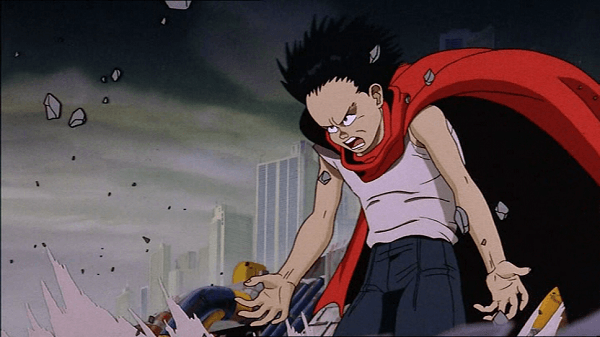
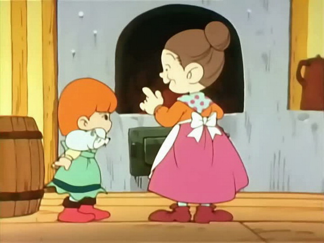
I was searching lately for best way of cel-shading which would have the same look and feel of old-anime shading. Most nowadays games use cel-shading managed to mimic cartoonish style. What I want is shading similar to the following:


I know that games like Ni no Kuni managed to mimic the way of shading but still in my opinion you can see a quite different in both shadings.
while I was searching I found someone who talked about difference between new and old anime shading and he mentioned 5-tone shading where each surface has 5 degrees of shading.

So anyone have tried or thought about this? any ideas?
I was searching lately for best way of cel-shading which would have the same look and feel of old-anime shading. Most nowadays games use cel-shading managed to mimic cartoonish style. What I want is shading similar to the following:


I know that games like Ni no Kuni managed to mimic the way of shading but still in my opinion you can see a quite different in both shadings.
while I was searching I found someone who talked about difference between new and old anime shading and he mentioned 5-tone shading where each surface has 5 degrees of shading.

So anyone have tried or thought about this? any ideas?
Simple 2D texture lookup maybe? One direction for N dot L and the other direction to tune the tones - modulate base color with result and call it a day. Maybe narrow where to sample in the N dot L direction with some ddx/y take two samples and smoothstep... 2 channels left for special fakery. Same idea for specular...
Probably relevant to your interests: GuiltyGearXrd's Art Style : The X Factor Between 2D and 3D
Ah, good old Paul "Otaking" Johnson. Lovely bloke, just don't get him started on this in the bar. ;)
similar thing was applied on XIII (the game), although stuff was lightly textured underneath these shades


You seem slightly confused. The example images of what you want have no shading at all, they're completely flat. Then you refer to the 5-tone stuff which is a completely different style than what you presented. I think you need to decide what you want first. :)
imo, 1d lookup for 2 tones only and a simple lighting rig comprising directional main source and ambient fill-in. the difficult bit is the inking, as nagz's godawful example shows.
also, I don't know if "region-of-interest-based inking" is a thing, but it maybe should be... or maybe additional hinting can be provided by mesh topology or vert properties. it seems like some sort of imagespace contour detection stuff might be an approach. in any case with the amount the look is dependant on view I'd expect a fair amount of imagespace stuff is needed.
or check out rime's shaders ;)
Quote:
You seem slightly confused. The example images of what you want have no shading at all, they're completely flat. Then you refer to the 5-tone stuff which is a completely different style than what you presented. I think you need to decide what you want first. :)
I think it has shading if you see the first image on his body there is 2 shades of color, also isn't flat shading part of shading ;).
To clear things out, I am interested in same shading as represented in the figs above.
I like the old Anime of the 1980s like Mysterious Cities of Gold, where each frame was hand-painted and they used the two- or three-tone shading for characters so they fit into the lighting of the scene better, and the fluctuations between frames sometimes due to variation of the colour paints - is that what you mean, OP?
I'll check things mentioned by guys, thanks :).
Yes Rime has similar style :o.
Yes Rime has similar style :o.
Quote:
I like the old Anime of the 1980s like Mysterious Cities of Gold, where each frame was hand-painted and they used the two- or three-tone shading for characters so they fit into the lighting of the scene better, and the fluctuations between frames sometimes due to variation of the colour paints - is that what you mean, OP?
Yes, this is what I am aiming for.
What the "rant graphic" above fails to mention is that the Eastern variety of limited animation might have been more colorful, but also very static and animated "on 3s" (8 fps), with no camera movement and with most action sequences relying on shifting animation planes. Western animation was usually for kids only and more simplistic and broad with colors, but with an emphasis on fluent movement instead.
(and as for the tech: tinker and tune phong; might need well balanced look-ups for the colors, as already suggested)
(and as for the tech: tinker and tune phong; might need well balanced look-ups for the colors, as already suggested)
https://www.youtube.com/watch?v=oBI0MU73nlc The characters in Dragon Ball Fighter Z are pretty impressive. I saw a talk ( from GDC ? ) about how they did it and the previous games of the studio.
My troll radar is bleeping in a confusing tone.
Out of the western animation available the author of the thesis picked some quite thrasy stuff.
And the same happens to the examples of newer eastern animation.
I'm pretty sure both new and old, eastern or western, all of them have their sitcoms and their legendary quality works.
But back to the original request, there is a method for the first two pictures and maybe one for the so called "5-tone" based on introduction-level openGL tutorials:
HERE'S THE BASIC PROCESS IN A (VERY) SIMPLIFIED VERSION:
CASE 1 - MAP SOLID COLORS -> SHADOW MAPPING, VERY LIGHT SHADOWS -> EDGE DETECTION
.
CASE 2 - DIFFUSE SHADING -> POSTERIZE DIFFUSE MULTIPLIER (4 LEVELS; LEVEL 0=BLACK)
->PHONG SHADING -> SHADOW MAPPING, VERY LIGHT SHADOWS -> EDGE DETECTION
HERE IS A MORE DETAILED DESCRIPTION
-The basic scene with the 2 characters on the beach can be achieved by skipping the whole diffuse shading and phong shading (the parts where the brightness of the surface is *smoothly* calculated comparing normals with the light direction vector) and applying shadow mapping with very weak influence, that is, parts covered by shadows won't be much darker than parts directly lit.
-A more ellaborate 5-tone scheme as mentioned in the third image would involve posterizing the results of the diffuse mapping so that the 32-bit float range is narrowed down to 4 distinct levels, the lowest brightness level being special in that any part of the image must be superimposed by black. Shadow mapping will have lower influence like in the previous case. Phong shading will not be bypassed this time though, as the highlights still need to be rendered.
Of course in both cases you'll have to apply edge-detection for the image and there are many ways artists do it: some shows have thick outer edges and thin inner edges for outlined objects; others have thin lines on edges overall; some of them apply lines on the whole image while others only do it on the characters and keep the scenario around them realistic. So edge detection will be a subject all on itself.
i checked google and there seems to be a classic method of contour detection where any fragment with its final normal in camera view beyond a certain threshold is turned to black.
sounds perfect for full enclosed objects but not so much for complex meshes because it relies on the borders containing fragments both visible and facing beyond the threshold.
Something tells me that overlaying a highpass of the final image's depth buffer will not only be more faithful to the art style but also faster to process in real time. The problem is if the high pass is picky nearby objects will share the same outline and if the high pass is too loose (high sensitivity) objects will have black spots and lines in unintended places.
Quote:
My troll radar is bleeping in a confusing tone.
Statements from a "king of otaku" may have that effect. ;) In case it's not obvious, Paul Johnson's examples are cherry picked for his agenda. Here are some other examples of old anime that don't match his argument, but they are similar to panic's examples on the other hand:


by the way, i watched akira and the most impressive thing for me was the variety of the futuristic landscape.
and less flat cel-shading is much sexier


i don't know, man, this orange spinning thing is too shiny, highlights are everywhere
http://www.gdcvault.com/play/1427/Style-in-Rendering-The-History
