|
Precious and fragile by Andromeda Software Development [web] & enoughrecords [web]
[nfo]
|
||||||||||||||
|---|---|---|---|---|---|---|---|---|---|---|---|---|---|---|

|
|
|||||||||||||
|
popularity : 67% |
|||||||||||||
alltime top: #3595 |
|
|||||||||||||
|
||||||||||||||
| added on the 2023-06-25 22:05:17 by Navis |
||||||||||||||
popularity helper
comments
Awesome work. Demanding and stressful colors. But all with style!
rulez added on the 2023-06-25 22:07:32 by gaspode 
Loved it at the party 👍
Very enjoyable glitchy visuals, especially in the first half.
Sweet surprise
solid demo navis! glad to have helped find soundtrack for this!
Remindz me of a daft punk video on acid
Too weird
wonderful!
first half was perfect, second half was slightly annoying.
next-level good
Solid ASD-style.
Hell yeah, ASD making _good_ demos again! Must've been amazing on the big screen. Fantastic soundtrack too!
I'm also delighted Kinects are still being used. I gave a away so many to artists over the last few years :D
Black screen on RX580.
cool style
What a nice surprise.
i'm not too captivated by the 'linkin park on downers' part 2 of the demo, but, well :)
hm, what maali said....was cool until the guitar and vocals started...destroyed it for me...
very intense visuals, excellent shader work, snappy and varied effects with great audio. nicely done Navis.
i tried to find something to enjoy here but i kinda failed. would have been a piggie but the colors are demanding and stressful indeed :\
the sudden music shift was a surprise (to say the least). i was like, did youtube just fire up in the background? :)
i like the overall mood + visual. that's some nice glitch/distortion shaders there!
but on the negative side: i cant see any connection between the kinect dancers and the music, or any reason for the moves they are doing or for them being there in general; the first half is a bit too simplistic; and the second half is too overblown - the screen is just flat colour blocks for too long so it loses the dynamics.
Thought this was cool. Definitely a demo of two halves. A bit like From Dusk Till Dawn in the 'What the hell???' department!
But lovely animations and great soundtrack.
But lovely animations and great soundtrack.
looks completly wrong on amd 6900xt.
yt version looks cool tho!
yt version looks cool tho!
Very cool.. bold choice with the music, I'm not sure if the demo was designed with that style in mind, but the increased intensity works, and I wouldn't be surprised if it were the official music video on Youtube. It can't all be oontz oontz. Bonus for coming up with a demoscene-y way to do your own motion capture rather than grabbing some off-the-shelf data.
Made with Notch.. just kidding. :)
Made with Notch.. just kidding. :)
okay
Nice ASD is back
Quote:
Black screen on RX580.
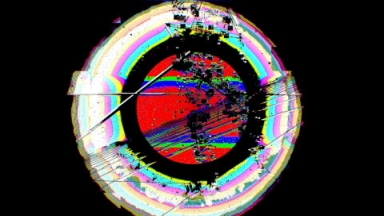
I have an RX580 and I did get visuals, but it doesn't look anything like the screenshot.

ASD RULZ
I really like the idea and the execution, unfortunately it's just 25% too much. Too much glitch, too much postprocessing and too much distortion. You loose a lot of the dancing which is pretty exceptional, i'm sure. However it felt like you wanted to hide recording artefacts, but i don't think there is anything that needs to be hidden. same goes for the post effects in the second part, it blocks 25% too much and clutters the view.
BUT:
It's still 125% cool though so here's my thumb :)
BUT:
It's still 125% cool though so here's my thumb :)
I really enjoyed it.
Sorry to say, but this was horrible. Felt no visual connection between the visuals and music. Music was also not my cup of tea. Colors were painful.
Cool! Refreshing!
YES! this is great stuff
ok
Didn´t work for me
Wonderful.
The transition into a color is sooo good.
I actually like this one
yeah! thanks for evolving!
Weird.
hmm, I'd probably say that the music doesn't pierce me and the visual also does not resonate with the music very well. also too much flashy colors.
cool stuff! idk about the mocap but it kinda worked here, i quite liked the colours and fx
loved it.
I precisely like how the visuals and the music work very well together while the connection is not obvious at first.
I precisely like how the visuals and the music work very well together while the connection is not obvious at first.
Music is not my cup of tea, but the visuals were great and the concept is much much better than "Anoxia Redux"
norm
oh wow! this is fantastic!
a bit short but awesome anyways
I missed that one earlier! You guys are on a roll! Fantastic stuff!!!
I love the music and the visuals are also astonishing again!
Very cool animations. Obviously, a lot of work went into them.
I also like the colors.
I also like the colors.
lists containing this prod
submit changes
if this prod is a fake, some info is false or the download link is broken,
do not post about it in the comments, it will get lost.
instead, click here !
