|
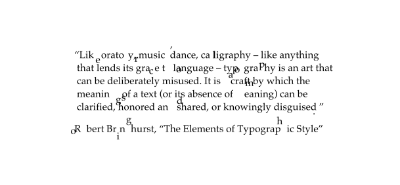
Bad Kerning by Dekadence [web]
[nfo]
|
||||||||||||||||
|---|---|---|---|---|---|---|---|---|---|---|---|---|---|---|---|---|

|
|
|||||||||||||||
|
popularity : 60% |
|||||||||||||||
alltime top: #9855 |
||||||||||||||||
|
||||||||||||||||
| added on the 2019-06-16 09:20:56 by ricky martin |
||||||||||||||||
popularity helper
comments
my favorite from the compo. gosh darn that kerning
rulez added on the 2019-06-16 11:57:15 by waffle 
I hope this UIKit madness never stops
iLike
I love this. My favorite of rm’s minimalism demos.
Also thumb
nice idea ,well execu teda nd i lik edthe musi c!
Annoying and yet so pleasing at the same time! :D Great work!
The music is fantastic.
very yes
audio love
audio love
th b p
m u
u
m u
u
Code:
k e r n i g
e         i
r         n
n         r
i         e
g i n r e k
Nice, but fails to act on its premise. The kerning (where applicable) is proper. Would have been more interesting if its main actor were to be distorted text instead of letter soup.
Nice little UIKit iOS demo with font playing
Fonts are nice! Very cool!
Solid stuff :)
Original and very well executed! Great!
Simple idea well executed.
Slick.
I would have thumbed this up if it wasnt for the fonts rotating like a flat polygon. if each individual font had been rotated and translated in 3d-space but facing the camera instead this would be perfect.
pay attention to details.
pay attention to details.
I like it!
Short and sweet.
pay attention to details.
Kernig
neat
ok
Quote:
not that i have to justify every creative decision to some condescending dork on pouet, but please pay attention to the nfo:
Thats not how it works here:
* You WILL get condescending remarks.
* YOU WILL learn to love them
* You have to do it how the elders say or else. Take the "should have done this on Amiga" comments. >_>
Heaven forbid if you do something how you wanted to do it, ffs.
submit changes
if this prod is a fake, some info is false or the download link is broken,
do not post about it in the comments, it will get lost.
instead, click here !
