|
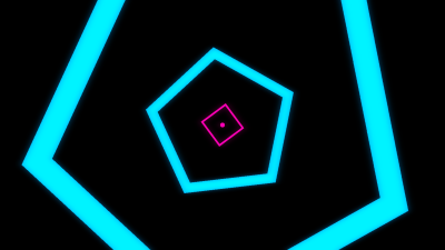
What Are You Syncing About? by Ninjadev [web]
[nfo]
|
||||||||||||||
|---|---|---|---|---|---|---|---|---|---|---|---|---|---|---|

|
|
|||||||||||||
|
popularity : 74% |
|||||||||||||
alltime top: #782 |
|
|||||||||||||
| added on the 2017-04-17 11:37:45 by iverjo |
||||||||||||||
popularity helper
comments
One of my favourites from the compo, so damn fresh!
rulez added on the 2017-04-17 12:06:16 by gloom 
what gloom said
Jup, what gloom said!
great!
Really great stuff!
best prod yet!
Great work guys! Best prod you've made thus far :)
Forgot to thumbs up, here it is :)
fresh look, nice syncs and transitions!
Congrats on the 4th place and thanks for the preview 😉 as I told you already, you did a really cool prod with a nice vibe!
I really liked this one. Very nicely done.
The pink light on the blobs with the heaxagon background looks much better. The loader and ending are much better too. Well done!
Very nice!
The same fresh style as your previous prods but with more maturity & polish: love it.
Very good sync! Superb!
Great demo, amazing progress, and very fresh!
This is one was incredible!
Fresh is the word. I liked this a lot!
Would absolutely not have been a steal if it placed higher.
Would absolutely not have been a steal if it placed higher.
Shit bag démo......C64 prod ? :)))
Very well done!
One of my all-time favourite demos of revision '17. Excellent work!
My favorite from the compo.
That was one epic trip. Good job!
Well that was absolutely lovely! :D
Very cute. The music sounds like a Japanese racing game, for some reason.
Superfresh! Really loved this extremely polished show. Awesome transitions! Deserved a higher place imo.
Really enjoyed this!
tune got stuck in my head
Super fun!
Ninjadev keeps on in the same style, but somehow it just keeps getting better. Simple, but it works.
Probably my favorite demo of the compo, the direction is bang on without a question. Also, as a sidenote, finally a demo that's "simple" enough that you can show to a beginner and say "hey, you can build something really cool from basic elements and a bit of finesse".
Aweome show! Excellent tune, nice transitions, lovely effects. What's not to like?
what a slick presentation, rocked the compo with style, top notch!
Lovely sync!
Very fresh with loads of nice scenes and transitions + music to dig! One of the best JS prods I've seen.
Oh yes
Absolutely brilliant! Really one to watch again and again.
Everything about this is just perfect. This screams "demo" like few demos do.
very enjoyable! nice oldschool vibes but always fresh, no single shot overstays its welcome and somehow even the color scheme fits. everything about this is just done right. definitely the best browser demo so far.
i sync its very cool
Splendid timing. Also what cupe said
:)
super clean
Amazing guys! Wish I could have been there.
Dat syncing.
Dat syncing.
Cute and neat! Great sync and colours. I especially like the music and that piano-roll spaceship.
Great
Best ninjadev prod yet, you guys are starting to really nail this :) really fun prod!
synciesync! spot on!
Haha, that soundtrack, so bubbly, I think you are physically unable to not like it. :)
What everyone else said, basically. Love the colors and the sync (even if IMHO you missed the one or other nice chance the music gave you), and that B&W 2D->3D transition in the middle is just perfect. :)
What everyone else said, basically. Love the colors and the sync (even if IMHO you missed the one or other nice chance the music gave you), and that B&W 2D->3D transition in the middle is just perfect. :)
Won't run for shit on my piece of junk PC, but had the YT video playing in the background since it became available. =-)
Melon Dezign is back???
This is my kind of demo! I could watch stuff like this over and over again (and I probably will).
One of the few memorable demos in the compo IMO
Though the music is not really my cup of tea, the whole presentation, flow, transitions are so perfect, that it's impossible to not thumb up
Though the music is not really my cup of tea, the whole presentation, flow, transitions are so perfect, that it's impossible to not thumb up
This is definitely Blueberry-style demo. I'm sure he'll watch it over and over and over and over again. Kinda agree with Sagacity, the music has a strong Japanese game feel, especially when those delicious jazzy chords came in. Lovely! The game part is great, and even if it's not a new idea (remember seeing it in Delirium demo by Deform for the first time), I really enjoy it. The only think I dislike is this terrible, MIDI'sh sounding flute :)
I absolutely love the syncs, colors and the music in this! Great web-demo that proofs again that web is a serious platform for demos. Continue the awesome work! <3
Great with a super tune!
Fuck yeah, so super fresh and perfectly synced. One of my favorites too.
Btw, noticed this on the bigscreen and again watching at home. It seems on some scene transitions, there's a small lag before the next scene begins. Looks to me like typical shader compile lag/state baking the first time you draw a new scene, or like rendertargets aren't initialized until a scene's first frame or something. Perhaps you need to prerender a frame of each scene offscreen during loading?
WOW!
my favorite from all revision!
my favorite from all revision!
this is just great
Cool synchro, fresh visuals, great tune! Good work.
i adore its playfulness
Highly enjoyable oldschool meets newschool style with a super consistent execution - instantly feels like home :)
Has a nice fun synthwave style to it without getting too retro/nostalgic. Points for the ad reference in the title. :)
Very nice even on my anicent 64-bit W7 HPE SP1 box with ATI Radeon 4870 video card (512 MB of VRAM).
So damn good! Totally love the style and the polish. Definitely the most enjoyable compo entry for me.
I apparently commented on this but forgot to set a thumb. So here it is!
simply adorable!
i need warm socks because this shit is so damn fresh!
Really cool!
(the minecraft-like scene wasn't much interesting though, imho)
(the minecraft-like scene wasn't much interesting though, imho)
Why was this in the PC demo compo?
What happened to the web / javascript demo compo?
What happened to the web / javascript demo compo?
a little yawn :/
I enjoyed it and it works like a dream on my iPad aswell. ;)
Don't know about fresh tbh... it's well executed for sure but isn't this stylistically out of fashion by now? The overall visual design is certainly more than passable especially by demoscene standards, but for me personally it's hard to get excited about. The "direction" or whatever you wanna call it is solid and elevates this from yet-another-neon-retro-extravaganza to slightly higher territory. Still, a lot of the synchronization is a bit banal, as most of it is just directly tied to either the drum rhythm or melody line. That's not to say there aren't some delightful details too but I find most of the intra-scene content to be very mundane both as far as the visuals and synchronization go. Just triggering the same parameter repeatedly by a note doesn't do it for me.
My favorite part is the cylinder one early on that reduces a 3D scene to two dimensions. There's a lot more to explore in that territory.
There's a lot of quality here, but it's not my taste. That isn't to say I don't want to see more from you guys. You've done a crazy amount of progress in a short time, so at least have a fat imaginary thumb for that

super fun!
loving it! great visuals perfectly synced to a catchy tune. (i got it stuck in my head last night, btw. :)) )
One of my personal highlights from Revision.
one of my favs from the demo compo ;)
♥
I think the direction works quite well, but the music is the real thing here.
Some great scenes, some not so good, overall lovely mishmash, even if you ignore the platform.
Great one! Super stylish and a funky tune!
fresh af, this truly rox!
nice
In my opinion the best prod from revision. Really enjoyable trip!
The rest of the demo doesn't live up to the geometric perfection of the first minute and the last scene, but this was very cool nevertheless.
Love it, and the music is so catchy <3
Fresh! Lots of nice transitions and good flow all the way
really makes u sync
yay!
so basic yet so entertaining and mood-uplifting! ♥
although the colors fitted they could have been a lot better, tho! :p
so basic yet so entertaining and mood-uplifting! ♥
although the colors fitted they could have been a lot better, tho! :p
I really enjoy the happy-go-lucky ninjadev style. This was awsome!
Nice happy demo and nice music
YES! This is good stuff!!!
One of best demos of 2017
yesssssss
generic design, awful colours, cheesy music.
startup part is ace :)
Yay, awesome prod!
Great sync! Enjoyable, and a worthy spiritual successor to Everyway.
Cool one! I'm with Preacher here. The 5th (counting the screen shots) scene falls a bit out of place and could have been improved by some background like scene #7. The mine craftish scene didn't really fit at all and in #10 the color-scheme wasn't matching the other scenes.
Still a great, fast, happy demo with a nice tune!
Still a great, fast, happy demo with a nice tune!
fresh 'n synch like i love ! Music is very good.
I missed this one! Very nice!!
I synch it’s awesome
my favorite!
Completely awesome!
Wow, this is a perfect prod!
lists containing this prod
submit changes
if this prod is a fake, some info is false or the download link is broken,
do not post about it in the comments, it will get lost.
instead, click here !


