| Naturally Undead | ||||||||||||||
|---|---|---|---|---|---|---|---|---|---|---|---|---|---|---|

|
|
|||||||||||||
|
popularity : 59% |
|||||||||||||
alltime top: #9668 |
|
|||||||||||||
| added on the 2016-08-14 13:24:37 by ponk |
||||||||||||||
popularity helper
comments
starts a bit weak but overall quite nice
rulez added on the 2016-08-14 15:48:53 by sensenstahl 
Very good
Nice!
Liked this a lot. Fresh colors, cool effects. Well done!
Silky smooth animations, nice flat shaded aesthetics and a great tune!
Extra points for very good performance, open sourcing and platform :)
Extra points for very good performance, open sourcing and platform :)
I deeply dislike the black background, but the rest is really nice. Well done, looking forward to more from you!
I like it.
Fantastic effect(s).
not bad, it reminds me a bit of early Traction stuff. only that humanoid that 'rides the snake' was a terrible idea to add :)
Fresh.
A hint of texture, even using a subtle overlay, would be nice.
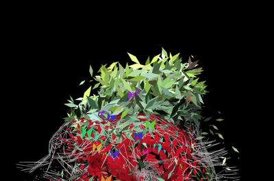
It is messy visually with the wireframe, leaves, and the moss effect. It might look nicer without the wireframe and with a diffuse light on the moss effect.
A hint of texture, even using a subtle overlay, would be nice.
It is messy visually with the wireframe, leaves, and the moss effect. It might look nicer without the wireframe and with a diffuse light on the moss effect.
Really ilked this1, very contemporary looking and fresh. Glad to see someone thinking outside the typical demoscene territory.
missing thumb
Enjoyable scenes, and unique effects.
Aaaaaaw, I was literally going "don't end now please, I'm about to really enjoy this" :( Shame it runs out of energy so soon.
Ohh beautiful :O That fluidity. That music. ♥
Special thumbs for "runs smoothly on my potato" and "1st demo"
Special thumbs for "runs smoothly on my potato" and "1st demo"
I liked to this prod on the big screen during the compo and was surprised to see this kind of effects in a fullscreen WebGL demo. You deserved a better rank to my opinion. Good work. Keep going.
Awesome first prod.
For a first demo this is an awesome start. Coherent direction, good contrast, and just enough movement. Also the tune was nice. The models as well. But the font and the human kinda ruined it for me. Oddly enough I only found the human shape out of place when I watched it at home. I didn't like the font at the big screen, but there is more than enough to compensate, even without this being a first demo. Technicly kinda superb for a browser demo. If you start with this I'm wondering what more will follow.
Any chance of a video cap? Or is there some trick to run this? I just get stuck with a spinning cube saying loading assets, but it seems they never load. :(
Awesome.
not bad to be a firstie
I really liked this one. fresh and well executed. The butterflies felt a bit cheap though, and the lines (though anti-aliased) still have some aliasing that is distracting... maybe you did the AA in the wrong color space (gamma)? The middle part with the leaves growing and flowing has a nice impressionistic feel. anyway: more please!
Not the best video capture or anything...
But here ya go :)
https://youtu.be/9P_rd8G8xRA
(Great production btw!)
But here ya go :)
https://youtu.be/9P_rd8G8xRA
(Great production btw!)
new
Looks cool.
nice, a bit dull, though
nice enough
Moody and original.
submit changes
if this prod is a fake, some info is false or the download link is broken,
do not post about it in the comments, it will get lost.
instead, click here !
