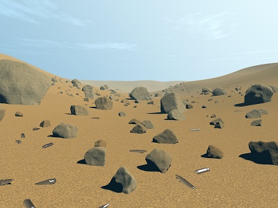
|
Wind Down by Tomasz Dobrowolski
[nfo]
|
||||||||||||||
|---|---|---|---|---|---|---|---|---|---|---|---|---|---|---|

|
|
|||||||||||||
|
popularity : 65% |
|||||||||||||
alltime top: #5144 |
||||||||||||||
|
||||||||||||||
| added on the 2015-10-04 01:25:42 by tomkh |
||||||||||||||
popularity helper
comments
For the marvelous music reminding me Faithless.
Cool.
Quote:
Also I'm not sure 8k is the best category for delivering a message (or for anything - but that's a different discussion).
Oh - come on! ;)
I don't see any problems with 8k's.
This is not really much for 8k, but it looks pretty nice - I don't think that this one was about massive sizecoding at all.
Of course.
Simple but nice enough. I really liked the music. Runs a bit slow for me in fullscreen but I still enjoyed it anyway.
no rocks/shells here but I saw it on the stream and it looked very nice. music is also decent. in the end it is a kinda very boring flyby. but (weak) thumbs up for motivational reasons and not having coder colors! :)
laggs a bit on my double centrino with hd4500 :) but ok for cool prod and i will try on i5 at my appartment
thanx !
thanx !
Quote:
Also I'm not sure 8k is the best category for delivering a message (or for anything - but that's a different discussion).
What a fantastically arrogant bullshit. Anything can deliver a message, and this one does it rather spectacularly.
fuck webgl...but thumbs up, it was nice! :)
second Gargaj on the floor texture, but with a thumb ;)
Nice tune
Quote:
Same here.no rocks/shells here
what's the message then? there are gun shells on Mars?
Nice to see you active again tomkh ! :D
Keep it going.. suboceanic was very nice!
Keep it going.. suboceanic was very nice!
meh
Good message, good execution. It's rough around the edges but still, props for making a tinytro with a message!
Ambitious. Good work.
Good work indeed. I like the atmosphere of this and the scene looks good as well.
What riminia, cce and TomoAlien said.
tomkh: FF here. No error message.
the stones look great.
I wondered the same as Maali, but if the message really boils down to "war sucks", then I find it very banal. The visuals didn't impress either, even for the size.
I like the music and the atmosphere°!
Some more text besides the credits would help to get the message across. In a couple of years few will be able to put it in context.
Rocks gonna rock
Pretty good, the geometry is nice looking for a distance field. Nice tricks employed for it (far beyond what I could come up with). Stuff like the low resolution texture and the too obvious details with the noise function are a downer though. It makes the technique way too obvious and distracts attention away from immersion and the actual message. It's ambitious though, glad you went with an actual concept in this small size.
The terrain texture was really painful to look at, rest was nice.
Mars!?
Hmm, no music in my Mozilla's SeaMonkey v2.33.1 web browser. :(
Nice production, but seriously wtf!?
Thanks for "making of", it's always pleasure to read a story behind the demo.
in short: i really like the direction it is going, just more blood next time
do not have to be literally more fluid or stains, only - it is not as dramatic as it could be
a motivational piggy, keep up the good work, sir
do not have to be literally more fluid or stains, only - it is not as dramatic as it could be
a motivational piggy, keep up the good work, sir
The discrepancy between sand and object geometry is jarring. Not only the dune texture but also the whole terrain could have used a layer or two of noise.
That said, I have no problem with delivering 'messages' in any size category, even if this one doesn't really do it for me. Ambition is always good.
That said, I have no problem with delivering 'messages' in any size category, even if this one doesn't really do it for me. Ambition is always good.
No objects here either: only the sand terrain, the pool of blood, and the white flag. Chrome 48.0.2564.116, FF 44.0.2.
Maybe this means something to you!
nice
The shadows are really weird... and the textures are very obviously just generated noise. Not necessarily a problem to have generated textures or imperfect lighting but those two things were really distracting.
nice enough
meh
A minimalist and surprisingly emotional 8k journey. Wind Down trades flashy effects for atmosphere, taking us through a lonely desert of shifting sands and subtle hues. The slow tempo and reflective soundtrack give it a meditative edge—like watching the end credits to a game that never existed, but somehow feels familiar.
In a way, it echoes Desert Dream—not in technical ambition, but in emotional tone. Both evoke a sense of solitude and introspection, though Wind Down does it with a fraction of the bytes. Constraints breed creativity, and this piece proves it with elegance. Haunting, in the best way.
In a way, it echoes Desert Dream—not in technical ambition, but in emotional tone. Both evoke a sense of solitude and introspection, though Wind Down does it with a fraction of the bytes. Constraints breed creativity, and this piece proves it with elegance. Haunting, in the best way.
Quote:
nopemeh
submit changes
if this prod is a fake, some info is false or the download link is broken,
do not post about it in the comments, it will get lost.
instead, click here !

Also I'm not sure 8k is the best category for delivering a message (or for anything - but that's a different discussion).