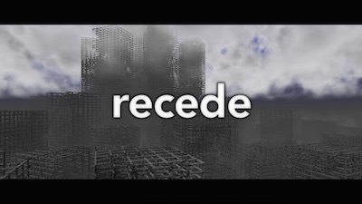
|
Recede by The Digital Artists [web]
[nfo]
|
||||||||||||||
|---|---|---|---|---|---|---|---|---|---|---|---|---|---|---|

|
|
|||||||||||||
|
popularity : 62% |
|||||||||||||
alltime top: #8707 |
||||||||||||||
| added on the 2015-08-01 20:13:26 by firehawk |
||||||||||||||
popularity helper
comments
My favorite 4k from the compo and nice music :)
rulez added on the 2015-08-01 22:19:03 by Queen_Luna 
nice!
Clear-outline fonts, progression, who needs more?
nice overall concept and nice to see others than windowses competing in this category.
Great feeling and cameras, it's a shame it's mac only.
The MUSIC. Neat distance field too, but that green color is pretty far from appealing...
Nice concept, great music.
what Drift said
What Frequent said.
very good one. minor flaws in camera paths and details. maybe just subjective?
the camera paths were really weird. the design is simple and top notch.
great !
fails to work on my iMac (2011 - El Capitan)
Compatibility version runs fine on 10.8.5 and manages ~15 FPS on an Intel HD4000 Macbook Pro. Just FYI. :)
Neat intro! Heaps of atmosphere, cool effect, & great music for a 4k. Some of the camera motions could be smoother (jerky turns) but that's a really minor nitpick.
Neat intro! Heaps of atmosphere, cool effect, & great music for a 4k. Some of the camera motions could be smoother (jerky turns) but that's a really minor nitpick.
Finally watched this on a real machine, MBP 9,2 with Intel HD 4000, OSX 10.10 Yosemite, the compo version 1280x800 worked. It's kind of watchable. Very long pre-rendering. Nice atmosphere in the music, though the sounds are a bit too harsh for my taste. Visuals are nice and atmospheric as well, but somehow harsh, just like the music. I'd cut off some edge off the trebles and add reverb, whatever that means for visuals.
distance!
nice
submit changes
if this prod is a fake, some info is false or the download link is broken,
do not post about it in the comments, it will get lost.
instead, click here !
