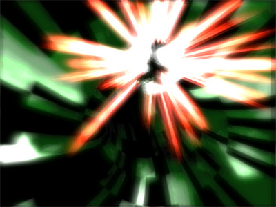
| No way back by Traction [web] & Ümlaüt Design [web] | ||||||||||||||
|---|---|---|---|---|---|---|---|---|---|---|---|---|---|---|

|
|
|||||||||||||
|
popularity : 65% |
|||||||||||||
alltime top: #5924 |
|
|||||||||||||
| added on the 2006-04-17 15:23:32 by Spewk |
||||||||||||||
popularity helper
comments
cool
rulez added on the 2006-04-17 15:24:26 by Spewk 
Eye & earcancer
nice sync and good music.
and I liked some effect.
however, simple flow.
and I liked some effect.
however, simple flow.
one of the best entries in the compo but i prefer "normal traction" better ;)
i like it
not much love with the framerate.. still deserves a thumb
clap your hands say yeah yeah yeah!
Very nice (don't believe the ugly screenshot!) Deserved better than #11 imo.
much better than the screenshot.
I won't be as critical as Preacher was about this prod, as I'm relatively happy with nearly all the 2d-graphics made. Altogether I have to agree with Preacher on what he said (dunno about the codework, not my expertise). In retrospect, it might have been better to release this at a later occasion with a lot more fine tuning. Or not. Oh well, I hope we'll be bringing you better entertainment next time. Thanks to everyone at BP06 who voted for NWB.
it have some nice visuals but not the best preacher's demo
no no no no no!
energy less pump demo.
cant stand it.
energy less pump demo.
cant stand it.
like some parts of it :)
Some parts are good :)
visuals were average but the soundtrack really kicks!
it's all go, kool-demo-shock.
well rendered, demoish enough for a thumb; except not my kinda thing.
well rendered, demoish enough for a thumb; except not my kinda thing.
Not a bad demo, some nice effects and sync. Some parts are ugly and don't fit at all though. The music is MUCH too boring and repetitive for me. Definitely deserves NO thumb down yet not thumb up either. So here's the oink oink. :D
I liked it on the bigscreen, i guess it was too flashy and fast to notice its flaws :)
But now that i watched it at home, two words come to my mind: chaotic and oversynced.
I dig the music though :)
But now that i watched it at home, two words come to my mind: chaotic and oversynced.
I dig the music though :)
Interesting enough, so a thumb up, and good music :)
Hmmkay, some crap to me. But nice visuals and not-so-boring direction.
I say rule
I say rule
Music was great, but minimalistic "traction effects" with glow and colors didn't do it for me.
it was energetic show.
simple deployment.
but very good effect and music !
I like this hot rythmical demo very much.
I execute this over and over again !!
but very good effect and music !
I like this hot rythmical demo very much.
I execute this over and over again !!
eh
Hana-bi! (fireworks)
errrm, no.
sorry, but changing camera every beat does not make dull effects any better.
preacher: nope, sorry.. i'm months behind in demo watching so i'm catching up with bp06 stuff now. :)
preacher: nope, sorry.. i'm months behind in demo watching so i'm catching up with bp06 stuff now. :)
no way... go back !
nice fast music and some effects were very nice. The lightning sphere and raining slab.
Uuuuh, I could love this one, if it wasn't for the speed of the visuals. The music is very nice, but the visuals try to keep up with the pace of the tune, which, in my eyes, is a big mistake. There's almost no time to enjoy the beautiful effects and the colours and it just plain bugs me!
Repetitive music and too much sync error.
a bit too hectic and plain in the visual department, but I really like the soundtrack for some reason.
Slight thumb up.
Slight thumb up.
kick-ass
up
Took me a second run to notice the sheer amount of effects one is bombarded with, it doesn't spare to throw them into your face for a second to just go to the next one - holy shit the work this must have been.
The sync is spot on, and the fast paced action surely shows in the visuals as well, no time to stand still the next effect is on already. I loved the glow stick explosion, and the two horned man made out of lines - some of the 2D art is enjoyable as well - a bigger slice of the cake goes to the tune.
Cool one!
feel free to do so =)
still a nice prod anyway =)
still a nice prod anyway =)
Yeah it's a mess. The constant flashing and camera cuts on every bass drum beat makes my head hurt towards the end. The scene with a wireframe fairy was pretty cool, though.
euphoric as fuck. gargaj's best track
wow I thumbed that down?
clearly the thumb should have been the other way around :(
sorry guys :'(
clearly the thumb should have been the other way around :(
sorry guys :'(
submit changes
if this prod is a fake, some info is false or the download link is broken,
do not post about it in the comments, it will get lost.
instead, click here !
