|
light 2 by Illi Recentes ImperatoreS
[nfo]
|
||||||||||||||
|---|---|---|---|---|---|---|---|---|---|---|---|---|---|---|

|
|
|||||||||||||
|
popularity : 66% |
|||||||||||||
alltime top: #3549 |
|
|||||||||||||
| added on the 2003-04-21 10:33:45 by uns3en_ |
||||||||||||||
popularity helper
comments
Excellent! Please don't change your style.
One of the three winner demos of breakpoint. I really like this demo, one of the best IRIS stuff ever done!
Wow! I am impressed by this little demo. It seems that Iris finally decided to leave the oldskool behind and create a modern looking demo.
I really love it, especially the second part with very cool effects, fab music and atmosphere. (little) negative points would be too short (meaning that i wanted to see a lot more from this quality), the linking between the two parts could have been done a bit better (with a picture for example) and i wish they used another font!
BUT definately the surprise from Breakpoint. BIG respect to Dr.Doom who not only did the complete code and created some very cool effects, but also for the stunning pixelwork!
Really hope to see more of this in the future. Very nice.
Excellent demo. Best I've seen from Iris.
After seeing Magia, I can genuinely say that I preferred this. But I feel I need to add that the generic 2col fonts (as in a few Iris demos) give it a bit of a 'cheap' quality in some places. That's my only gripe.
i liked this one best of the amiga demos at breakpoint. very good!
Cool design, nice music and that rose is lovely.
Opened eyes. 'light 2' IRIS.
Beautifull.
Beautifull.
Not as good as Quest though
Iris roxxor!
Great demo, with very nice design/synchtros (The thing I miss). It's nice to see that Iris kick some ass, I liked some of it's older demos..
I preferred this over the MaWi demo.
thumb up for the cool reflective balls effect. A great leap forward for iris..
video version please!-)
Indeed, very nice demo. The competition was just a bit to hard ;)
I like it
Rocks!
Good one.
Extremely nice! Cool code, very nice graphics, a fitting soundtracks and a totally cool credits part. I want more!
geiles teil!
I really like the credits part
why there is no video? :-p
There is a youtube video now.
http://youtube.com/watch?v=s6c_TfBtm-U
Excellent.
yes
excellent demo. Missed out on this when it came out :/
Nice synchro in the first part, nice visuals, altogether a very good prod.
indeed
I like it. Keep up the good work.
Music in the second half, so good.
<3
This is actually quite nice. I could be cool to see an Amiga comeback from Doom (and the other Iris guys for that matter), but I doubt it will happen.
the voxel-part kicks ass
*voxel-space
and here is a deserved one
Very nice bubbles
Excellent demo
Where the LIGHT is IRIS? Very nice production!
For the second part.
Quality demo as always from IRIS. Another youtube link
This one is close to perfect!
.nice one
Wonderful.
Yep rulez all over the f&*n place!
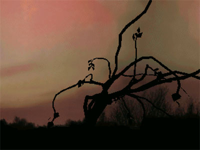
Is the tree realtime?
nice
Yep
submit changes
if this prod is a fake, some info is false or the download link is broken,
do not post about it in the comments, it will get lost.
instead, click here !

keep up the good work monkeyman.