|
E - Departure by Ctrl-Alt-Test [web]
[nfo]
|
||||||||||||||
|---|---|---|---|---|---|---|---|---|---|---|---|---|---|---|

|
|
|||||||||||||
|
popularity : 70% |
|||||||||||||
alltime top: #2600 |
|
|||||||||||||
|
||||||||||||||
| added on the 2010-12-29 03:11:28 by Zavie |
||||||||||||||
popularity helper
comments
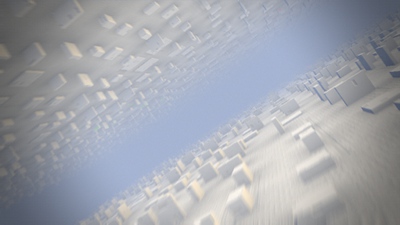
i really liked the dark part, that looked a lot better than the bright one... could also have used a bit more variation.
added on the 2010-12-29 03:12:16 by Saga Musix 
First I was like  but then I was like
 but then I was like
xernobly: exactly. I love blinken cube-city lights :-)
got better towards the end, but it all remains a bit too static
what xernobyl said
Boring.
Oh, wait. I this is a 64k? I thought it was a 4k...
Only one scene in 64k is allowed only if it is really great scene. Otherwise people will be bored. The only reason why I do not thumb it down is really nice camera movement.
Simple and enjoyable
Incredibly boring. Except for the music there's nothing I like here.
Nice music. Single scene with buildings. But looks very nice.
There is things to say, but the camera rules.
Not bad demo (even good) but it missing something imo.
The dark part with blink colors is nice maybe this effect would have been much eye candy with raylights or light traces.
Camera path is groovy.
The dark part with blink colors is nice maybe this effect would have been much eye candy with raylights or light traces.
Camera path is groovy.
nice ambience
Cool static geometry. Day part got a bit too long, but then dark part came :) needs moar glow, though ! :D Zic is nice too.
Demoish baghdad houses


.
Only a single scene, too simplistic textures and meshes, not enough for 64k after all, but I also like the camera paths.
Would have deserved more polishing. Still, there is a nice atmosphere.
doesn't look too good, but has nice music and perfect sync.
I absolutely loved the un-demoish-ness of it, but I refuse to thumb it up with that font.
what eyebex said
nice
Like it !
Great music & Camera paths !
Great music & Camera paths !
what? demolish MORE bagdhad houses? :S
nightime rulez, music rulez :)
Only one scene and nothing moves, but the dark part and the music were great.
feels like this could have been really good with some more time spent on it. the cameras and the motion blur save it from a thumb down
That music is excellent (and going on my mp3 player). The dark scene is the better part of the prod.
Youtube video: here
(submitted to fix me thread)
Youtube video: here
(submitted to fix me thread)
loved the dark/fluorescent lights part
the lights are black here... :(
What Stan said about the only scene.
Elseway, music is awesome, and you made a nice job with the camera.
Elseway, music is awesome, and you made a nice job with the camera.
zavie: Core2 Quad, Vista64, GeForce GTX 480
Cyborg Jeff in 64kb = surprise.
Also I like the night scene.
Also I like the night scene.
Nice music
Wow, concentrating on a single static scene and only working with camera and lighting requires some guts. Considering this restrictions, the result is quite nice. I have to try this some time ones we are back on track with our engine.
Regarding the direction, I would recommend to tell a little story like "light and dark are equal", "nowadays everything is too fast", "rotating black and quickly gives birth to color", and use the visual tools (camera, lights, shading, textures, color, fog, motion blur strength, noise, etc) as characters. When watching your product, ask yourself "what's our story?" and how could be tell it more daramatic. This is only your tool for consistent design decision. Your audience don't need to get it (necessarily).
Regarding the direction, I would recommend to tell a little story like "light and dark are equal", "nowadays everything is too fast", "rotating black and quickly gives birth to color", and use the visual tools (camera, lights, shading, textures, color, fog, motion blur strength, noise, etc) as characters. When watching your product, ask yourself "what's our story?" and how could be tell it more daramatic. This is only your tool for consistent design decision. Your audience don't need to get it (necessarily).
cool
Quite nice.
I know it was hard to code while some people were playing pinball! =)
As I told you on the partyplace, some ribbons or particles in the middle of the demo would have give more interest. It was getting boring until the darker part which is awesome.
As I told you on the partyplace, some ribbons or particles in the middle of the demo would have give more interest. It was getting boring until the darker part which is awesome.
and I liked the music too. Very addictive.
well crafted one
good synth
What happened to D? This is a huge improvement on B, tho. Good music and a simple idea done pretty well. The light part was too long with the impatient camera trying too hard to sell it to me, but it was the dark part that won me over. That shit sold itself.
@Ctrl-Alt-Test guys: Keep up the good work.
P.S.: Who was the guy I talked to at tUM and how the f**k did you find me? :D
P.P.S.: Are you guys on IRCnet?
P.S.: Who was the guy I talked to at tUM and how the f**k did you find me? :D
P.P.S.: Are you guys on IRCnet?
Answer to the last question => true.
Simple and nice
hmmm... really nice rendering but I expected more :|
the nice colored block are underused!
well, I give a thumb to motivate you for a final version :)
the nice colored block are underused!
well, I give a thumb to motivate you for a final version :)
nice and decent. and a lovely tune.
The music! :D
This is clearly lacking the richness of B-Incubation, also colors are a bit dull, and the direction is too obvious, I was probably expecting to be more surprised!
But the music is very cool and the night part has a cool demo feeling.
But the music is very cool and the night part has a cool demo feeling.
i love it. keep up the good work
like
nice; i preferred the dark part as well
At first I was like, meh. But when it got moving, and the music picked up, this was quite a show :) Nice motion blur; really added alot. Went on a bit too long, but I loved the tune, so it didn't matter too much.
I must say though, both times I saw this, I was waiting for something to happen. A bit more progression (one scene in 64k is *perfectly fine* if enough happens with it) would be nice. Still enjoyable :)
nice one. the beginning was a bit boring, flat shading and to long, when it turn to night its more interesting and looks better. reminds me a bit to inception where the city is mirrored.
~10 times too long for the content.
I liked the idea but a little more content wouldn't have hurt. Instantly evokes the idea of a 4k.
Decent.
I hate watching still the same cubes for 3,5 minutes. Sorry even pleasant music and good direction cannot save it.
no
+ nice cameras and motion blur
- really cheesy bump map insets on the cubes (sorry, they really ruined this for me)
= piggy
also, sync seems to be off by a few seconds?
- really cheesy bump map insets on the cubes (sorry, they really ruined this for me)
= piggy
also, sync seems to be off by a few seconds?
very nice and smooth, i liked it!)
What ♻ said.
To me it seems like either a too long tune for the content or too little content for the tune. The tune is rather nice, but could benefit from a little filtering - it becomes quite pitchy here and there. If cubes are to appear as a city, keep them out of the air ;)
Cool prod but the font, na! + It is a bit too repetitive before the dark park appears + the dark part is perhaps a bit too dark, at least on my screen.
concept and rendering is quite nice, but its just too much flyby for my taste
O SHIT
If it was shorter, had fast'n'rapid camera movement and more of that fine motion blur, I'd thumb it up. Also, it feels like 4k.
cool ambiance and nice music.
the dark part was better
very nice! eventho sometimes it looks like it lacks AO/proper shading, but THAT LIGHTS/DARK PART and THAT MUSIC O_O
submit changes
if this prod is a fake, some info is false or the download link is broken,
do not post about it in the comments, it will get lost.
instead, click here !
