|
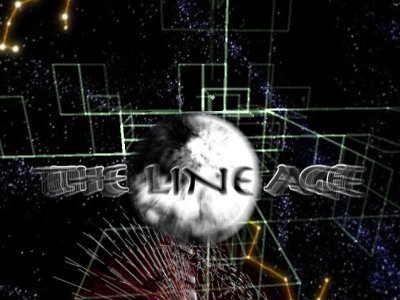
The Line Age by Trauma
[nfo]
|
||||||||||||||
|---|---|---|---|---|---|---|---|---|---|---|---|---|---|---|

|
|
|||||||||||||
|
popularity : 68% |
|||||||||||||
alltime top: #4211 |
|
|||||||||||||
| added on the 2005-07-31 08:00:00 by diver |
||||||||||||||
popularity helper
comments
Unfortunately, it doesn't look as interesting at home as it did via stream. A piggy for now.
added on the 2005-07-31 09:33:09 by tomaes 
cool concept, boring realization.
prolly the first traumarmada demo that actually looks nice - and of course the music is lovely.
codersdemo, nice fx but the design doesnt appeal. thumb up anyway for the cool ideas in this demo.
a demo entirely in lines is, well, just f*n cool. Also the haloed line drawing technique would be cool for things... maybe I've seen it before, maybe I haven't, don't care, was used well.
A weak thumb, the music is great but the visuals are not that appealing. Some nice ideas though.
Nice, clean and effective! Good work!
nice :D
It's a nice concept and if there's anyone out there who likes lines as much as I do, I'd certainly like to meet him, but where the heck is your GL_LINE_SMOOTH? Especially the landscape part looked quite rough and aliased.
You stole my lines-only-demo idea, and did it all the way i wouldn't have.
Wow! Great concept and the logo transitions at the beginning really reminded me of 2d logo line bouncing effects on the CPC! =)
nice scene.
good concept.
however, a bit boring.
good concept.
however, a bit boring.
thumb up for the lines, thumb down for the awful typedesign that completely contradicts the demo.
ugly and boring
crappy
The basic idea was good, but remembering the older Trauma demos, this one was a real disappointment. I hope you guys get the hold of the old style again soon :)
Sorry, I kind of like it. There's just something in eventboxes, voronoi abuse, hidden surface removal and codercolours.
On the other hand it could have been way better. There are freakier effects around, the "trademark" L-system-thing sucks and the aforism in the beginning is just plain lame.
On the other hand it could have been way better. There are freakier effects around, the "trademark" L-system-thing sucks and the aforism in the beginning is just plain lame.
i remember liking this one.
The intro sequence with logos splitting up into lines was great, reminds me of the old FLD/FPP effects on the C64, expcept in 3 dimensions. Simple to do but nice looking. The rest of the demo doesn't quite deliver though I do like the effect-description-texts, also gives me that oldschool C64 vibe where every effect had to have a name!
Yeah, it was neat. I'm into this.
A Trauma prod: the code is there while the design isn't.
Very very good!
Some very nice scenes, but I don't think it fits too well together. A piggie for me.
The music was awesome, but the effects were only so-so. You need a coder's background to really appreciate them.
Sorry but the music sounds as if coming from a laptop speaker, plus there are only a couple of scenes with nice visuals. The rest seems to be an attempt to mash together as much 'line effects' as possible, with no design or carefully selected colors : Voronoi or not, it just looked like some sort of uninteresting mesh interpolation.
The fonts sucked big time.
The demo is also rather small (3 minutes flat).
The fonts sucked big time.
The demo is also rather small (3 minutes flat).
I didn't like it at the compo and it still doesn't do it for me back home. For being 4th at this years ASM it's athumb down. Otherwise it would have been a piggy.
The space/stars background doesn't fit in and never blends in with the effects. Many of the line effects look like from a demo around 1995 (simple and aliased). You could do at least double with these ideas.
Sorry.
The space/stars background doesn't fit in and never blends in with the effects. Many of the line effects look like from a demo around 1995 (simple and aliased). You could do at least double with these ideas.
Sorry.
I never have been liked much Trauma prods and this is no exception, logo in begin was nice, but everything wasnt. And what is with that basic L-System tree, Sol you can do better. Sorry, but not my cup of tea.
I liked this very much. Big props for the line logos and the scetch.
nice prod
some nices ideas, quite a few executed very well.
on the other side there is definitely some design missing and yeah, as monroe already pointed out, the typedesign SUCKS!
on the other side there is definitely some design missing and yeah, as monroe already pointed out, the typedesign SUCKS!
Substantial
Very nice, a GL_LINE_SMOOTH_HINT version would have been cute too... or was jaggyness a somewhere wanted feature?
OpenGL lines rulz, a good work :)
OpenGL lines rulz, a good work :)
what a great era!
oldshool in a serious way!
and the logo effect was the killer :-)
Trauma is back!
this just looks bad in almost every way
Guess this went for something similar to floppy's dream equation series. Looked much better on the big screen when the jaggyness wasn't visible. Really disappointing to see afterwards and 4th place was too much anyways.
short, but thumb up for the design and music
!music.
argh
Rewatched :(
math porn. unfortunately, no design or spirit to this, and it's short anyway.
Maybe the demo is not too entertaining but the music is pretty cool.
traumoja traumasta
nothing to say, it's high level
Underrated. Have already thumbed this up. Also the music rocks!
music rulez.
I enjoyed this one a lot... the music is awesome!
gl_lines rulez :)
Line age rules ;) say whatever...
It's nice to see some innovation... Nicely done. The music is pretty cool too, it could've been cooler with antialiased lines though.
this made my day
Its one of the greatest things I ever saw. That music is really going with animation))
Agree with 800x600 and no antialiasing, but it looks slightly better with forced antialiasing in gfxcard settings. SDL... meh... why? :) But a good demo with good music and pretty neat ideas/fx, so here's a thumb!
well, no. nothing interesting/beautiful, scientific remarks and very slow (10fps on r3870?!).
I'm glad they didn't anti-alias all the lines. I feel it would have detracted from the feeling/meaning behind the demo. Great music and prod. Love the oldschool!
Lines......
great!
I really like the awesome and mindboggling effects, great track too!
Quite weak comparing to other Trauma releases. Has some nice visuals nevertheless, and a pleasing soundtrack.
meeeeh
The music sounds kind of depressing along with these exciting math effects. Watching the texts (and especially their font) made feel like I am in a middle of a MS Powerpoint presentation (yikes). This would have been so much better without any text at all, excluding the starting logo. Still thumbs up for the coding skills.
submit changes
if this prod is a fake, some info is false or the download link is broken,
do not post about it in the comments, it will get lost.
instead, click here !
