|
OldSkool D3DX Demo by Oxygene [web]
[nfo]
|
||||||||
|---|---|---|---|---|---|---|---|---|

|
|
|||||||
|
popularity : 72% |
|||||||
alltime top: #4238 |
|
|||||||
|
||||||||
| added on the 2000-11-02 03:21:54 by kenet |
||||||||
popularity helper
comments
I'm not a big demo freak, but i like to watch one sometimes, and I've got to say that I really like this one. Old effects, flashy colors and kikass chip....
Thanks kenet ! :)
Thanks kenet ! :)
this demo wasn't done by kenët but by leonardo.
kenët only submitted it in the pouët.net database ;)
kenët only submitted it in the pouët.net database ;)
Code: Leonard/Oxygene
Musax: BigAlec/Delta Force
Gfx: Mon/Oxygene
ok ? :)
ST for ever.
Musax: BigAlec/Delta Force
Gfx: Mon/Oxygene
ok ? :)
ST for ever.
Leonard, not Leonardo, ralala ;)
yeah, i love it !
...I know kenet didn't made it ! :)
But he gave me the URL and he ADDED it ! :)
So thanks kenet :))
But he gave me the URL and he ADDED it ! :)
So thanks kenet :))
Whoever loves old fashion will love this short demo nice and colorful! =)
Oldschool flavour =)
may the "VIEUX CONS POWER" be with you =)
brilliant - atari style still looks cool. Hey Leonard, any chance of more real atari prods?
blup!
after trying to read the scrolls in this demo, i almost got sick :)
after trying to read the scrolls in this demo, i almost got sick :)
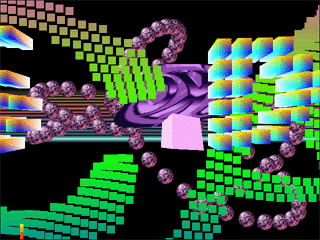
Hey! Just from the title and the screenshot I understand what it is and it's a great and funky idea!!!
I SHALL SEE THIS! (As all the others I forgot to write down in some paper or notepad :P)
I SHALL SEE THIS! (As all the others I forgot to write down in some paper or notepad :P)
old idees with new hardware ... well done Leonard! a good cracktro-style with console-colors
a must see
a must see
insert d3d.dll into any path and press left mouse button to continue
Ha, yeah! This takes me back to 1989-92 on my Amiga 500.
Phun baby Phun!
Coolness... nice job Leonard.
I saw this a while ago. This thing's pretty insane. I love it ;)
aw, forget my thumbs up :)
headache.
ahhh good old days
ROX!!!1
ROX!!!1
Too many objects on the screen at the same time... :|
Byt the music was cool !
Byt the music was cool !
lol!
sick and tired of cubes, scrollers & vectorballs.
i really like it. some more work wouln't hurt, all effects should scroll or fade in in some way. it kinda destroys the oldschool feeling when the bobs suddenly appear.
p.s: i just downloaded leonards st-player and a couple of scavenger tunes....
an atari st told me : "yyyyeeeessss"
(for my opinion, it's only cool)
(for my opinion, it's only cool)
back to old days with directx :)
still so so cool =)
sharp stuff, lots of movement and colors, great sid-alike tune.. leaves impression: this is cool man!
ouch ouch ouch
Agree with superplek
Would have been great, if the effects were nicely presented, instead of all piled on at once.
it's ok. but the presentation was pretty shitty, as psonice mentioned.
no chance you could have this much shit same time on screen on oldskool hw ;-)
no chance you could have this much shit same time on screen on oldskool hw ;-)
Nice tune, oldskool scrollers, oldskool dragonballs, very oldskool. But my eyes! My poor eyes! Aaugh!
it rocks!
The effects is looked nice and the oldskool design done well. But then the screen full of "effects" and i near of womit the monitor :) Everything puted into one screen. Bad.bad.bad. If you separate the effects like parts the demo looks good but not so... :(
Ke Koooool!!! Impressive *though I haven't seen it yet*.
I get a warm fuzzy feeling watching old amiga cracktros/intros as well as some modern-day tributes to those.. but this is really just butt-ugly.
And it doesn't even look right. RGB-cube scrollers are not very oldskool.
This would have been considered ugly even in 1987...
And it doesn't even look right. RGB-cube scrollers are not very oldskool.
This would have been considered ugly even in 1987...
that done on a good ole ATARI ST ... and you'd definetly rock the house :)
Anyway ... damn cool to watch oldskool stuff on modern PCs
Anyway ... damn cool to watch oldskool stuff on modern PCs
messy
Somehow I fail to be impressed. It's just a bunch of old routines crammed together all at once totally failing to deliver the "oldschool" feeling. Too messy and cluttered. They could've done something really nice and creative instead using old routines updated in a nice way.
My eyes!
Rocks of course !
Being the sad nostalgic I am, I actually like this one. However, the screen gets too cluttered with the second scroller, so only a pig from me.
I still love this screen... Thats what brain-blasting demos on the ST looked like. (Ooooh Crikey, to name one of these). But back then the cpu power was nearly 2 Mhz :) Waiting for some new stuff from Oxygene :) And for me there could be another 100 objects on the screen :)
i'd say its ok ( and i'm not oldschool at all to decide whether this prod is or not )
I like oldscool stuff !!!!
Lot's of things moving :) more moving stuff == better booze effect!!!
you should add some effects like a tunnel/wormhole in the background and like ~10 more scrollers
opengl is better? :)
Hehe, Leonard stuffed all the effects he wanted to do on the ST in 1 VBL (I mean all of them running simultaneously)!
I like it. :)
i found it really boring, and the wannabe VU meter thing could have at least had proper frequency response
hehe nice :)
what a sweety :)
Greate oldschool demo
Doh! I never voted for this one ... eheh ... :)
I really like that one ... and it's in FULL OVERSCAN ... you rule, dude!
I really like that one ... and it's in FULL OVERSCAN ... you rule, dude!
Wow! Confusing stuff!!!
rocks...!
i like my effects enjoyed separately
i WANT MORE oLDSKOOL-DEMOz.!!
and i like it.! :)
and i like it.! :)
yes!
oldschool on pc mostly sucks, except when done by rez or keops. this stuff is ok, but certainly not great.
IMHO you have to have lived the oldskool era to like it ... so did I ... and I really love this one and a whole bunch of other intros ... :)
there is too much going on, atleast for me..
Outch,.. The only good thing about this prod is that it's pouet id is 1337 in octal.
So I should probably check out what's at id 4919 just for kicks.
So I should probably check out what's at id 4919 just for kicks.
pretty bad... at least it is < 32k
Wow, this is ugly.... what psonice said.
dto.
ouch, massacre!
1337! oldsk00l pr0n :')
:)
Ataaaaariii!
Is this satire? I kinda feel like it isn't...
Overloaded......
Love it. As he says at the start of the scroller "back to real roots". If you really want context to why the demo is the way it is, with the ST sprite, the full rainbow rasters, the flat-shaded cube and the classic fonts well there it is. Back to a time when demos were all about getting as much colourful action as possible on-screen. Honestly the context (if you really need it) is all there on the screen, look closer.
If you use an old PII-333 you will be very happy for the really smooth animation. One of the best Intros for an old RetroPC. Sad that there are no others, or others that need much more power and newer gfx-cards. :(
I'm begging for a video please :) (+lame thumbup based on the screenshot).
submit changes
if this prod is a fake, some info is false or the download link is broken,
do not post about it in the comments, it will get lost.
instead, click here !

I'll buy some couple of eyes before watching it again... but I'll watch it another time !