| The Invisible Hold by Adapt [web] | ||||||||||||||
|---|---|---|---|---|---|---|---|---|---|---|---|---|---|---|

|
|
|||||||||||||
|
popularity : 64% |
|||||||||||||
alltime top: #49611 |
|
|||||||||||||
| added on the 2008-08-03 01:48:38 by Alpha C |
||||||||||||||
popularity helper
comments
I really love your previous demos, but...sorry...this was quite boring and often disconnected. Piggy for now, but perhaps it will grow on me with repeated watching.
added on the 2008-08-03 01:53:14 by Stebo 
uhhhm. I was expectiing much more... ok guess, but not impressive
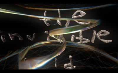
wins the least-readable-scroller prize
Sorry, but this was horrible! No design, no transitions, no sync, no background, too much black, awful env mapping...ok, I'll stop there.
Music was pretty good, but it was very unpleasant to watch.
Music was pretty good, but it was very unpleasant to watch.
seriously, what the hell... I think this was beyond my comprehension so I'll just give it a ?. Not a rules, not a sucks but a ?
Excellent music! Nice code here and there but otherwise the demo lacked design - badly!
Nice music, the reference to Siberian khatru wasn't too distracting. I didn't get bored.
Looks a bit empty sometimes and your music and design style gets a bit boring after many demos for which it worked great. But it fails here... sorry to say that.
Didn't really like it that much, as is the case with most Adapt demos. Especially the text parts were quite bad.
This is.... this.
Adapt demos are often like good whiskey: Sometimes hard to appreciate but very rewarding. This one is like a bottle of old, strange tasting whiskey from a obscure distillery: It might be excellent and very rewarding but it requires work to appreciate.
Adapt demos are often like good whiskey: Sometimes hard to appreciate but very rewarding. This one is like a bottle of old, strange tasting whiskey from a obscure distillery: It might be excellent and very rewarding but it requires work to appreciate.
ha ! Siberian khatru ! I was listening to the record earlier and then saw the demo and thought.. Waaait a minute..
Great to see a scroller but unfortunately it was partly unreadable (the 3D one) and partly ugly (the fonts on the other one). But piggie anyway.
Wasted potential
This was terrible, but the music was cool, so a pig.
even music sucks lol..
what AstronautStebo said.
It is when watching demos like this I just sit there thinking "Okay, soo.. someone actually DECIDED to make it look like this?"
this had a few cool scenes and a very psychedelic feel to it, but i'll have watch it again since this left a really strong wtf-feeling in the compo.. the music was a refreshing deviation from the demotune norm.
Gimme the mp3. :)
(the rest was pretty uninspired though.)
(the rest was pretty uninspired though.)
what gloom said...
definitely not bad but kinda ugly :)
Coherent mess
Not my cup of tea.
"a demo inspired by late 90s amiga demos, yet designed by stevie wonder"
the scrollers :(
JDruid & Navis: I had to stop watching the demostream and go through my records shit drunk in order to find out where that musical phrase was borrowed from. I finally found it and missed couple of (bad) demos on the way.
Yes: Siberian Khatru \o/
Btw. that's one ugly demo.
Yes: Siberian Khatru \o/
Btw. that's one ugly demo.
Uhm,. maybe not enough shaders in this computer? I will try later..
Great music, I love Adapt's demos and while this is not the best, it still deserves my thumb.
adapt syndrome repeated, some nice scenes, seriously lacking some decent design/direction
the demo has interesting parts, but some are too boring sorry. The tune sounds like a "funky demo" preset on a cheap synth, Not my thing. i
nah...
This demo reminds me of the days when I still liked demos. Oh, the memories. Nevertheless, it feels fresh and new. I like it. A lot.
Watching it with proper shaders, I think it's not bad. The scroller reminds me of an old Cascada classic :)
got no sound
made it work finally
Quote:
The scroller reminds me of an old Cascada classic :)
It may remind you of a Cascada demo, but it doesn't look like any of them.. unfortunately.
it has some great moments and some drawbacks, but overall feels good to me.
there is a lot in there, and I especially like the cloud effect and the head with the octopus style... unfortunally most parts are nice but "unpolished", or simply not as good as they could have been. I like the fact that you try to do music and not random industrial sounds like many other prods, but I think it's too slow paced for this kind of demo. a very good attempt and I think you will astonish us in the future if you keep developing.
also works in wine.
also works in wine.
a, fucking thumb.
Love the music.
Some nice stuff and excellent track, but quite unfinished
heavily lacks polishing
This is so off the wall I can't but love it, in a strange way.
submit changes
if this prod is a fake, some info is false or the download link is broken,
do not post about it in the comments, it will get lost.
instead, click here !
