|
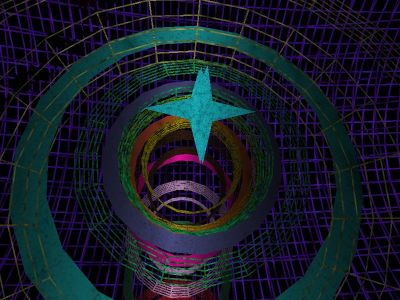
Hypnotic Tour by Pantuflas Software
[nfo]
|
||||||||||||||
|---|---|---|---|---|---|---|---|---|---|---|---|---|---|---|

|
|
|||||||||||||
|
popularity : 60% |
|||||||||||||
alltime top: #13823 |
|
|||||||||||||
|
||||||||||||||
| added on the 2008-07-27 05:57:52 by chip |
||||||||||||||
popularity helper
comments
goddamn, this screenie made me curious.
added on the 2008-07-27 06:04:11 by gentleman 
interesting, but a bit boring
404
It is rather ugly, but thumb up for the size.
A little ugly but quite interesting.

PIGGY!
A little interesting but quite ugly.
a bit dull
What said #535 & Alpha C :))
somewhat cool looks
download link is dead...
this somehow reminded me of the cyberspace levels in system-shock, so thumb up :)
can anyone upload it somewhere else?
I thing that simply with a better color schema this intro can be improved a lot. I am sure that chip will pay more attention to this in the next one
404 too
What buckethead said.
Aeko: scene.org link works.
nice prod. its got some weird atmo, which i like.
nice prod. its got some weird atmo, which i like.
quite cool
should have won the 4K Compo... Cool
Not hypnotic but repeative, I almost pressed Esc.
incompatible 4k version and its ugly anyway. apart from that, the dl link works in a strange way - looks like it presents an "under constraction" when being accessed with external referrers...
There's definitely something I like in the way you design, but unfortunately the result is completely ruined by the choice of colors and the visual quality in general. Also, the pretty long duration is wasted by the absence of variation of intensity. It could increase instead.
With a slick rendering and an emphasized intensity I would give this a massive thumb up.
With a slick rendering and an emphasized intensity I would give this a massive thumb up.
submit changes
if this prod is a fake, some info is false or the download link is broken,
do not post about it in the comments, it will get lost.
instead, click here !
