|
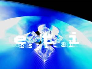
We took the kebabmoduli by Grin [web]
[nfo]
|
||||||||||||||
|---|---|---|---|---|---|---|---|---|---|---|---|---|---|---|

|
|
|||||||||||||
|
popularity : 62% |
|||||||||||||
alltime top: #46729 |
|
|||||||||||||
|
||||||||||||||
| added on the 2002-08-05 12:36:44 by skypher |
||||||||||||||
popularity helper
comments
Excellent !!
rulez added on the 2002-08-05 13:28:06 by Mike 3D 
Way too messy imho.
ok
The text was garbled on both my machines (win98se + voodoo5, win98 + geforce2mx)
otherwise, pretty cool demo
otherwise, pretty cool demo
Hm... nothing very special in my eyes...
Funny for a while but then it started to feel like a tAAt prod.
ok demo. not bad, but nothing impressive.
The glass like effect looks very nice and fresh, otherwise this has not much to offer. Ugly font.
KEBAB RULZ
On a 2nd viewing i noticed that it actually sucks bigtime.
Quite ok. I don't get the whole kebab joke though.
yeah. kebab is ultimate, but you get food poison from punjab...=)
I tried to read the text, but I can't yet read white on white (I'm probably a step or two behind you in the evolution)
Yes, this is very messy.
very messy, but I did like it because it was brighter than we took the green pill. very much a parody of the latter, and not half as good.
boring, i stop before the end
ripped idea...blended polygons make it too white, text can be hardly read... anyway, it's almost stylish.
Very ugly.
the design is crappy but musics rules
Unbelievable !!! for an intro
ok
yeah
Ugly
you got that right
sorry...
"We took the green pill" by Haujobb is one of my alltime favorite demos. This however is mostly mediocre, although there is one particular effect I like a lot (The messed up scrolling polygons or whatever).
submit changes
if this prod is a fake, some info is false or the download link is broken,
do not post about it in the comments, it will get lost.
instead, click here !
