|
king pig by Darklite [web]
[nfo]
|
||||||||||||||
|---|---|---|---|---|---|---|---|---|---|---|---|---|---|---|

|
|
|||||||||||||
|
popularity : 66% |
|||||||||||||
alltime top: #3447 |
|
|||||||||||||
|
||||||||||||||
| added on the 2007-11-19 08:32:00 by quisten |
||||||||||||||
popularity helper
comments
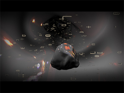
Despite the kind of lack of connection between the floaty music and the dark visuals, this was very likable. The greetings landscape and the post processing in the head-part were really cool.
rulez added on the 2007-11-19 10:16:10 by Preacher 
Nothing special at all ... but nice shadows ... I like it somehow ... :)
Nice, teh pig :D
The name cries for a piggy but this is better :)
Buchstabensuppe, Pigs and Greetingspart!
Buchstabensuppe, Pigs and Greetingspart!
Nice stuff.......so nice that I think you should have dropped the pigface. Puts the prod abit down, but otherwise a really nice prod. Cool track by Fezz.
pigface :)
nice
Quisten makes some great visuals.
love the soundtrack, the landscape and the speed of the show. the pigface doesn't fit.
bleeeeh
nice
Weird but cool one
not too fond of the edge detection filter though ;)
not too fond of the edge detection filter though ;)
yep
Somehow I quite liked this one, music, effects, visual, maybe more than the rest of the entries.
Good music and overall pretty nice(albeit disjointed feeling in parts)
If it takes forever to load, try hitting the return key. Guess there is some error message that I can't see?
Anyway, pretty good stuff but let down by the pouet joke feel. Is it a joke demo? Doesn't look or feel like it, so why the pig? Still a solid thumb up.
Anyway, pretty good stuff but let down by the pouet joke feel. Is it a joke demo? Doesn't look or feel like it, so why the pig? Still a solid thumb up.
psionice: The pig is the darklite mascot and also stars in transmogrify, pigbender and a couple of other prods.
As for the demo, I really like it!
As for the demo, I really like it!
Repetitive but quite enjoyable.
just something nice about this demo, i dont know what, but i like it :)
pigface from me.
I liked it a lot. Very nice and stylish visuals.
lovely!
i liked the tiles-landscape a lot, rest was just okish. the edge-detection postprocessing looked rather meh on the fonts tho :P
I really like the clean and sharp look, but to little content. A piggie.
some nice effects! especially the landscape
the pig kind of ruins it for me... the rest is nice though.
if I filter out the pig and concentrate on the clean landscape, I like it!
2nd on my scoresheet (which is the only one that matters :-)
pretty nice, doesnt need any cheap pigface stuff
I like the pig! And it gets a "rulez" ;)
the pig rules! and darklite rules!
i really like the demo : the music is nice, the demo is well synch. the only weak point is the karaté fighter layer.
The morphing effect ( or what ever it might me ) is really cool.
The morphing effect ( or what ever it might me ) is really cool.
changing screenmodes is for lamers \o/
a bit more seriously, best darklite demo so far.. i wonder why ;)
a bit more seriously, best darklite demo so far.. i wonder why ;)
Nice production - I really liked those floating letters and the high contrast filter made for a distinguished look.
the visuals looked kinda good but the connection with the music was somewhat off, it just didnt fit. also, i realize its somewhat of a norwegian tradition to increase length of demo but please stop repeating all effects right before the end.. its just fucking boring, begs for escape key.
i'll save the thumb down in hopes you'll do an edited remix with another soundtrack.
i'll save the thumb down in hopes you'll do an edited remix with another soundtrack.
i liked it
for those who experience the same black screen as me: just press enter, it's because for some reason the demo opens a "press ok" dialog box that informs you about the creation of a texture target
for those who experience the same black screen as me: just press enter, it's because for some reason the demo opens a "press ok" dialog box that informs you about the creation of a texture target
Could have been quite a decent demo without that silly pig :S
but zoom, you don't understand! it's all about the pig!
Very nice! I only would add a really kicking-ass scene at the end, when the music rises, instead of repeating the previous scenes
My favorite part is the one in which the 3D thing morphs (or whatever) between the human and the piggy face =)
My favorite part is the one in which the 3D thing morphs (or whatever) between the human and the piggy face =)
merlucin: well, repeating the last scenes was actually the last thing we wanted to do. sorry about that, we know that only lamers do those sort of things.
guardian: thanks for figuring that out! i should try to get that fixed. sometime. if theres any problems at all, let me know, the rendertexture implention is brand new. got a problem with bigscreen actually (do'h).
kusma: spot on!
guardian: thanks for figuring that out! i should try to get that fixed. sometime. if theres any problems at all, let me know, the rendertexture implention is brand new. got a problem with bigscreen actually (do'h).
kusma: spot on!
There is a lot of talent at work here. Mostly quality stuff and the code is obvious thumb up-material. You don't see many Norwegian coders topping this.(Even though I'm sure I've seen the letter landscape somewhere before. ;) )
But there is a big but. The pig drags the production down in the mud. So here's a piggy right back at ya, hoping you'll take your talent more seriously the next time around.
But there is a big but. The pig drags the production down in the mud. So here's a piggy right back at ya, hoping you'll take your talent more seriously the next time around.
It's all about the pig, so here you go.
(VG Nett) Samtlige av de over 300 grisene i et fjøs på en gård i Inderøy i Nord-Trøndelag, ble tirsdag kveld tatt av flammene.
:((
:((
I love it of course, good work guys!
black screen :/ video please !
cygnused > press return when experiencing the blackscreen, this should validate a popping (but invisible) dialogbox that has an ok button
then the demo starts
then the demo starts
guardian: pressed enter at the black screen and the demo started. thx :) (too lazy atm to read the above comments..)
codewize its really kewl but there´s missing a lot to get thumbed up. (what archmage said)
codewize its really kewl but there´s missing a lot to get thumbed up. (what archmage said)
At the start I were pretty sure that this demo is a piggy. But the shiny envmaps, synch, good postprocessing, billboards, great csg polyface morphing from child to pig and shadows made it good, despite the ending reminded me of the piggyface once again.
very cool but the pig was weird :P
I agree with archmage. The text all over the place was a bad idea in my opinion, but the landscape and the crazy slicing/morphing stuff was cool but it looks like you coded this effect then were ashamed of it somehow and decided to hide it behind floating text and flood it with pigs, crazy post-processing and - ugh - tunnels.
However, I will thumb it because despite everything the effect, especially in the head scene and the landscape, was cool.
However, I will thumb it because despite everything the effect, especially in the head scene and the landscape, was cool.
some nice shading here, maybe it is closer to pig than a king. thumb up anyway, a pleasure to watch...
Music was cool, but the video was OK. For some reason, I got OverTexture error or something before the demo started.
Is OK - I notice that the I and O keys act like a fast forward rewind - I started trying to discover more keys and thought that they were changing scenes but I think from reading the above that was by design.
one word : masterpiece.
i suddenly started to like the pig, but they do smell really bad! :D
Great music!
Some nice effects, but seems to be thrown together, with random scenes just changing rapidly. Also boo to the missing reflections of the letters all around the shiny head. :-D
Sweet little prod, but some annoyances that sadly make it land on a piggie.
The font is one of those annoyances - hard to read, especially in the very good greetings part.
Too bad, could have been much more...
The font is one of those annoyances - hard to read, especially in the very good greetings part.
Too bad, could have been much more...
Great music! Nice style, a little too repitive at the end.
Decent design
nice one
submit changes
if this prod is a fake, some info is false or the download link is broken,
do not post about it in the comments, it will get lost.
instead, click here !
