|
r08064 by Stravaganza [web] & xplsv [web]
[nfo]
|
||||||||||||||
|---|---|---|---|---|---|---|---|---|---|---|---|---|---|---|

|
|
|||||||||||||
|
popularity : 71% |
|||||||||||||
alltime top: #3424 |
|
|||||||||||||
| added on the 2005-11-07 16:51:19 by mrdoob |
||||||||||||||
popularity helper
comments
nothing outstanding, but enjoyable
rulez added on the 2005-11-07 16:52:17 by maalinstrippari 
What maali said. The outtro was goddamn funny during the compos.
MASSIVE !!!
it rulez I <3 u
it rulez I <3 u
nice
noithing outstanding? the soundtrack is DAMN outstaiding. one of the best techno tunes i ever heard in a 64k intro. i so much freaked out during the compo!
I thought it was kind of dull, some polygons, aliased lines and glow with no concept or plot or anything like that. I'd still thumb it up if it didn't fuck up my screen resolution after it exits though..
I WANT r08080!!!!!!!!!!!
I didn't like the original, and this feels quite boring as well. The outro was fun though.
Big up ! nice 64k remix ...
BTW, is it a softsynth or xm tune ? coz it rulez big time ^^
BTW, is it a softsynth or xm tune ? coz it rulez big time ^^
rocked the compo on the bigscreen
A boring prod with a terrible sound.
good synth.
dont particularly like the visuals tho (but hey, i didnt really like the original either).
and please, no more demo to 64k remakes, it's getting really tiresome :)
dont particularly like the visuals tho (but hey, i didnt really like the original either).
and please, no more demo to 64k remakes, it's getting really tiresome :)
Really nice version, but make something new for your next intro
here comes a detailed comment :
sound : very good*
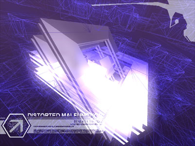
visuals : good. overall visuals are okayish but those color inversion scenes make it just brilliant, as i can hardly recall any more beautiful uses of this effect ( fr030 party version maybe ).*
multipart: good \o/
but. overlays seem out of place and are of mediocre ( if not to say bad ) quality. a few bugs with progress bar ( inner part is shifted one pixel to bottom, it jumped backwards time to few, also you'd probably like to set DrawLastPoint in line to true, cause the rect lacks one corner, as you're drawing it in line mode ), a bug (?) with end scroller transparency ( it's white chars on black background here, prolly with somewhat 95% of additive blending transparency ).
it'd all be ok if not * :
(*) all this gfx are not particulary fresh after a deepness in the sky, and each time i see something similar, i'm disappointed. it's beautiful, i dont deny it, but after mfx's release it looks just so second hand.
after all here's your thumb for effort and felicitous color inversion use.
liked it
nice
quite cool. but the music sounds really dull compared to the original.
the end was cool, didn't like the rest at all...
dunno ;D piggy
dunno ;D piggy
crashes here :
2,6GHz, win2ksp4, rad9800se, OMEGA5.8
2,6GHz, win2ksp4, rad9800se, OMEGA5.8
i dont like djsession-visual-in-demos
Impressive music & visuals \o/
more varations next time please
i loved the original, but this somehow missed the spot.
trace's visuals 
i was looking forward to see this in bigscreen as i couldn't see the original ones when they were played live. Very nice (and quick) conversion by kile & wondah.
Size does matter, again... xD

i was looking forward to see this in bigscreen as i couldn't see the original ones when they were played live. Very nice (and quick) conversion by kile & wondah.
Size does matter, again... xD
Excellent.
Thumbs up for the compression level, the synth and the final surprise ;). Visuals...erms... are not my cup of tea.
Ran it.. blue screen. Reboot, ran again, loading bar... blue screen. Tried again, and it ran! Slow! Pressed esc. to turn down AA, blue screen. Reboot... load.. blue screen. AAAAAARRRGHHH I HATE THIS FUCKING PC! Please, microsoft, make a version of windows that doesn't require me to spend several days re-installing windows and all my applications every 3 months.
Btw, the above statement is most likely related to the shit condition of windows on my pc, not the intro code ;) Visuals i take it are similar to the original, if not, any chance of a video? Either way, an mp3 of the tune would be sweet :D
Btw, the above statement is most likely related to the shit condition of windows on my pc, not the intro code ;) Visuals i take it are similar to the original, if not, any chance of a video? Either way, an mp3 of the tune would be sweet :D
Unimpressive and monotone. The end was refreshing but not particularly entertaining.
Good. But yeah, more variations next time.
kile rocks, although I didnt like the concept at all, I appreciate the code :)
Very good synth, pacman, effcts, and.. ovbiously... the size!!
oh!! and... la receta!!!
oh!! and... la receta!!!
we have an 64k intro engine you have not
we are cool and our warez are hot
;)
we are cool and our warez are hot
;)
It's nice, but guys...
what's with the precalc? took about 6-7 minutes here...
what's with the precalc? took about 6-7 minutes here...
++++recipe
++++++ending
rulez, but I would really like to see your coding skills redirected towards more creative efforts...
++++++ending
rulez, but I would really like to see your coding skills redirected towards more creative efforts...
nice remix in 64k.
great synth.
pacman scene was unique.
great synth.
pacman scene was unique.
funny end ..
the actual intro was so-so .. good music, but bit dull on the graphics side. when i was still considering if it's piggie or not the outro kicked in and made my day. :) kudos and greetings to pacman!
music kills the intro... pig for it.
First part is TOO long,second one is too short (I like to switch them :)
good, but boring
Cool, Mfx made an intro! ;)
Some good looking stuff, the pacman part was fun, but the whole thing was just WAY too uneventful. 10 seconds of content stretched to 20 minutes? That's what it felt like.
Some good looking stuff, the pacman part was fun, but the whole thing was just WAY too uneventful. 10 seconds of content stretched to 20 minutes? That's what it felt like.
A boring prod with a terrible sound.
cool version! cheers! better sincro, personally i would like to see more on the second part, btw lol at the pacman outtro. :D fresh.
Xplsivo Donsi power!!!!!!!!!!!!!!!!!!!!!!!!!!!!!!!!
Xplsivo Donsi power!!!!!!!!!!!!!!!!!!!!!!!!!!!!!!!!
1st part:
+ very cool overall design (especialy at the end of part I)
- zik was teh übersuxx0r
- too boredom-long and repeative
2nd part:
+ nice pacman idea
- the ugly moviescroller
- again crap musique (for my ears at least)
...
so the design was trashed by the wrong soundtrack, the second part and the overall duration, sorry
:)
sexual
&
funny
&
funny
ah ha! it runs windowed. Great stuff... almost a megademo in 64k, and the audio definately rules.
Excellent as always with a funny end
The synth sounded nice, the music on the other hand did not. And as others have pointed out, the intro is painfully boring.
Very good technical demonstration. We are expecting your next intro! :P
boring..
boring
not boring
Didn't work for me, but is ok.
looks ok but sound could use EQ, and a bit boring..
=)
boring.
boring... annoying sound
The scenes are too long and repetitive. Music is boring. I like the colors, special effects, and Pac-Man ending (make it a game!) though. No thumb up and oinker from me.
Repeatitive. Boring..
The demos are boring too. Whats the point?
I wanted to thump this down for the whole time while viewing. The scenes too long ,too repeatitive ,the soundtrack (mostly) consists of one pattern playing over and over again (with a little knob tweaking) and in addition this style of music is not to my liking. =(
But then the funny endpart surprised me. Haha ,I liked that Pacman-thingie! =0D
And the whole demo looks technically good.
Therefore I cannot thump it down.
Piggy.
But then the funny endpart surprised me. Haha ,I liked that Pacman-thingie! =0D
And the whole demo looks technically good.
Therefore I cannot thump it down.
Piggy.
nice one! i like your style.
Could've had more variation. Worked well on the bigscreen though.
Could have been great but lacks polish and sadly looks/sounds too cheaply done. Piggie.
....again and again xplsv bring us another pile of code of their another boring repetitive demoshow.
nice synth and glowy pac-man.


Music and sound quality really rule, the graphic is also good... but... there's nothing else :(
this is teh fucking shit. it rox.
Pacman!
I don't remember any Pacman figure. I guess I tripped on the escape key too early. Gotta watch it again just for teh pacman :]
cool visuals, but monotonous music
Well well... this is good intro
but such design been outdone like 5 years ago
nyway resp. guys
but such design been outdone like 5 years ago
nyway resp. guys
Visuals rocks, but music is sucks.
Great colors and atmosphere but it's a bit repetitious and boring, especially the music.
No. Crap tunes, boring. Pacman was only positive thing.
wash. rinse. repeat 10000x.
err
Poor sound and ugly fx.
Music gave me a headache and repetitive scenes ruined it for me.
Nothing special.
Less is more!
I adore the original, kudos for squeezing it in 64k but still a rehash ;)
both visuals and sound bored me to no end
we need more kyle 64 k
Been get ready for... nothing special.
boring visuals and sound
Design becomes a little bit old-fashioned, but it's cool anymay..
And the final scene :)
And the final scene :)
nice
Pretty cool!
well.....nope.
submit changes
if this prod is a fake, some info is false or the download link is broken,
do not post about it in the comments, it will get lost.
instead, click here !
