|
Flight 666 by Loonies [web]
[nfo]
|
||||||||||||||
|---|---|---|---|---|---|---|---|---|---|---|---|---|---|---|

|
|
|||||||||||||
|
popularity : 70% |
|||||||||||||
alltime top: #2268 |
||||||||||||||
| added on the 2005-07-30 23:47:27 by René Madenmann |
||||||||||||||
popularity helper
comments
Didnt work at my 3,2ghz x700 1gb memory pentium 4
GL_ext_framebuffer_object needed
I get as message.. Pitty..
GL_ext_framebuffer_object needed
I get as message.. Pitty..
thumbage!!
video please...
my videocard was not supported. (GL_ext_framebuffer_object)
my videocard was not supported. (GL_ext_framebuffer_object)
Psycho: I have 5.3 installed. Thanx I will do that asap. Still strange that every demo released this year works under 5.3 except flight 666.
BTW. WHY ARE YOU NOT MAKING AMIGA PRODS. ??? SHAME SHAME SHAME :)
BTW. WHY ARE YOU NOT MAKING AMIGA PRODS. ??? SHAME SHAME SHAME :)
it has tits.
awesome visuals opposed to a very weak track... :/
when i saw the visuals, i thought 'rgba beat you guys 1 week with mimicing plastic in 64k!' :PPP But, very good intro!
the same as magic
kickin ass modelling
Working perfectly here with the 5.6 & a r9800.
very nice materials! but too bad this intro lacks some action that makes you want to watch the 3d object show again
Kickass models, the rest is mediocre.
(see above comments)
Some nice models, but seriously lacks animation
Beautiful models, but I seriously hope that this "let's all go 195/95 and show ps 2.0 spherical harmonic-mapped boobs" fad blows over soon. Also, the font was butt-ugly and the first part with the cubes didn't have anything to do with the rest of the intro.
technically really impressive, nice models and gfx. music could have been better, but otherwise, this is some good shit.
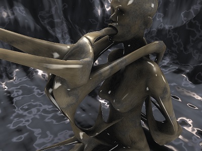
btw, what the fuck is going on in the scene in the screenshot? it looks like some kindof mutant giving itself a blowjob. =)
btw, what the fuck is going on in the scene in the screenshot? it looks like some kindof mutant giving itself a blowjob. =)
Didn't we already see this before?
Yes booster, you make weak music, and you are a weak person...
But i just loooooooove the models .. so cool...
But i just loooooooove the models .. so cool...
Very nice models, but too static and too much influenced by the .plastic demos. The music was also so-so.
Tractions' intro was very different, but alot more enjoyable in my opinion..
Tractions' intro was very different, but alot more enjoyable in my opinion..
Cool models, but lacks in action and music.
I really did not get the relevancy of Flight 666. On one hand we have really impressive modelling, heavily inspired by H.R. Giger, on the other hand we have a (I guess from a my limited understanding of modern 3d hardware) competent if not extraordinary lighting and shading. As most people said, what we here have in visuals we lack in dynamics, rhythm and music. Welcomed in the compo but might have been tighter.
it's not bad, the models look sweet
but the font is butt ugly, the track isn't that good, the scenes are too boring and yeah...
all in all, 50/50 and i know you can do better
but the font is butt ugly, the track isn't that good, the scenes are too boring and yeah...
all in all, 50/50 and i know you can do better
Mmm... Models look great, but music is a bit poor compared with the rest of the intro. And the dof effect didn't look so good. Piggy for me.
Would have been a Killer with better Music.
looking (too) many minutes at various similar scenes concentrating on statues created thru ps-tech-wanking isn't my idea of fun
dominated the compo in the "great looks"-department :)
very impressive models, but the rest is..... hm?! btw. the overall is better than averange!
Enjoyable but prolly the last enjoyable demo with this static model effect thing. Impressive but of course a week late (:
Hmmm ... nifty but a little too static and close to a 195/95 rip-off. A weak thumb up.
Yeh, yeh, I know we also had a female statue made of shiny marble but we animated her ;-).
Yeh, yeh, I know we also had a female statue made of shiny marble but we animated her ;-).
twisted lascivious statues! :))
horrible music and cheap shader effects... still, this is no "sucks"
Looks very nice
i'm with preacher on this one. Looks good but the "195/95" look is already starting to irritate me big-time.
Looks like an experimental intro focusing on generating 3d models, the models are cool but the rest is boring.
Guess, Loonies has no space for music... Well, models are great, but colors are very boring.
good looking bad sounding
Great model generation.
69, baby ! :D
welcome to we-dont-know-how-to-spell-farbrausch club
welcome to we-dont-know-how-to-spell-farbrausch club
for the models
boring, though offers a cool dof effect and nice (considering the 64kb size) models. all in all, a piggy.
BTW, the music sux.
hehe, missing GL_EXT_framebuffer_object... looks like the latest drivers for my laptops MR9700 are outdated (nov04). But since no new one is available and since ATI doesnt provide them...
Maybe in a year so;)
Maybe in a year so;)
Great models, but the textures and the music are just ugly :/
Also interesting that the endscroller was the slowest effect :)
Also interesting that the endscroller was the slowest effect :)
looked like crap, a blind sheep can pick better colors. i still love you for overall good and cool 4k's, but this sucked :)
I expected something better from Loonies. Too boring. Great 3d models though.
Ok.
is ok
nice rendering
Loonies, please more Amiga demos!!
Never got this to work on my 3,2ghz x740x ATI pc. (1gb ram)
But the recording from asm2005
lookedvery cool!
But the recording from asm2005
lookedvery cool!
Wasn't very entertaining in the compo.
Colours, surfaces and shading are great. Everything worked together from slightly off music and colours matching perfectly the slightly eerie modelling. Loved some of the slightly burnished metal feeling (not just marble gloss mapping).
Three things: the cube scene at the start, although cool, didnt fit and your synth is a little simple it seems for 64k.
Lastly, the depth of field was too much in one scene and made my eyes flip.
Overall, loved it though.
Three things: the cube scene at the start, although cool, didnt fit and your synth is a little simple it seems for 64k.
Lastly, the depth of field was too much in one scene and made my eyes flip.
Overall, loved it though.
Only could see the live video but liked it... is there a proper video recording by now?
complex models left no space for a proper musictrack... shame...
also, what preacher said.
also, what preacher said.
For the gfx.
pretty nice!
Enjoyable intro with impressive models and visuals. The music is OK for an intro. I like the DOF+bump scenes.
woooooot. massive
kewl stuff
kut
Looking good
Loonies rule!
no video?
wierd and ambient stuff + Modelling :)
nice stuff there !
It's nice
great
Very nice
nice 3d for 64k
quite possibly the weakest synth i've ever heard in a 64k intro
submit changes
if this prod is a fake, some info is false or the download link is broken,
do not post about it in the comments, it will get lost.
instead, click here !

However, the modelling was quite nice for 64K and I liked the bumpy texture surfaces.