|
vIIt by Noice [web]
[nfo]
|
||||||||||||||
|---|---|---|---|---|---|---|---|---|---|---|---|---|---|---|

|
|
|||||||||||||
|
popularity : 64% |
|||||||||||||
alltime top: #49757 |
|
|||||||||||||
| added on the 2004-08-08 10:38:02 by gnilk |
||||||||||||||
popularity helper
comments
Kzzz.... Grrrkhhzz... Plofplof.
rulez added on the 2004-08-08 10:48:27 by jimmi 
didn't i see taht in a wild demo already ... what the point ?
Nice but lack of design is obvious : looks like an "done in hurry prod": rules anyway ( modeling is nice )
Nice but lack of design is obvious : looks like an "done in hurry prod": rules anyway ( modeling is nice )
Didn't convince me.. and it ran slow on my machine.
Was there a reason for it to run at 1 Frame every 10 Seconds? P-M 1.8, 512MB, R9700 mobility
(didn't run on nvidia5900xt with 61.77 drivers... but I know for a fact that they're flawed with regards to GLSL)
kinda didn't make me feel anything. luckily it tells something of the quality of the compo at asm that this was one of the worse demos ;-)
wasnt there some rule that said it was illegal to reuse previously released material?
oh well, whatever..
oh well, whatever..
Noice has done a lot better stuff in the past.. Very disappointed.
I liked the visual, even if it was a bit flybyish. The reason I used the word "visual" instead of "visuals "is that there only was one visual. Except for the end part, but it doesn't count. Almost a thumbs down, what happened to all the cool effects Noice did in the past?
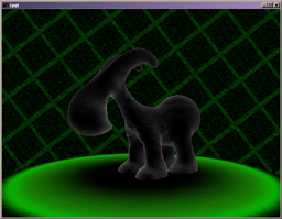
Unsmooth meshes (gnilk is lazy).
Oh, and ofcourse they ripped DXM.
Oh, and ofcourse they ripped DXM.
Flybyish demo with boring music, but it looks nice anyway. Still one of the worse demos in the compo.
Blaah, the animation was nice, so why did you ruin it by turning it into a horrible demo?
anim wuz better, noice is gut | lator sux
what is this opengl shading language that i have not ?
"Noice has done a lot better stuff in the past.. Very disappointed." .. agree with break
uhm, ok music but looks bad
I want to see it and it asks me about a shading language. Where can a find that?!?!
bad color scheme... and boring to see always the same thing...
We've seen plenty of demos with greyscale/red colour schemes, and now we get greyscale/green. Ugg... Works even less than the former. Texturing was uber plain. Lifeless camera movements.
(shader compiler error C1056: invalid initalization)
on my GF FX 5900xt
on my GF FX 5900xt
thom: hey, don't be dissin' grayscale+green now.
yeah, it's vit in realtime. i guess that's worth something.. music is cool but perhaps a little *too* thumpy for this particular demo.
yeah, it's vit in realtime. i guess that's worth something.. music is cool but perhaps a little *too* thumpy for this particular demo.
fugly :(
Seen already at breakpoint.
music.
looks terrible + boring
Why oh why did you have to remix that excellent wild... :(
noiceity.
music
its ok.
I'd like to watch this, but it crashes during startup. please fix your init code.
SW rules for life
i liked this
somehow i cant give more than a piggie here...even after thinking about it for about 10 minutes...having seen the WILD-Version before i had to recalc my thinking...but still a piggie.! (do it in 64k and let it look better next time,hehe ;) )
the musiC´s kewl,but would fit a demo with faster transitions better.!
the musiC´s kewl,but would fit a demo with faster transitions better.!
boring.
crashes
submit changes
if this prod is a fake, some info is false or the download link is broken,
do not post about it in the comments, it will get lost.
instead, click here !
