|
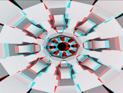
Going Forward by Ananasmurska [web]
[nfo]
|
||||||||||||||
|---|---|---|---|---|---|---|---|---|---|---|---|---|---|---|

|
|
|||||||||||||
|
popularity : 64% |
|||||||||||||
alltime top: #8006 |
|
|||||||||||||
| added on the 2005-06-14 00:22:47 by Preacher |
||||||||||||||
popularity helper
comments
Great tunnel, and I like the way it goes boom boom boom. But please, add more resolution to your rendertargets :)
rulez added on the 2005-06-14 00:23:33 by Preacher 
I've seen that thing before :)
OMG! BUTTERFLY!!!1
Best michera tribute ever!
Apart from the anaglyphic mode, this didn't really have anything. And even that mode didn't work, at least for me, that well on the bigscreen.
best fighter-flying-thru-the-canyon-scene of this blessed year - it was a bit hilarious to watch. music was very weak.
MICHERA FORREEVVEEEERRR!
Limp ninja schopt priesterpenis!
Limp ninja schopt priesterpenis!
that flying fighter part is fucking ugly and looks totally unrealistic.
but otherwise this is a pretty good one.
but otherwise this is a pretty good one.
Tunnel is great, a pitty with the plane (angle). Fun
I... don't remember a plane? I remember the tunnel. It was ok. I do remember this being cool to watch, so, thumb.
heh, like the .nfo addition about 'no sound' (:
quite ok
Nice stuff, apart from shortcomings already discussed (too long fighter-part etc).. Looking forward to more releases from you guys, getting better all the time.
Really amazing emphasis on the depth here.
The effect on the screenshot looked great. The fighter part looked very "oh crap we still need 30 seconds worth of effects"-ish. ;-)
generally okay, but it looks SO unfinished!
I don't really like the music and the plane scene is quite horrible, but overall this is pretty ok.
tunnel was good.
trance musik was ok.
however, the plane scene is quite horrible.
trance musik was ok.
however, the plane scene is quite horrible.
Hmm, this isn't quite as good any more as it was on the big screen, but it's still nice to watch. Without the anaglyphic 3D it would probably be mediocre, but the red-blue really adds another dimension to it (no pun intended).
3d anaglyph works ok here and there is coloured textures inthe plane scene
but, music sucks a lot, there is no rythm in visuals, it's very boring to see the plane more than 10 seconds, textures are ugly and are mirrored on the greetings cubes here (gf4200ti)
objects are not very interesting and bad used, and there is too few scenes and interest
no td coz there is color maps
such nice tunnels & music to go with it...
.
the tunnel was nice, but that's about it.. so piggie
Enjoyfull.
toooooo little content for it's length, quite boring.
yay music
nah!. music rox! but that airplane :))) lol!
i think this is the best ananasmurska demo so far :)
awful music
Well, now that I watched this sober enough, I can say that only things I hate in this are the music and the "fighter flying in a canyon" scene. Other stuff is quite neat. Maybe thumb down was a bit too harsh ;)
Oh yeah, was it really necessary to make the plane scene last like half of the demo (at least it felt that way)? ;)
Enough nice elements for a thumb up.
Unfortunately, streched view takes away most of that depth and reality feeling that anaglyphic view is creating. :/
what is with making the greetings part totally uncomprehensible? :)
i don't know what to think, i have no 3D glasses, music is very commercial, and there are not enough different parts for me
3d effect was there but the demo didn't do much for me.
I like the trancy tune - 3d effect in magenta/cyan glasses is really great too. One of my favourite anaglyph demos yet!
Made a Youtube for it:
Youtube(anaglyph)
Made a Youtube for it:
Youtube(anaglyph)
ok
submit changes
if this prod is a fake, some info is false or the download link is broken,
do not post about it in the comments, it will get lost.
instead, click here !
