|
lost in the underflow (party version) by Radiant
[nfo]
|
||||||||||||||
|---|---|---|---|---|---|---|---|---|---|---|---|---|---|---|

|
|
|||||||||||||
|
popularity : 67% |
|||||||||||||
alltime top: #4398 |
|
|||||||||||||
| added on the 2004-05-10 22:58:20 by radiant |
||||||||||||||
popularity helper
comments
EXCELLENT design I loved this one even if it's a little slow. It should have scored higher...
rulez added on the 2004-05-10 23:37:14 by RandomGr 
good demo..interesting music..but in the scene where we see the squares moving round i would prefer if every square was moving. I liked the end that looked like a yellow sponge
Keep moving....
Keep moving....
I really like the 2d gfx. It's really slow though, and each effect is given too much time.
Looking forward to your next effort!
BTW:There's a z-clipping issue during the first rotating cubes scene (GForce3)
Looking forward to your next effort!
BTW:There's a z-clipping issue during the first rotating cubes scene (GForce3)
the visual/sound pace was wrong in the beggining but it got better throught out the demo.
nice comeback :)
i got the zclipping thing too (gf2mx)
nice comeback :)
i got the zclipping thing too (gf2mx)
Great work and impressive comeback from radiant, It should really rank better. Something is wrong in the cube scene, initially they moved, but in this released version (which is also the one that was played at the compo) they are not moving. Too bad because the effect was very nice, I hope it will be fixed in the final.
Anyway, great job, It should indeed rank higher
Anyway, great job, It should indeed rank higher
hm, how could this end up on 7th place? deserved better, compared to the other releases from react. the music was very good in places and not so good in others, weird. a little on the slow side (both in the way of design and the code) but okay none the less.
React had a couple of polished demos. This is the other one. I liked it, nice music and simple but effective little effects.Well done !
I think that the Zbuffer artifact is not an artifact, but the texture.
I think that the Zbuffer artifact is not an artifact, but the texture.
Impressive ! I always thought you'd go on with this stuff. It's been a while since I last saw some piece of code from you, but it's been worth waiting ! The rank is a prank :-) - We've talked about it. Hit'em hard with the next production is my advise. Very well done !
thumbs up, pretty nice demo,keep up the good work radiant.
Greedy on the eyes and ears. Somehow it all falls right into place.
by the way, the aliasing "problem" was intentional as far as I know. And I think it indeed looks good.
Only original effects in this demo. I really love this one. A little short tough but always stylish as a whole. Beautifull!
giiiiiiiiiiiiiiiiirlpower! :)
I liked it...
slow, lot of bad colors... simple... and crash at the end
I loved the music and the graphics were quite nice. The only part that is slow is the 'cube formed by cubes' one. Finally, I found the colors throughout the demo rather bizarre, but still liked them :-)
Great music. I loved the guitar scratches and , did I hear sound from the back speakers?!?!?
I could never imagine that only cubes could make such an athmosphere! Good flow , great effects , polished , definitely not simple.
rules
I could never imagine that only cubes could make such an athmosphere! Good flow , great effects , polished , definitely not simple.
rules
Well it's nice for a first try. Could've used better overlays and better-looking FX.
Cheers! Nice music. Color choices didn't hit me but it didn't annoy me too much :)
I like the music and the presentation very much. Some fx are quite simple, some should take not so long. Surprising for me to see a new good looking demo from Nina at the partyplace!
very good music + very good design + several parts = rulez
Great debut - keep up the good work. Nice design.
Antonios, if you read this email me, haven't heard from you in a while :(
Antonios, if you read this email me, haven't heard from you in a while :(
lovely.
;)
zorg inside!
nice! but to slow parts, music to monotom and some of the gfx really fitted some didnt. looking forward to see the next release(s).
Antonios is in the army :/
it was a hot summer evening in Athens, he sat about in his almost comfortable chair in front of his beloved computer, unable to make himself do some usefull work with his latest graphics projects.
He just sat there, staring at his screen in utter silence, in the background a television was showing some olympic games, but that was too uninteresting for him to turn around, instead he just stared at his screen and decided to go through some old directories in the windows partition of his laptop.
And there among files long forgotten, he found the source of this demo (Lost in the underflow), lingering in a shadowy corner of the disk after the last compile that radiant did before the democompo on this very machine at the partyplace.
Ah, he thought, why can't I watch this on my beloved OS?... after all it should be easy to port... the rest is history.
So people, here is the port of Radiant's Lost in the underflow for GNU/Linux, unfortunately demoscene.gr is down at the moment, so you can download it from my PC for now (it's mostly always online anyway)
http://nuclear.dnsalias.com/litu.tar.gz
enjoy,
Nuclear / the Lab
It was a cold summer evening in Helsinki... Er, I made a quick&dirty port of the prod to Mac OS X. Seems to run well on most machines. Get it here:
http://ftp.kameli.net/pub/fit/ports/Lost_in_the_underflow-OSX.tar.gz
http://ftp.kameli.net/pub/fit/ports/Lost_in_the_underflow-OSX.tar.gz
i only saw the mac port and it looked horrible in most parts. some nice ideas (ruined by bad textures) and good music tho. i'd better watch the pc version before thumb usage.
Hi, radiant - just wanted to ask if i could play around with the textures for this product (make a remix) - let me know if it is okay...
Really good! :) Deserved more than 7th in React04..
rather good demo with design problems
It's a really neat demo!
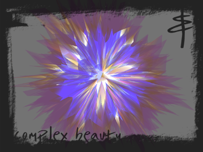
well, that was a disappointment. terrible design, hardly convincing music, and the effects were either a "damn, how could they cook up something this ugly" or a "heywow, we've only seen this 60 times before", except for the part in the screenshot, which was nice and therefore lasted way too long.
Very nice. More from you please! :)
Totally boring and ugly. Only good effect is the one shown on the screenshot.
it was a warm spring evening in Thessaloniki ... blah blah blah... you know the drill, let the porting chain continue. Got Marq's macosx port which was based on my GNU/Linux port, and ported it to something immensely more elite.
Silicon Graphics IRIX port: http://nuclear.demoscene.gr/files/litu-irix.tar.gz
Runs fine on my SGI Octane2
Silicon Graphics IRIX port: http://nuclear.demoscene.gr/files/litu-irix.tar.gz
Runs fine on my SGI Octane2
.
.
Would have been great in 64k, a bit weak as a demo.
Quite appealing nevertheless.
Quite appealing nevertheless.
Something charming about this one, an interesting take on back-then-contemporary tropes. Also again a nice track.
super steamy prod :D
screenshot effect looks pretty cool
screenshot effect looks pretty cool
submit changes
if this prod is a fake, some info is false or the download link is broken,
do not post about it in the comments, it will get lost.
instead, click here !
