| Emotion Engine by Epoch [web] & Ivory Labs | ||||||||||||||
|---|---|---|---|---|---|---|---|---|---|---|---|---|---|---|

|
|
|||||||||||||
|
popularity : 67% |
|||||||||||||
alltime top: #3108 |
|
|||||||||||||
| added on the 2024-06-16 22:42:59 by MuffinHop |
||||||||||||||
popularity helper
comments
damn this is awesome! also platform thumb
rulez added on the 2024-06-16 22:45:05 by wbcbz7 
Great demo. Really enjoyed it at the party.
i kinda like those big sprites :)
visuals & soundtrack are top-notch, but each scene feels a bit too disconnected from the others & overall the whole thing lacks the polish to make this the banger it could have been.
good demo nevertheless.
visuals & soundtrack are top-notch, but each scene feels a bit too disconnected from the others & overall the whole thing lacks the polish to make this the banger it could have been.
good demo nevertheless.
Nice one!!
Nice demo
Really cool. Psychedelic sound. Hypnotic demo
This one got my attention.. very nicely done.
Mellow! And love the soundtrack!
A bit too long for the content. The nice design, effects and music still make it enjoyable to watch and listen to.
Moooood! It all fits perfectly to create that y2k aesthetics
Enough time has passed for the new media aesthetics to feel fresh again. Or maybe I'm just nostalgic. But a great demo nevertheless :)
I like it, but it could have been a bit shorter. Please make more :).
nice demo with very good tune.
Clearly the best looking N64 to date
good to see Traction is back! ;)
Nice effects and platform choice!
Wasn't emotion engine the PS2? Hehe... kidding
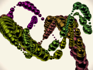
Minimalistic that has a flavor of replay maybe with some bright pastel colors. I kinda like it, even if I'd wish those colored balls blended better at the edges, too rough antialiasing maybe.
Minimalistic that has a flavor of replay maybe with some bright pastel colors. I kinda like it, even if I'd wish those colored balls blended better at the edges, too rough antialiasing maybe.
Nice mood, gfx, jungle, superb!
Forgot the thumb
Minimalism. It reminds me of some early 2000s demos.
Too much white and color saturation but, anyway, quite chill and good.
Too much white and color saturation but, anyway, quite chill and good.
the lack of z-sorting and aliasing in the wireframe rendering, together with the synth pads that sounds slightly too fancy when combined with the drum samples feels very deliberate
and yeah, meteoriks for cheekiest prod name
and yeah, meteoriks for cheekiest prod name
this is stylish! + platform thumb!
.
You made it! Great mood and platform! Also a sweet track by noby.
Such a nice mood and style and everything, mesmerising! And platform <3
Visually boring.
This is fantastic!
Epic one for this platforml.
Lush production, and the (Think?) break mangling I hear is nicely done as well!
Quote:
Started as an attempt to port Traction demos, so glad to hear that.
I am intrigued. Shoot me an e-mail if you want to cooperate on this or something related :)
Nice one! I disagree with it being too long, the pacing fits well with the chill soundtrack.
Cool look on this one! Am I looking at that strange texture sampling mode from N64 which is not quite bilinear filtering on the sprites?
What decca and break said!
Nice.
Enjoyed this one.
Nice
What a lovely surprise, beautiful demo I love this style and presentation, the music is pure brilliance, for me It reminds of an era I personaly love so much. And all on the N64!? Class, nice job guys.
soundtrack thumb
lovely
Very nice!
interesting and pleasant
Just plain wonderful, especially the soundtrack <3
ok visuals (part from 2:00-2:30 was very stylish though)
wonderful and blissfull track!
i'm "stalking" noby on discogs and with the amount of good looking records 12''s he added to wantlist over the years i think track like that was inevitable ;)
wonderful and blissfull track!
i'm "stalking" noby on discogs and with the amount of good looking records 12''s he added to wantlist over the years i think track like that was inevitable ;)
visuals look ok, track is a meh experience tbh. It's so generic that while listening to it I instantly thought "I know this track, it's one of those scene tracks". Kudos for understanding the audience so well & having the skill set required for making such a track, piggie for the result, because I don't like it.
Not a big fan of this type of ice-cream advertisement d’n’b,
and the visuals also didn’t really do it for me. Overall the lack of progression was a bit meh, but you’ll get a piggie as i have no idea of the technical limitations of the N64.
and the visuals also didn’t really do it for me. Overall the lack of progression was a bit meh, but you’ll get a piggie as i have no idea of the technical limitations of the N64.
peak newmedia style & catchy DnB on the N64! i love the vibes, great demo <3
❤
Nice!
Love this style!
lists containing this prod
submit changes
if this prod is a fake, some info is false or the download link is broken,
do not post about it in the comments, it will get lost.
instead, click here !
