Pouët logos with transparency issues
category: gfx [glöplog]
@Raina: Good work, man!
This one has its shadow abruptly cut on some sides:
. . .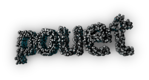
Here's a version with the alpha channel contrast turned up to blend the shadow but obviously most of the rest of it is lost:
. . .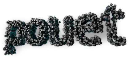
So, here's an attempt at rebuilding the shadow:
. . .
. . .

Here's a version with the alpha channel contrast turned up to blend the shadow but obviously most of the rest of it is lost:
. . .

So, here's an attempt at rebuilding the shadow:
. . .

 ->
-> 
Very well done. I don't even know how you do it.
I basically learned about GIMP's "Color to Alpha" from this thread. Then it's applying that selectively via masking and/or combining with the original image. Different images may require different tricks and it's not always successful. So you try again later or hope somebody else will.
 ->
-> 
 ->
-> 
 ->
-> 

 ->
-> 
Gorgeous!
 ->
-> 
 ->
-> 
 =
=
 =
= 
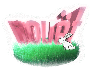
that rabbit logo grass looks a bit cheesy .. maybe raina can do his magic on it :)
 =
= 
second try looks bit better imho. :)
Better than what I managed to do with that one.
 ->
-> 
Quote:
With this one I'm a bit reluctant, it looks okay on background as it is.
 ->
-> 
 ->
-> 
 ->
->  or
or 
Not sure which one makes more sense.
The middle one, imo.
