Flat Design Pouet
category: general [glöplog]
Just messed with the css a little bit...
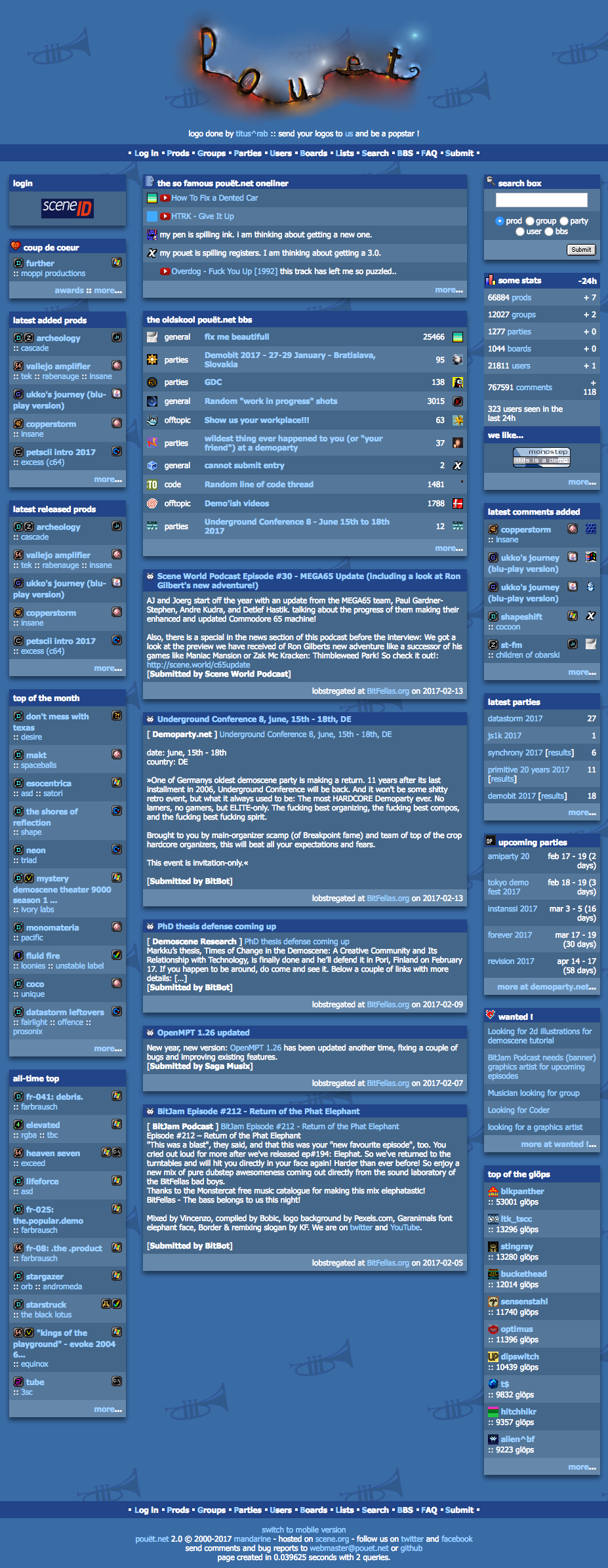
Thoughts?
Thoughts?

I like it

Make it so, Number One. :D

I don't like it

those shadows actually make it less flat than the current 'design' ?

good point
I like it.
Removing all of those lines round the tables cleans the design up a ton, and the shadows do the job the lines currently serve (giving the parts some visual separation) without all the fuss.
Removing all of those lines round the tables cleans the design up a ton, and the shadows do the job the lines currently serve (giving the parts some visual separation) without all the fuss.

Flat design (to me at least) implies less visual detail - simpler design, no fancy borders on stuff, no textures. The idea is to make it clearer, less cluttered. It doesn't mean flat as in 2D.
So if you're using shadows to give a sense of 'depth' in order to separate out the UI elements like mrdoob did there, that's flat design. If you're putting shadows under the text and stuff to make it look cool, not so much.
Note the 'Submit' button - that has a fancy bezel and an outline to make it look like a physical 3D button. That now sticks out as the main non-flat element ;) The platform / demo type icons could do with an update to match too.
Web 1.1 :D
No really, I actually like it. Clashes a fair bit with the icons and buttons though. Like some sort of (unintentional) normal mapping. ;)
No really, I actually like it. Clashes a fair bit with the icons and buttons though. Like some sort of (unintentional) normal mapping. ;)

Nice effort

It's different than it's been since decades. So... no? :)

Yes please!

I don't think the colors work anymore like that.

But on the upside multiple skins are supported so if you can provide a CSS we can make it work :)
looks fresh!

Fonts look horrible blurry and there is maybe a tad too much of drop shadow, but quite okay :)

Shadow things...they look good, but tend to slow down A LOT the scroll down performance and overall performance of the render.
Like the top-bottom padding increase making some sections more easy to read.
Like the top-bottom padding increase making some sections more easy to read.

The proper google-like flat design would have 2-colour icons, 100pt fonts, 999 pixel margins around each paragraph and absolutely no colour differences between elements, not to mention any graphical separators. Go back to drawing board and don't come back until you learn something about "not getting in the way" and "not distracting" UIs!

soo... like the logos, can we have people submit stylesheets and it'll be different every time?
come ooon... it SOUNDS GREAT!!! :D
come ooon... it SOUNDS GREAT!!! :D

Quote:
I don't think the colors work anymore like that.
Like they ever did :)
Quote:
Fonts look horrible blurry and there is maybe a tad too much of drop shadow, but quite okay :)
Don't worry about the fonts, they'll stay readable for you unless you buy a Mac :D

Quote:
Like they ever did :)
It's all about context, okay? :) If you're proposing an update, you might as well update everything, right? :)
When we are talking a complete design overhaul:
flat -> yes, please!
fonts -> not blurry please (while i think this is just some filtering on the screenshot!?!)
change colors to more modern -> yes, please!
+ remove the trumpet-background completely!
...i know "pouet" is the sound of a trumpet, but otherwise this has nothing to do with the demoscene at all! ;)

tbh I don't like it that much, just replacing borders with drop shadows doesn't do it for me :/ Lets make a "compo" out of it, I'll give it a shot tonight and see if I can do any better :)

As far as I can tell aside from the avatars everything else that contributes to the visual is in the CSS, so you can overhaul it as much as you can. User-selected CSS isn't (yet) in the code but it should be fairly trivial to add; as well as external previews. (index.php?_EXTERNAL_CSS=http://...)
Quote:
fonts -> not blurry please (while i think this is just some filtering on the screenshot!?!)
I didn't changed the fonts, that's how the font looks on my browser/os conf.
Quote:
But on the upside multiple skins are supported so if you can provide a CSS we can make it work :)
The css would benefit of some clean up... In order to remove the borders I had to modify quite a few rules.