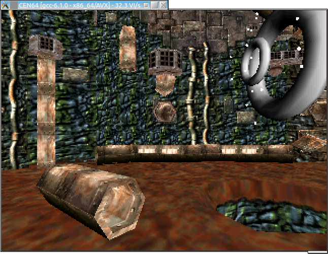
Random "work in progress" shots
category: general [glöplog]
visy
hyvää settiä. Pidin aikoinaan jmagic:ä jumalana, mut sit kooderi kamu sanoi, et dope demon efektit on suurta kusetusta :D Taivas tippu niskaan, ei voi olla mahdollista! oli se kova isku 14v pojalle :D Eiks maagista ollu modikin, jotai "maagi tekee efektin" :D Assyille 93/94 en päässy edes sisälle kun sammuin.
hyvää settiä. Pidin aikoinaan jmagic:ä jumalana, mut sit kooderi kamu sanoi, et dope demon efektit on suurta kusetusta :D Taivas tippu niskaan, ei voi olla mahdollista! oli se kova isku 14v pojalle :D Eiks maagista ollu modikin, jotai "maagi tekee efektin" :D Assyille 93/94 en päässy edes sisälle kun sammuin.
:D thats great honey, thats great.
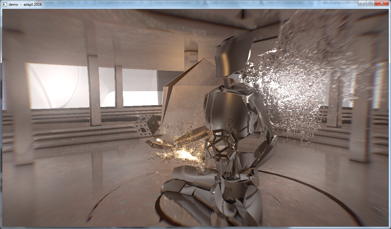
Unfortunately it didn't look like this in the asm demo compo last night as the demo was shown in 1080p instead of 720p and some of the postprocs is screwing things up badly there.
Not a happy moment when you notice during the compo that almost whole demo has a bit zoomed flat silhouette image overlaying the real deal, making it tons too hectic and unclear. Should have either fixed other than 720p resolutions or be smart enough to remove those damn buggy resolution options from the start dialog completely.
Working on a fix now to get the party final version properly released...
Haven't seen the demo yet, but looks like a solid rendering you have there.
For those complaining about the colors: it could have been worse :)
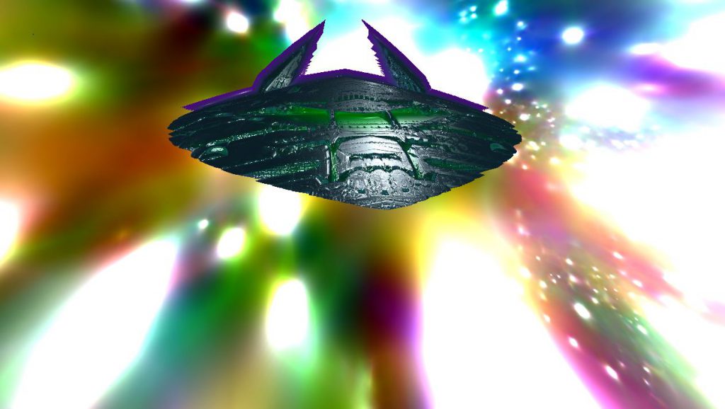

the real question is: could it have been better?
@Seven: cool coder spectrum bg colors there.
But anyway the end result is very cool 1k, I consider it one of the best ones ever released, congratulations!
But anyway the end result is very cool 1k, I consider it one of the best ones ever released, congratulations!
related to the above, sometimes unfortunately the work in progress is actually better than what gets to be shown in the compo:
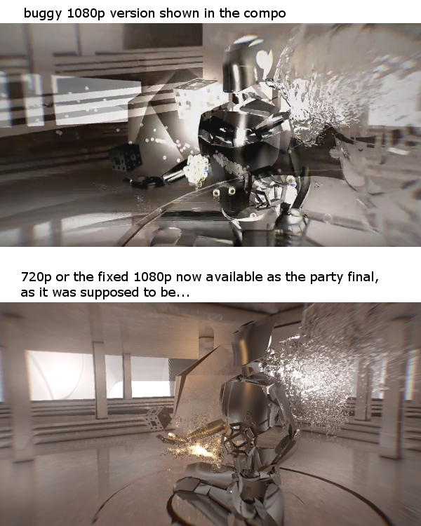
the 1080p was only a minor issue of using incorrect uniform name of the resolution in _one_ shader, just to mention.. Hopefully this will remind people to check their prods in other than the usual dev resolutions. And in case trouble with other resolutions are observed, then I strongly suggest fixing those quickly before the demo party even starts...

the 1080p was only a minor issue of using incorrect uniform name of the resolution in _one_ shader, just to mention.. Hopefully this will remind people to check their prods in other than the usual dev resolutions. And in case trouble with other resolutions are observed, then I strongly suggest fixing those quickly before the demo party even starts...
Quote:
For those complaining about the colors: it could have been worse :)
I actually don't mind that, looks trippy actually! :D
mudlord: sorry, "Escape through My Little Pony-space" didn't quite set the mood I wanted.
awesome, p01
that heatmap this in wicked
Original heightmap, noise derivatives and turbulence:

Perspective mapped and processed, all calculations in 100% 2D:


Perspective mapped and processed, all calculations in 100% 2D:

ahhhhhh it's all done in 2D! loved it noby
 ACE!
ACE!Noby, super cool looking 2D ;). And thanks for sharing!
..and all above 1k WIPs are motivating me to dive back into sketching these small intro worlds too.
..and all above 1k WIPs are motivating me to dive back into sketching these small intro worlds too.
deepr: great! and we should get back into finishing demos =). your GI and screenspace hacks are still wonderful.
thanks yall
thanks yall
First version of Memorial that I started back in 2009. Here you can see textures and multiple names, all which didn't made it in the final cut. Also I removed the border.


The original shadertoy shader for
Young Person's Guide To The Vimana
Postprocessing, color grading and even minor syncs go a long way...
Young Person's Guide To The Vimana
Postprocessing, color grading and even minor syncs go a long way...

this place is scary (4k looking for musician! :)
That, visy, looks very promising and polished (4klang musician here ;) )
Msg me on IRCnet in interested
visy: oh, that looks quite fine! :)


