
horrid platform icons
category: general [glöplog]
keops: the labels highly improve the legibility of the icons, alas the fuji is fucked up. I've mixed my fuji with your lables and got :


The rasters reflect a TOS 1.6+
ps: yes sir! so here comes an icon for Flash and Gameboy
  . More to come.
The rasters reflect a TOS 1.6+
ps: yes sir! so here comes an icon for Flash
and Gameboy . More to come.Some of them are a bit hard recognizable, the snes due to almost the same colours, the light psx due to a too bright colourset, the same goes for ps2. The GBA looks like it's cutted at the side borders.
How about the four colours logo for the snes, or was it only in Europe? (And even when, the demo scene is mainly located in Europe.) :)
How about the four colours logo for the snes, or was it only in Europe? (And even when, the demo scene is mainly located in Europe.) :)

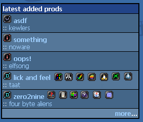
hey, and what about ditching the whole logo thing (it's annoying, maybe if done in an unique style and placed into other place would help?) and just put the damn thing in words?? For example after or before the group's name, in a greyish typo so it's just informative:
 prod name
:: group name :: C64
prod name:: group name :: C64

Here's another ones,
Game Park 32 :

Flash

Game Park 32 :
Flash

zomb: and then wait 2 hours till someone complains there is too much text on the index.php
no. i will try to redo the index.php yo have the platform icons on the right instead of the left though.
no. i will try to redo the index.php yo have the platform icons on the right instead of the left though.

Two images for the mobile phones (ripped from the internet, invested some minutes in add. work):  _
_ 
_ p01: get me one of those just saying ST not STe nor STF please
ps: like that  ?
?
?p01: perfect
Horizonally centered, bottom aligned and less large (better for the layout imo):


I seriously wonder why there suddenly is so many win3.11 demos around

msx 
vic20
vic20
keops: I had forgottent the "rasters" in the 030 logo of the Falcon. All the more that mine is just behind me :p
adblock is your friend!
So is account2.php.
Pocket Pc (a bit hard to identify...) :

ps: I definitely don't think that 3-6 letters are way too much text (most if not all of the platforms can use short names), whenever I look at a new prod I focus first on the type of prod icon first, and then the group (the blue color of the links + the type icon already give me a hint of "what is important") - or maybe that's just me ;)
Anyway, if we're gonna stick with the icons, I'd bug an icon artist (anyboy out there? :) ) to make the whole array of icons in the same style, with at most 2-3 colors which would combine well with the pouet color scheme (just as the atari white icons keops posted). Right now it looks like a circus, with every icon displaying its own colors... And yeah, try putting them in other place, the type of prod is more important than the platform itself imho... the icons are screwing the layout anyway (and yeah I know that account2.php is there, but the platform icons are a great idea, too good to just hide them)
Anyway, if we're gonna stick with the icons, I'd bug an icon artist (anyboy out there? :) ) to make the whole array of icons in the same style, with at most 2-3 colors which would combine well with the pouet color scheme (just as the atari white icons keops posted). Right now it looks like a circus, with every icon displaying its own colors... And yeah, try putting them in other place, the type of prod is more important than the platform itself imho... the icons are screwing the layout anyway (and yeah I know that account2.php is there, but the platform icons are a great idea, too good to just hide them)
damn you atari freaks. :)

I'm just waiting for someone too come up with a good wild icon.

well while shamelessly ripping msdos and mswindows icons you could also rip ActiveSync transparent icon for PocketPC. Looks times better than the one provided by BackSpace. Have no descent host to put it online tho :(
and yes, default to _off_ please.
and yes, default to _off_ please.

What about something like that? (just a quick try out)
Icons would be less ugly that way
Icons would be less ugly that way
Thomson :

I totally second keops

keops : maybe place os icons after group name ? cause some prod names are too long. ( look at 10'th in top10 for instance ^^ :D )
And if anybody has got ActiveSync ( 3.7 or so ), i was talking about icon which is in
Wcesview.dll
resource #650
sublayer #3 ( 16x16, 256 colors, transparency )
same icon that you have in My Computer on 'Mobile Device'
And if anybody has got ActiveSync ( 3.7 or so ), i was talking about icon which is in
Wcesview.dll
resource #650
sublayer #3 ( 16x16, 256 colors, transparency )
same icon that you have in My Computer on 'Mobile Device'