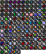
pouet intro icons suggestion
category: general [glöplog]
Quote:
I'm with mog on this one. More minimalism doesn't only look better, it also makes the icons more readable.
+1
The current one is still the superior, since (most of) the icons are distinctively color coded. Humans recognize by color far better than by shapes, especially when they're that tiny and many of the symbols are quite similar. If you filter 1k and 4k intros in the prodlist.php you can differentiate between the two much easier with the current set.
Simplification is what made me want to kill the people who made Visual Studio 2012.
For me the shape, the color, the contrast, ... are all important.
I'm not necessarily for a fat border, but keeping an identical border at least gives some consistency to the icons independently of which platform or category they represent.
Absolute flatness is just a shortcut for 'do whatever the fuck you want' which generally looks ugly and messy :)
A more minimalistic approach does not mean that you have to rule out color or shape. Actually, it endorse both color and shape.
tried the middle one. not sure how much embossing would work.
imho too much ebossing on current icons.

if i was to work on these icons, i wos unsure about the middle or lower icon style.

imho too much ebossing on current icons.
if i was to work on these icons, i wos unsure about the middle or lower icon style.
how about this one?


how about this one?

no offense rudi but they're fugly both regarding design (asymmetric shape is horrible) and technically (aliasing looks bad).
why the fake border anyway? as said before. it doesnt fit the rest of the pouet design and as pandur says, it's a waste of pixel space... just make a square with a color for coding/categorizing and then the logo or text on top as it is now. minimalism and effective.
why the fake border anyway? as said before. it doesnt fit the rest of the pouet design and as pandur says, it's a waste of pixel space... just make a square with a color for coding/categorizing and then the logo or text on top as it is now. minimalism and effective.
i'd join the party... but for some reason my tools glitch and refuse to work on this file. o_O
I like rudis icon set.
One can have a custom avatar and you can contribute pouet logos. Why not enable custom icon set or even a custom pouet css?
One can have a custom avatar and you can contribute pouet logos. Why not enable custom icon set or even a custom pouet css?
I kind of like the icons as they are.
Or maybe a set where more details are displayed, just not those minimalistic ones.
i think rudis icons are way better than the current ones
is this good? tell me. just for me to feel better. i'd not want to see them on here. :D

and now... i'd change them all from 1k up alil too so all same "font" but... yeh... this was about the <1k

and now... i'd change them all from 1k up alil too so all same "font" but... yeh... this was about the <1k
Unreadable. 3 digits + big border = no go.
i thought it's not really about reading it perfectly. sure right... you have too get pretty close to see. i don't really care tho. in case... they all got popup info. but yeah... maybe a color code would make it more obvious. :D
If you can't read it, then there's no point to extend it to 3 digits anyway.
just cause... maybe the american way would do? 1/2 or 1/4 or 1/8 k? or .digits?
thanks ddeml and v3nom!
rudi +1 except Tux icon
They're nice rudi, but they don't really fit pouet - same with the current ones. Everything here is flat, and mostly has a black 1px border, no insets or emboss borders.
However they're a step in the right direction, keep it up :)
However they're a step in the right direction, keep it up :)
Well, it's not like the rest of the icons is 100% consistent, either - just look at the piggie, which has plain colours, versus the thumbs, which have gradients, suggesting depth - kinda like the platform buttons. But yeah, rudi's going into the right direction with a lighter border.
we also need to ditch the terrible blue everywhere!
I like Rudi's best so far. Maybe make the border even just a plain inset (negative) border, like the icon is actually "looking thru" the background.
