My pixel art sucks. Need help.
category: general [glöplog]
I have always been a fan of pixel art, but never tried to do it myself. Well, now I have to, and guess what: everything I do looks like total crap.
Of course I looked up a few tutorials on the net, but I think there are some experienced pixel artists around here who could help me with some insider hints.
Mostly I have to do small sprites around 30*30 px. My biggest problem is that everything looks quite undefined and flat. And I struggle hard to find the right tones to indicate structure and details.
Thanks for your advice!
I'm no pixel artist, however I sometime do tiny icons like 32x32 pixels, however I work on the 32x32 area while the surrounding area is visible.. so the image may actually be 1024x1024.. you just work on a tiny area so that you can compare it to the context its supposed to be used in.
I used to be into pixelling once. I hung out on a website called Pixelation, and the amount of help they gave me there was amazing. Look around and see if it is still alive, because it is definetly the right place to go.
Don't worry, you just suck that's all
Did you read this?
There are people who can help you. These guys are friendly and will help however they can, provided you give some examples of what your problem is.
maw: first draw in B&W , after add #666666 and #AAAAAA for light.
and after try to colorize, one step after one.
and after try to colorize, one step after one.
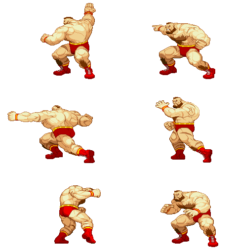


How could I not :(
That's a nice page, though. But mostly, what Insectecutor said. Give some examples of what the problem is, it's sort of hard to give general tips.
Just post some examples you pixeled up to now and I/we can give better tips and advice.
structure and details in 30x30..? omfg... just don't try to get it "right". making things look more complicated than they really are usually already does the trick.
Drawing on paper might help. Simply practising helps. Using references helps. gathering general information about drawing & painting helps.
OK, thanks for the advice so far. I will upload some examples later and of course check out pixelation, seems to be a great source.
My biggest problem is that I have to create quite a lot of different enemies (up to twenty) in that tiny size. Since I am doing this for an action game, the player must be able to distinguish the diferent types of enemies instantly. But I don't want to use a whole rainbow of colors...
My biggest problem is that I have to create quite a lot of different enemies (up to twenty) in that tiny size. Since I am doing this for an action game, the player must be able to distinguish the diferent types of enemies instantly. But I don't want to use a whole rainbow of colors...
Looking at masterpieces can be frustrating and might not help
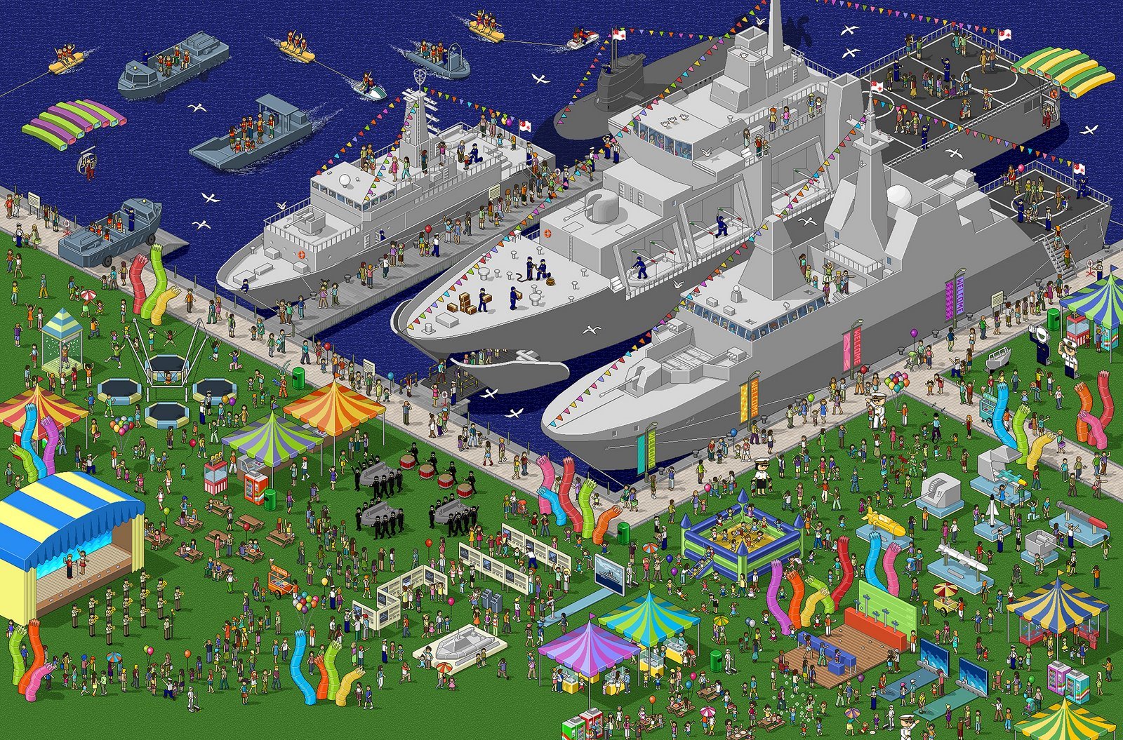
Oops, I totally forgot to mention: I am talking about enemy SHIPS for a shoot em up.
so here it is... except for the last one I did use a little "help" from photoshop, but I know by now that this is not a good thing to do.
so flame on...!
Decide on a common light source for your sprites. I notice the 2nd one along has a top left light source, whereas the rest don't share this. Think about how they will self-shadow and add very feint highlights and shadows to hint at depth.
e.g.
e.g.

yeh, apart from the shadowing on the first two, the rest seems pretty fine to me
Make a pixel-art demo about it.
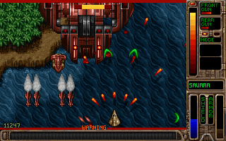
Also sort out your outlines. Check out the use of outlines here (on the ship, on the buildings):

You have put outlines on everything as if it's the law to put outlines on things. You need to use outlines to show the quality of an edge, is it a sharp corner or a smooth one?
The ship's razor-thin wings in the grab from Raptor above have an subtle, smooth 2px highlight. The sandy buildings on the ground have a bright 1px highlight/shadow to give the impression of a bevelled corner.
Awesome thread. :-)
You may want to harmonize your palette a little bit. Everything looks somewhat oversaturated and wacky in a '3 year olds will be pleased' way. =)
Not that I painted a lot but I always had a problem in drawing humans or animal forms (Well, I tried once I think). I could draw other things easier (mountians, houses, mechanical things (spaceships, weapons), fonts) - well only on CPC I tried but I know. I don't have an eye for human body anatomy or something. I think. Can this change?
I also only pixeled things. I'd like to try photoshop. How do people draw there? Through an otinanum demo I might find the opportunity to do things I never did in the scene, like drawing on PC. Hmm..
I also only pixeled things. I'd like to try photoshop. How do people draw there? Through an otinanum demo I might find the opportunity to do things I never did in the scene, like drawing on PC. Hmm..
Optimus: human anatomy drawing takes a lot of practice and study. Years of practice and study. It is a learnt ability, it is just a matter of time and effort and the very most of the people start doing it in a reasonable/good quality. It is mostly a technical skill and nobody have bornt "having an eye for human body anatomy".
Quote:
I don't have an eye for human body anatomy or something. I think. Can this change?
Here's a clue:
Quote:
(Well, I tried once I think).
Try harder!
