FPS looking for Shader artist to pimp our rendering
category: offtopic [glöplog]
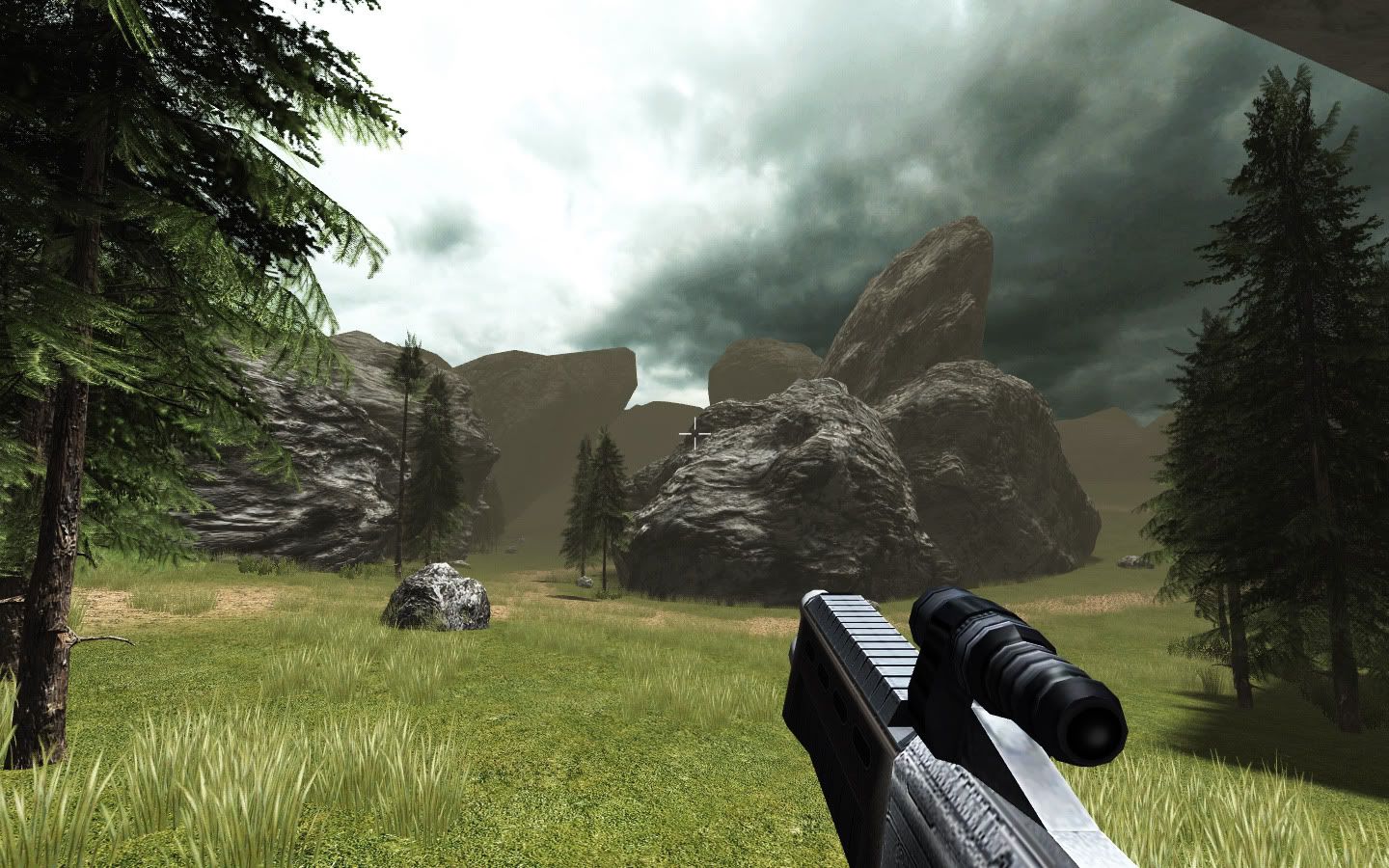
Thanks, Yep, i will make it a bit darker (not too much, as the player needs to have a good visibility, as the game will be all about skill.
The shadows will be darker too, but on this screenshot, the engine is using a single shadow map, and it's stretched over 300 meters(the more you stretch it, the less dark shadows are).
The next engine version (in around a week) will have PSSM and will allow really more defined shadows.
I will try to find a good balance between everything at this time.
Target rendering done in PS, in terms of contrast/saturation (didn't touched fog settings or anything map related).
What do you think?

What do you think?

its better. still the ambient value of either the fog or whatever illumination model you use on the polygons are too high. im not an expert, but i think ambient value should be very very low. but when i see the closest polygons there are no ambience. so, i guess its the fog. the fog on the boulders as i said earlier is very important that they look darker. maybe the fog density is too high or the fog ambient value are too high
if you can manage to project clouds(could-dome texture (or whatever)) on the polygons as lighting values (multiplies) that would rock.
yeah, if the fog color is light, there should be visible partible mist as well. now it just looks odd.
That last shot is a lot better just because of the mossy texture under the grass and the trees.
Rocks are still weird. I don't think I've ever seen a lush landscape with totally barren rocks in there. They need bedding in a bit more.
Check out this picture of a big ass rock. Things grow in the cracks and chunks drop off.
Rocks are still weird. I don't think I've ever seen a lush landscape with totally barren rocks in there. They need bedding in a bit more.
Check out this picture of a big ass rock. Things grow in the cracks and chunks drop off.
also I understand you're after shaders here so i'll be on my way...
since fog makes everything the same color (well not everything). you still see the dome. maybe the start and/or end point of the fog is wrong too. because you should not be able too see the clouds as light as they are. they should be more ambient than the distant boulders are if you deside to use the fog.
as how the engine renders the scene it should in fact look like this:

so there is something wrong and in the picture below i show you why.
maybe you allready knew that.


so there is something wrong and in the picture below i show you why.
maybe you allready knew that.

maybe the closest clouds should be a tiny bit visible, but i didnt bother figuring out with my brain if this is true or not by just looking at the picture.
wow. Peopz trying to optimise a dead ass screenshot. lol. But I'm too lazy to do that things now.
For a bot of detail and movement throw in some cloud shadows maybe.
The lowest clouds should be invisible, the higher clouds depends on the type of fog/dust, not the distance. If it's a 50m thick layer of dust, then most of the clouds will be visible. Maybe just blend the clouds to brown near the horizon and it'll look ok.
Also the base of the tree looks bad, it needs some love.
The rocks look 'fresh' like they've just landed there.. either they have, and the ground should be disturbed a lot by the impact, or stuff should be growing on them. Like perhaps grass on the top, moss on the sides / around the cracks.
Also the base of the tree looks bad, it needs some love.
The rocks look 'fresh' like they've just landed there.. either they have, and the ground should be disturbed a lot by the impact, or stuff should be growing on them. Like perhaps grass on the top, moss on the sides / around the cracks.
And here we go again.
psonice: does that mean you're applying to the job?
The concept art looks pretty cool, but if there's one advice I can give you (apart from "wear sunscreen") then it's that you should probably focus on a single game first, instead of having two in simultaneous development.
Don't forget where you're asking. This is the popular look of the demoscene these days...

:)
Seriously though, great concept art and character modelling, but you can't expect people to work for free or for a promise of riches to come. I've done that a lot over the years and I never saw a penny from any of them. Nowadays if I don't get payment or a contract up front I don't waste my time and I'm guessing that most people here think the same way.
wade: you're very biased on this. in fact demoscene graphics look more like this:


gargaj: you're very biased on this. in fact demoscene graphics look more like this:


Also add bloom.
Gargaj: lacks cubes. And no, I'm not applying for the job. Unless it's going to pay actual cash each month rather than possibly some known amount of money at some possible future date :) Not that I'd be all that good at it anyway. I'd be expensive and bad, just what they want :D
I guess most of the sceners really qualified for this already have jobs. Like, ones that actually pay. But for somebody who's maybe at college, looking at getting into this kind of work, and doesn't mind doing it as a hobby it could be good experience and a good mark on their cv?
I guess most of the sceners really qualified for this already have jobs. Like, ones that actually pay. But for somebody who's maybe at college, looking at getting into this kind of work, and doesn't mind doing it as a hobby it could be good experience and a good mark on their cv?

That would work... "Battle on planet chimera".
More like planet minimalanimal :)
or minimalartifact
The demoscene is all about noise!


